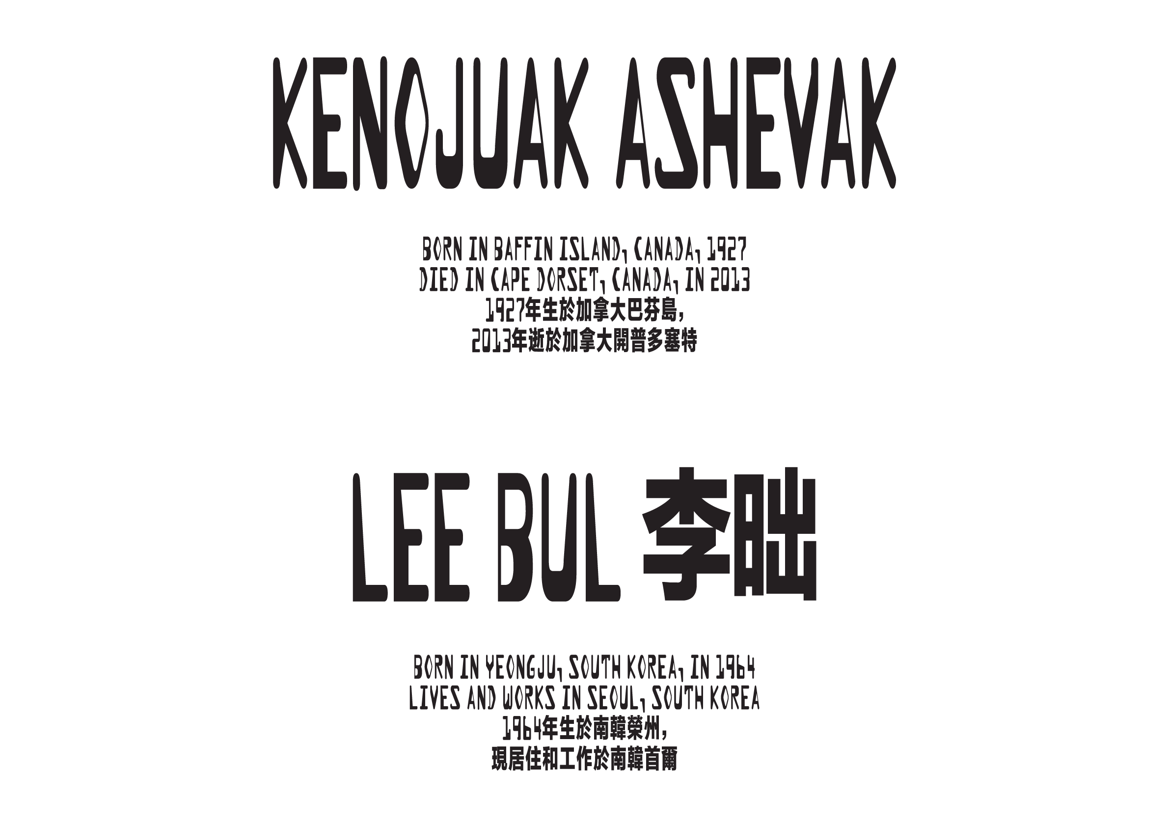
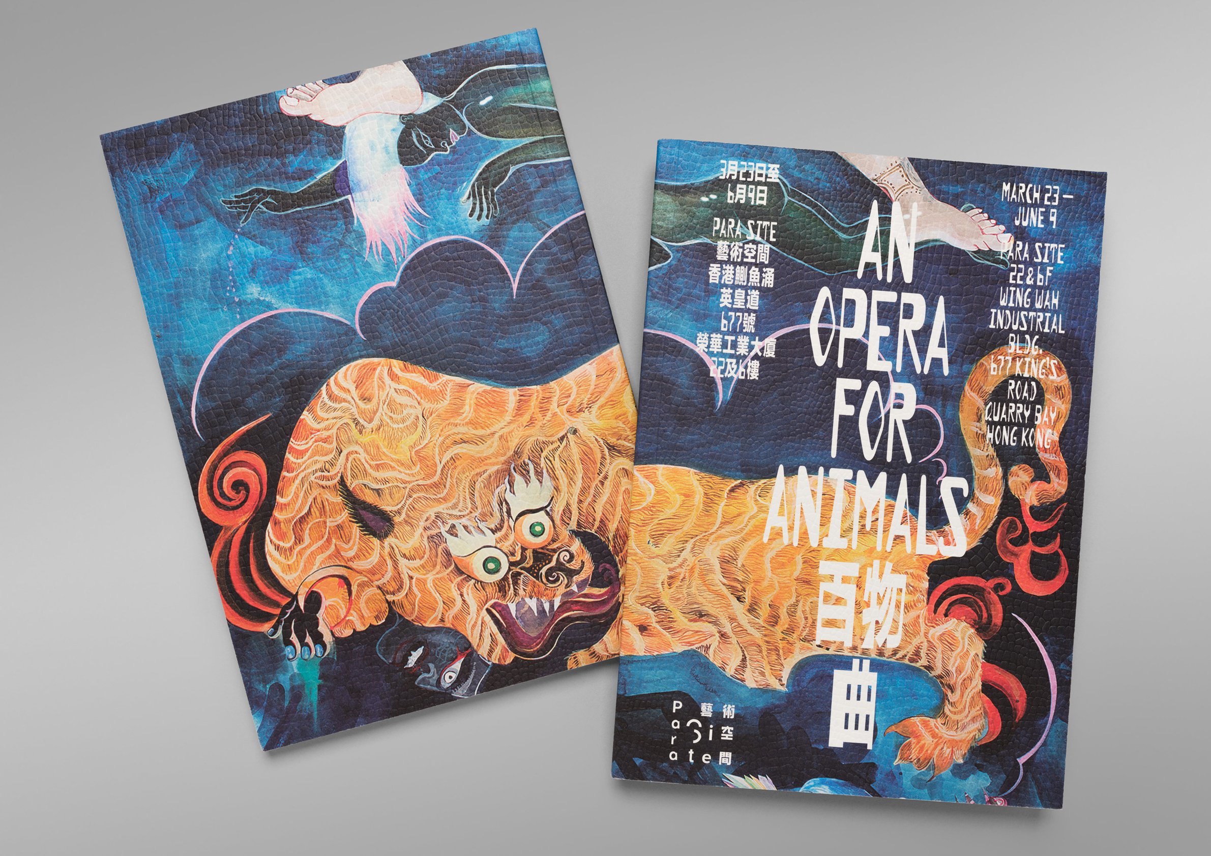
The identity for An Opera for Animals takes a typographic approach to expressing the themes of the exhibition — the complexities of performance and its connection to a natural state, its position within the modern world, and how that modern world was arrived at.
A relatively expressionistic OCR-inspired typeface from the early days of grunge-esque type is stretched vertically, revealing surprisingly organic qualities — a snaking figure here, a tail there, and wild.


