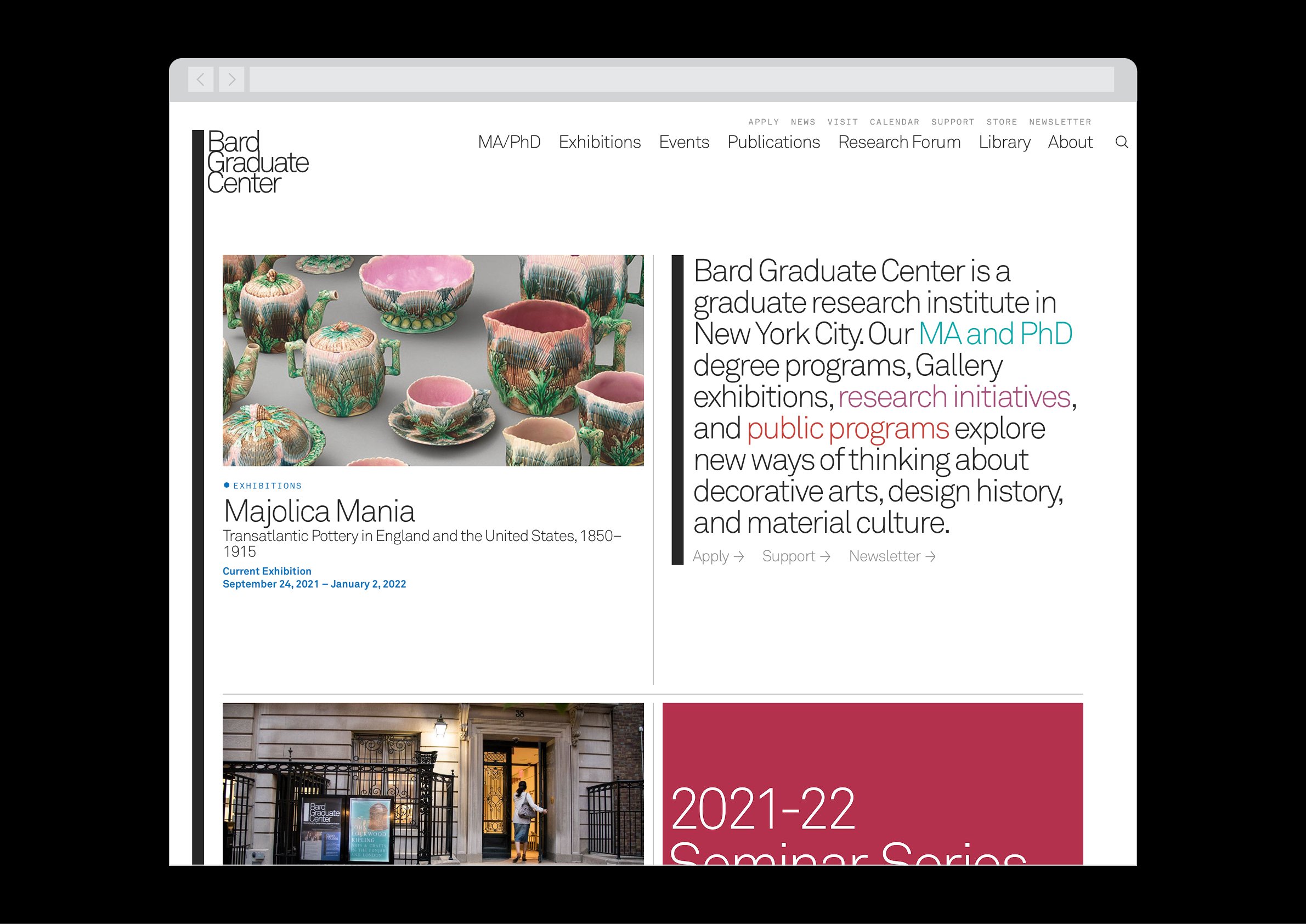
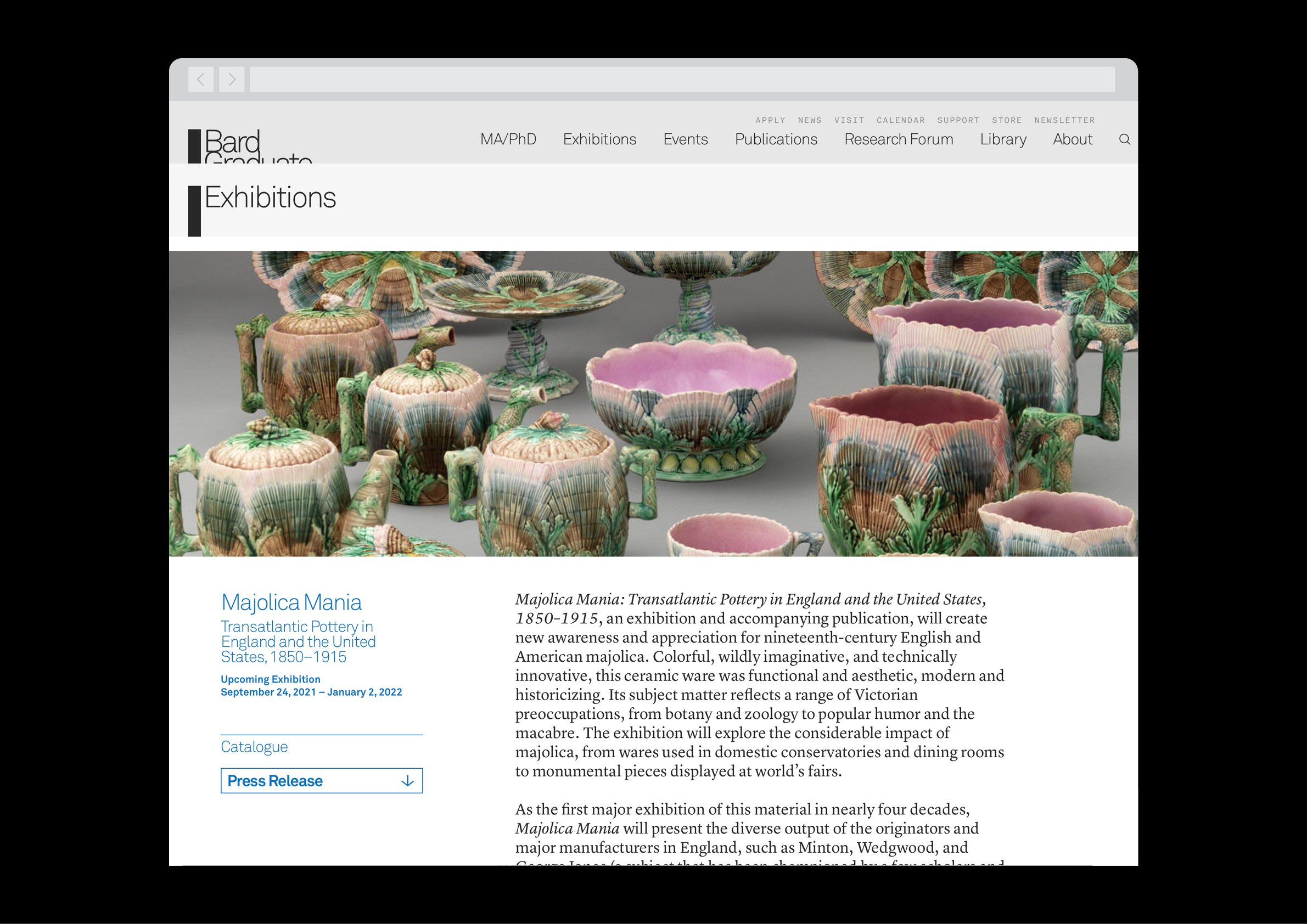
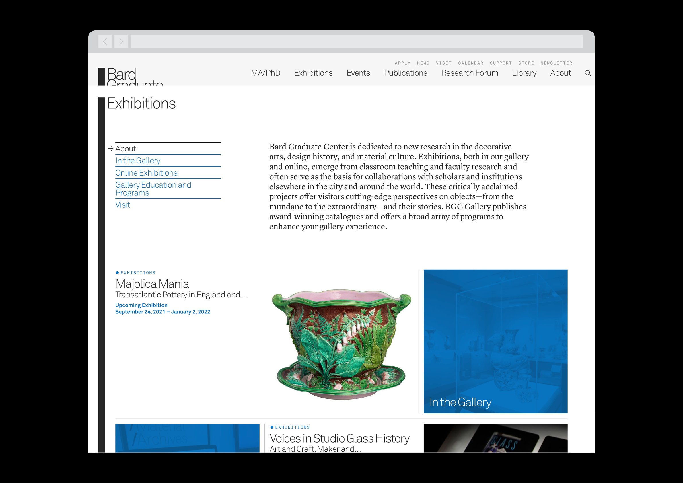
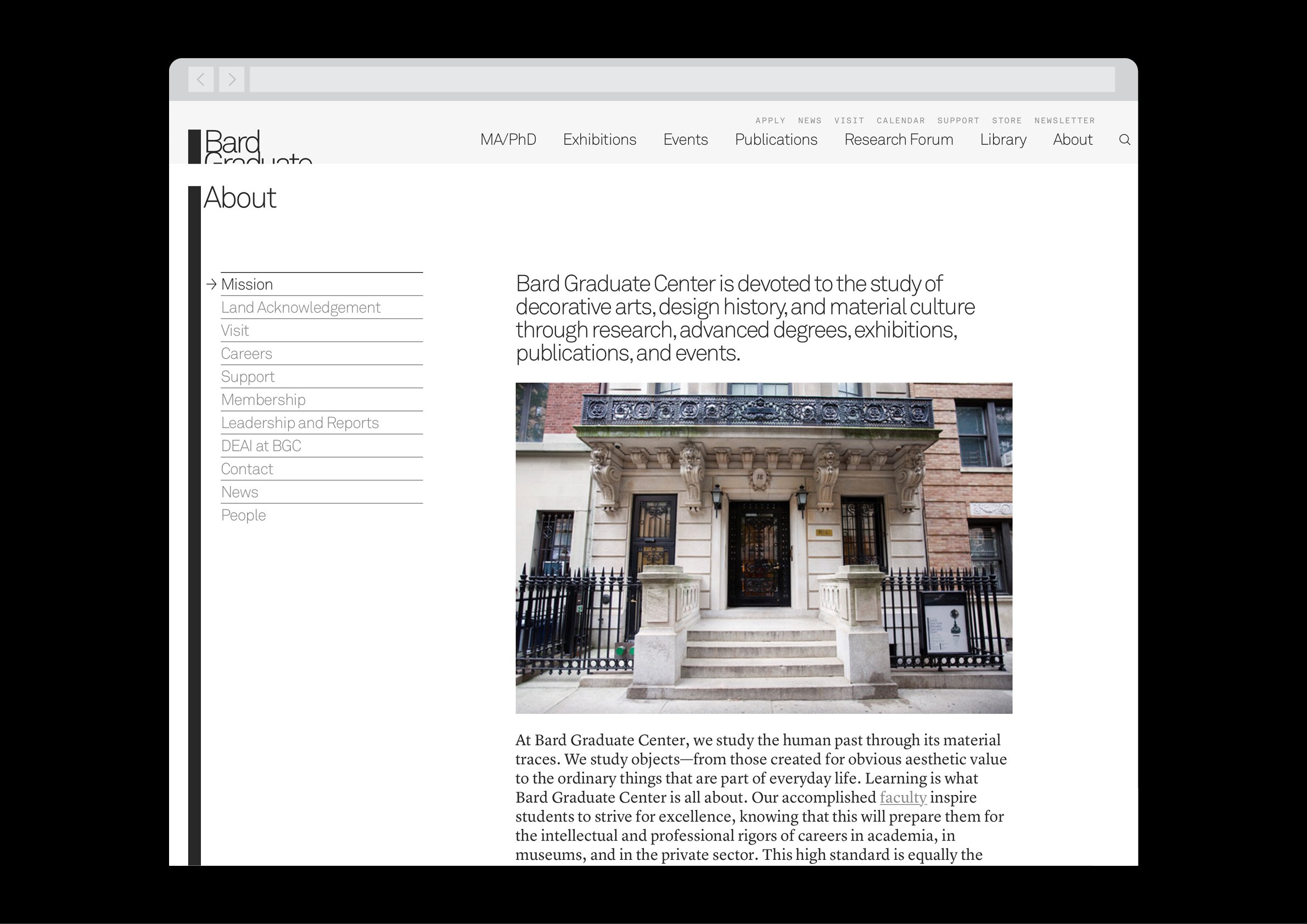
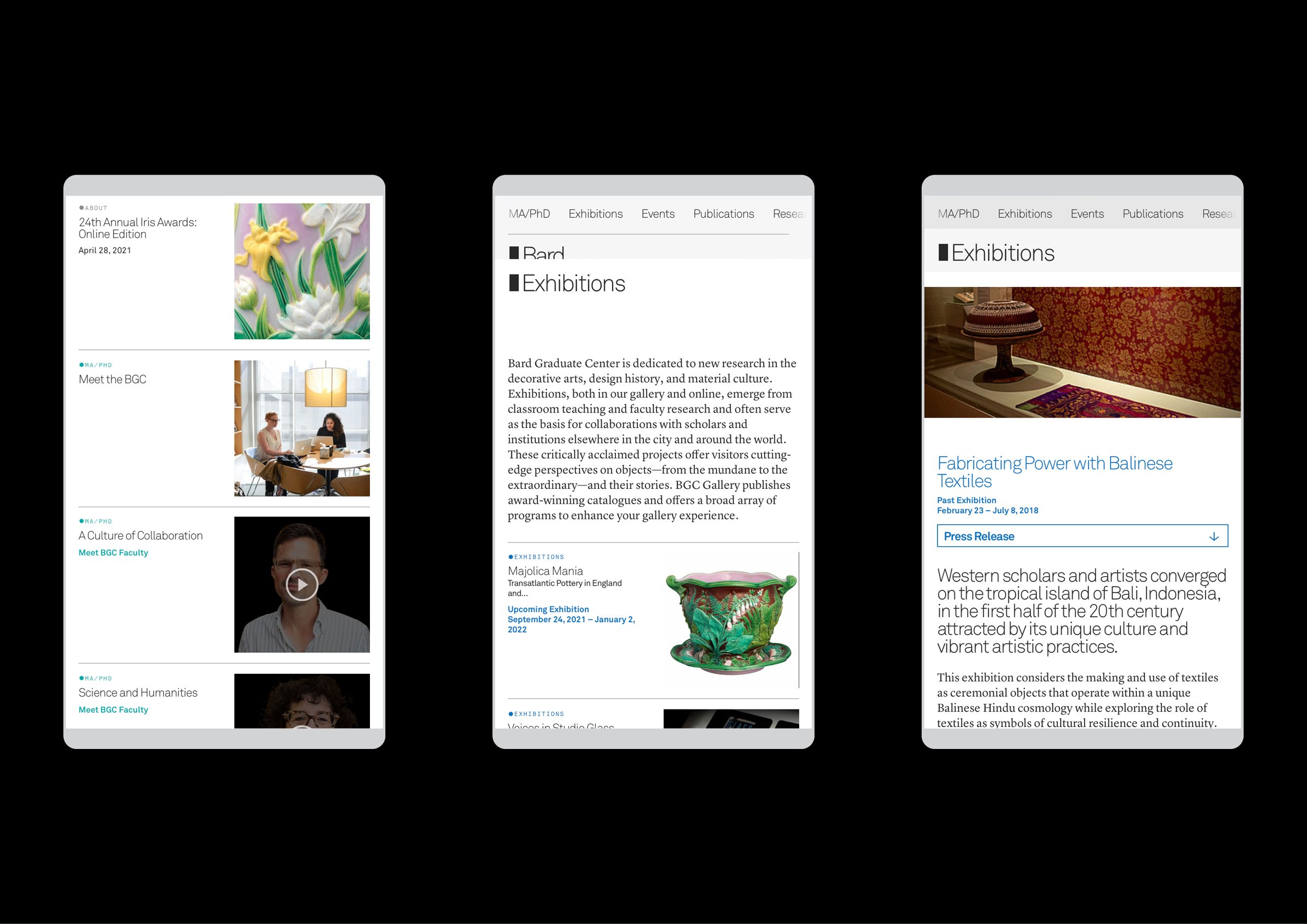
Bard Graduate Center is a complex institution comprising an MA/PhD program, an exhibition program, ongoing events, publications, a multimedia Research Forum, and a library. To address this complexity, we designed a website that would reveal itself in “stacked” fashion, a sort of visual breadcrumb trail indicating hierarchy and the visitor’s present location within the site. The homepage and the navigation, the latter simplified to the main pillars of the BGC, exist on the bottommost level, and the navigation slides the entire site down when activated so as to maintain the illusion. Each pillar appears as a second layer, and successive pages appear on top of that, and so on.
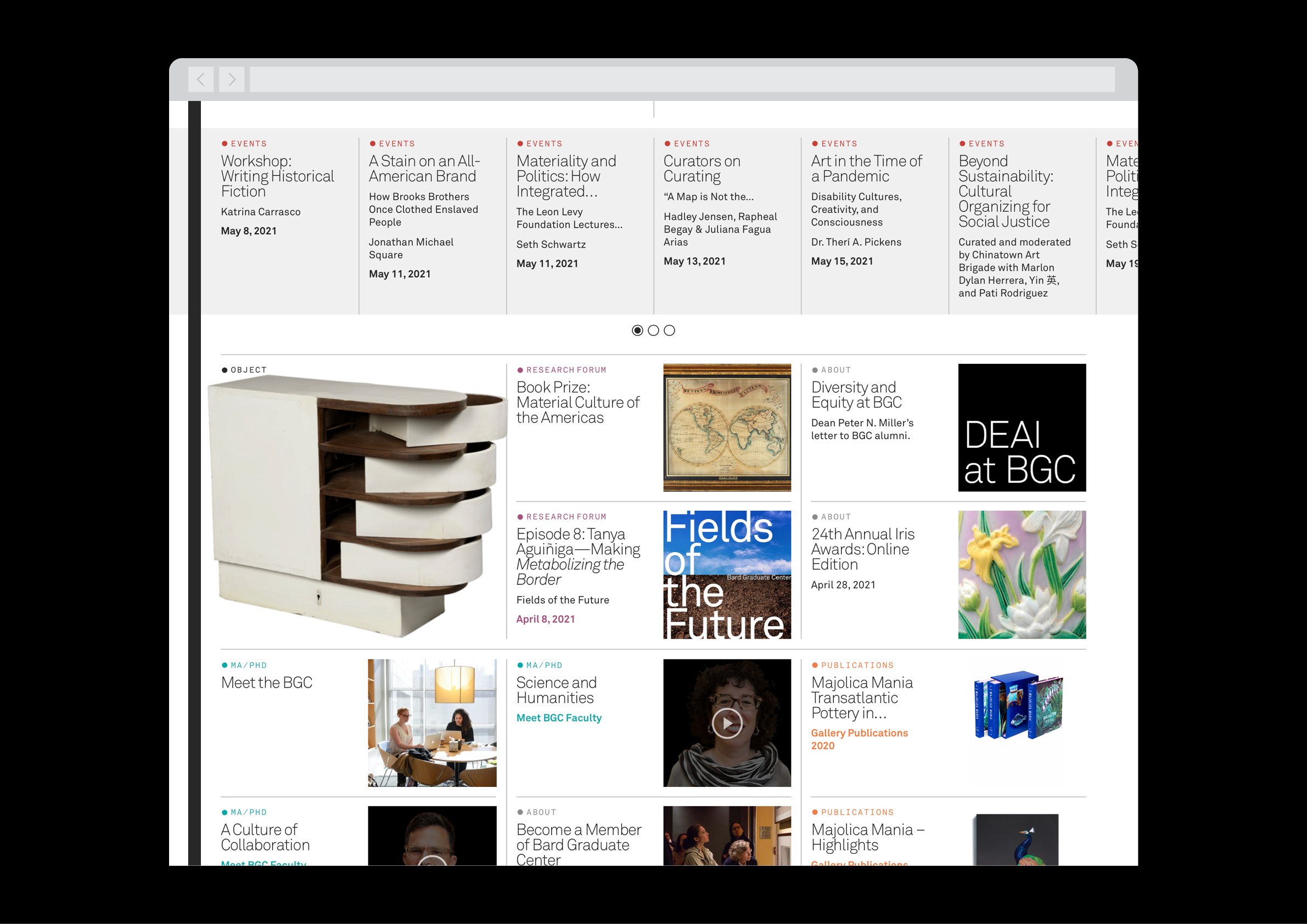
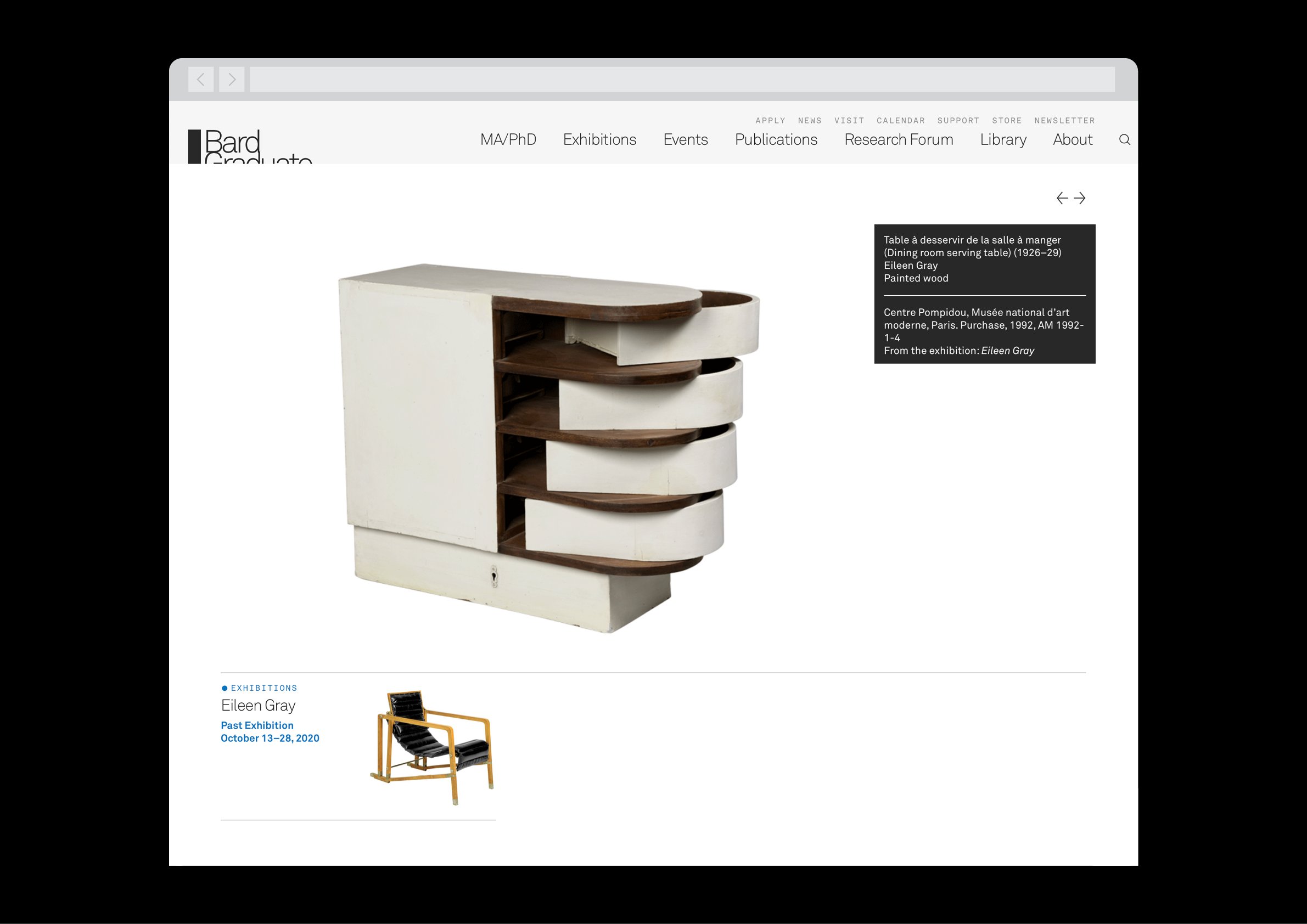
The homepage and each landing page have a strict square grid system for displaying the multitudes of content, all of which are color-coded to their respective section. Within these grids are silhouetted items from the exhibition archive, surfacing relevant objects of study or of current relevance to the Center’s programs.
