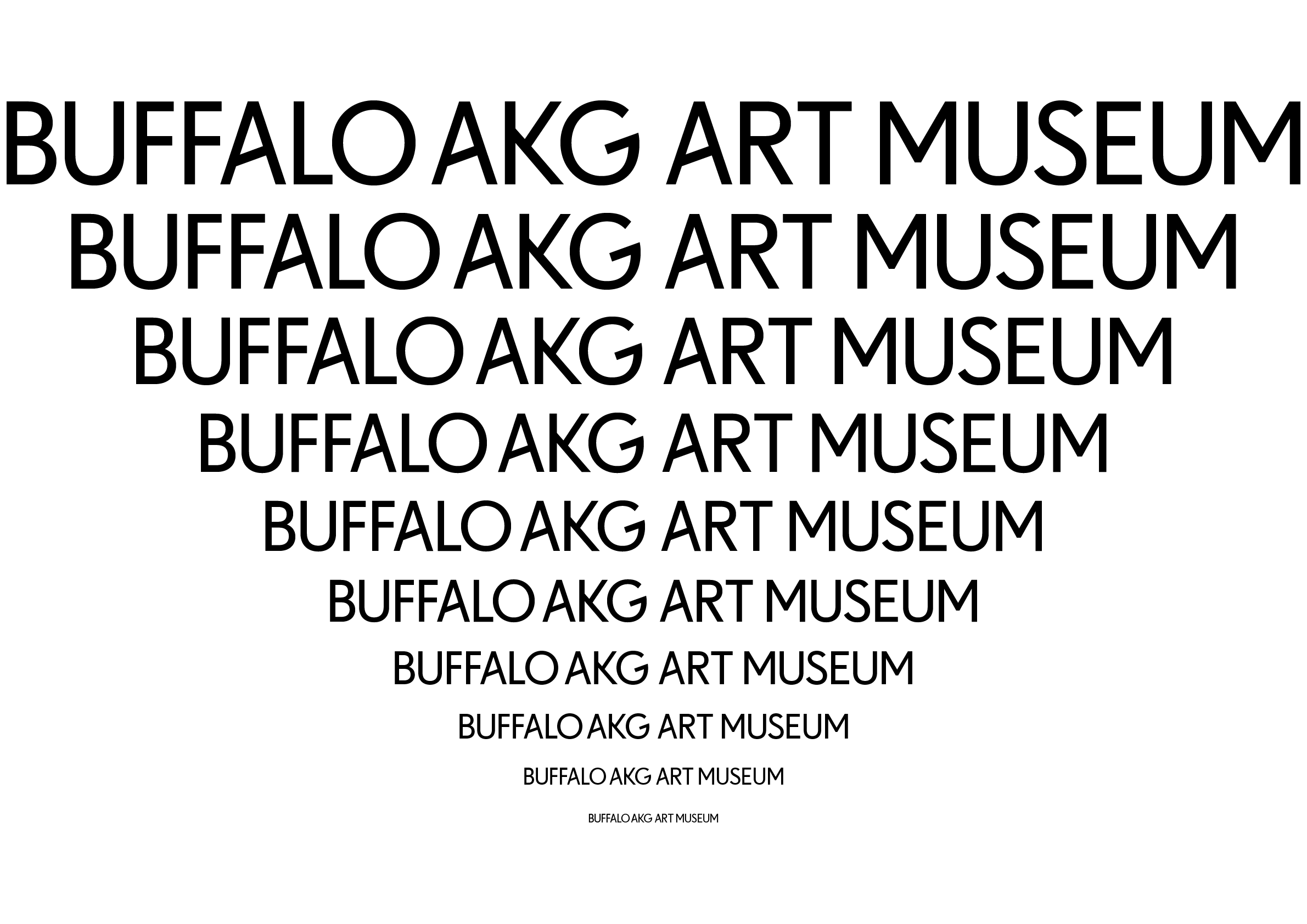
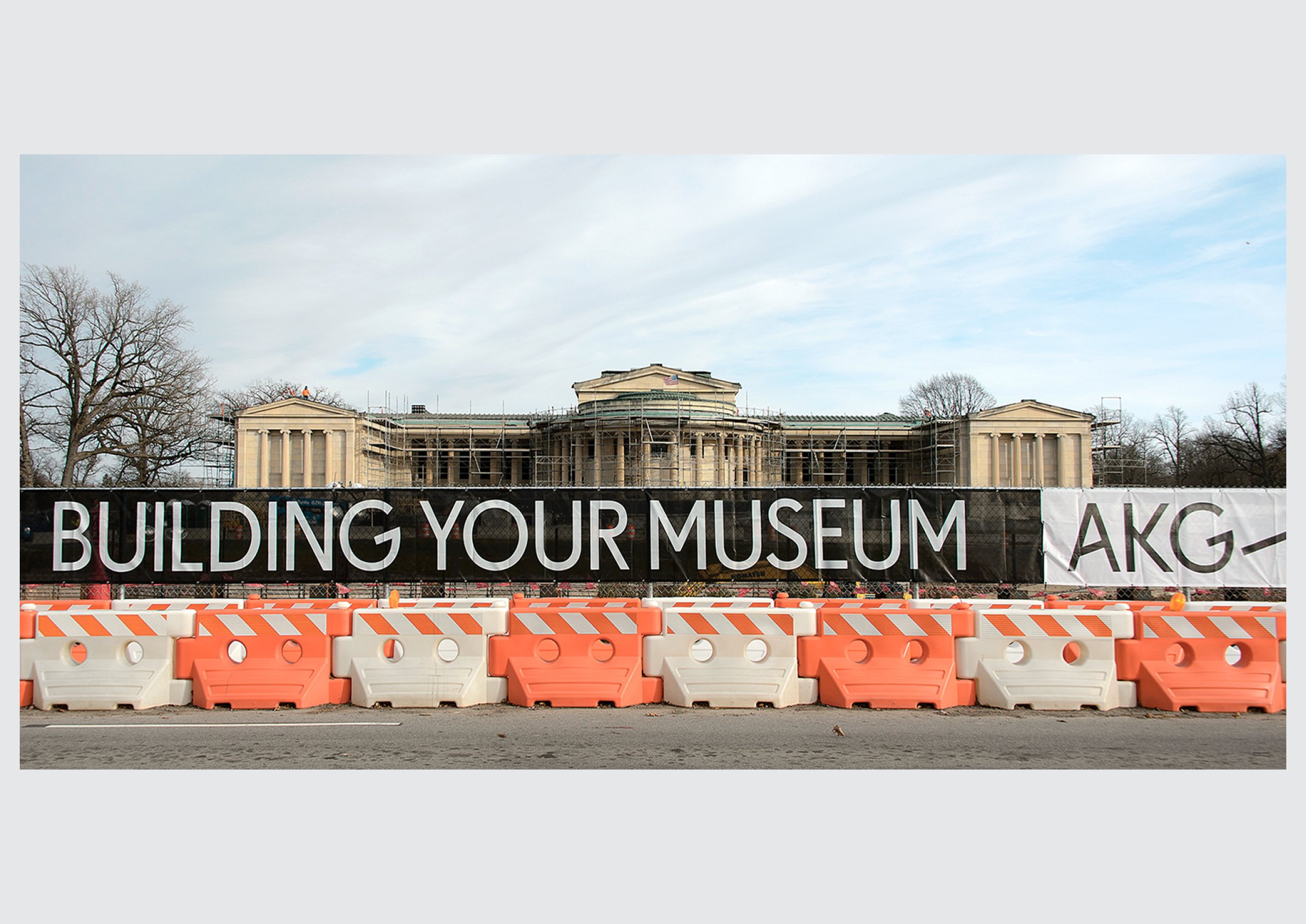
Buffalo AKG Art Museum is a lot of name, with an acronym in the middle. We made the A, K, and G the most conspicuous part of it. The new identity accompanied the former Albright-Knox Art Gallery’s new name and its 2023 reopening with an OMA-designed addition.
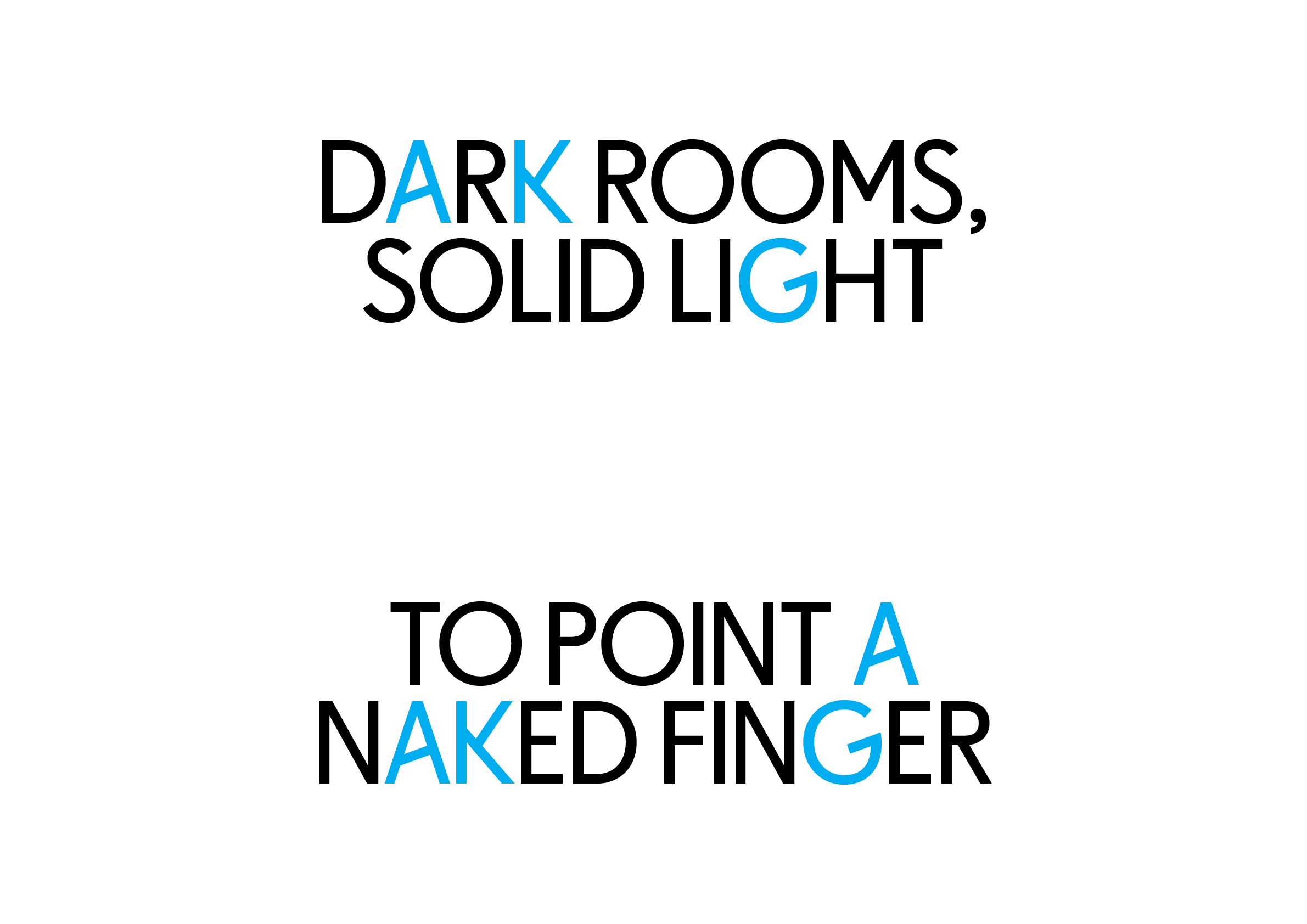
The first drawings used Neuzeit and related grotesques as a starting point, with alternate-universe forms for those three letters. We then worked with Christian Schwartz of Commercial Type on AKG Sans, a custom typeface drawn from scratch to bring the rest of the alphabet into the same world. The museum’s active editorial team could use the unusual A, K, and G wherever they appeared in a sentence, letting the identity turn up well beyond the logo.
The full name is paired with a shorter AKG mark and variable punctuation: AKG? for a question, #AKG for social media, ¡AKG! for bilingual programming, and so on. It’s a lot of emotional range for an acronym.