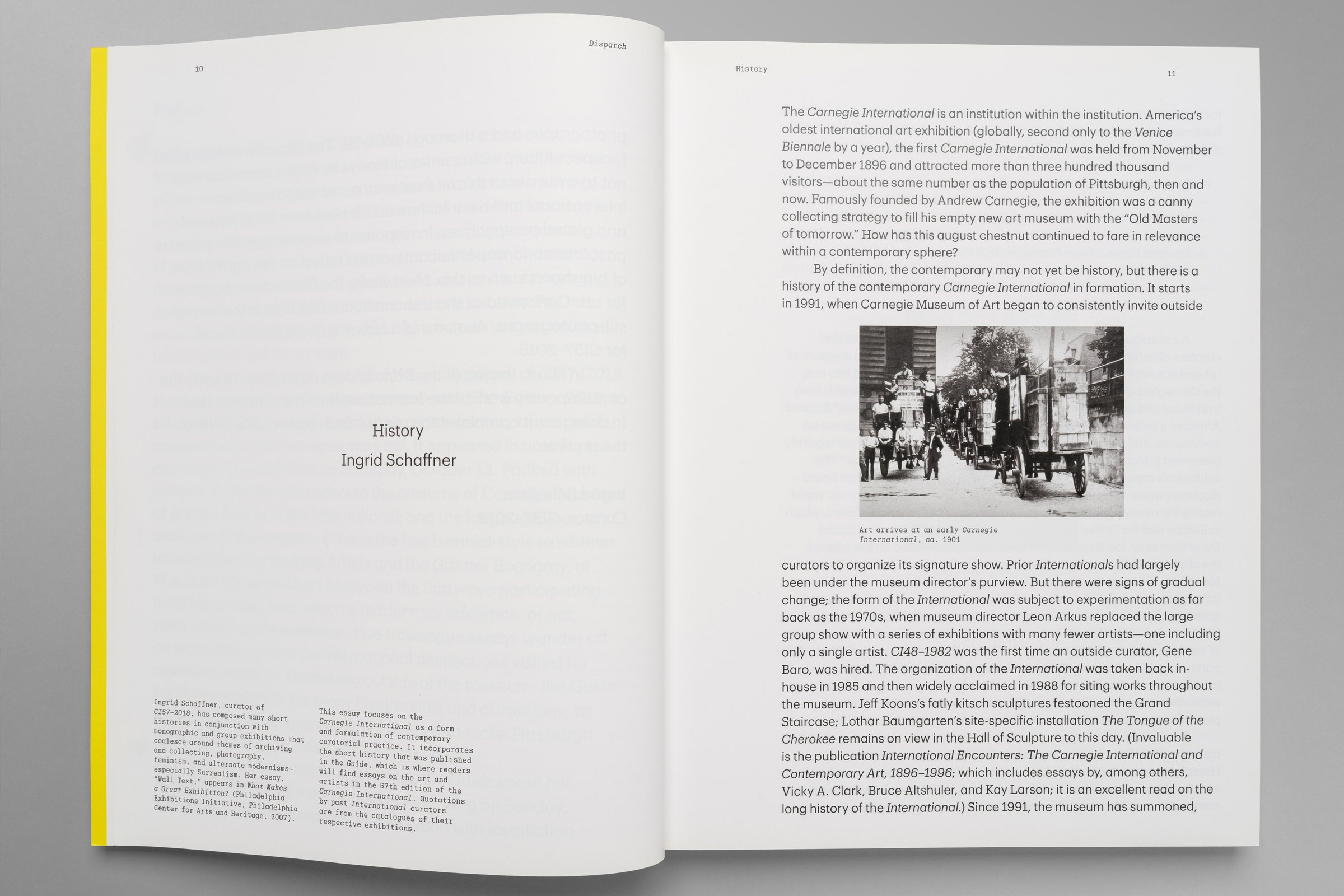
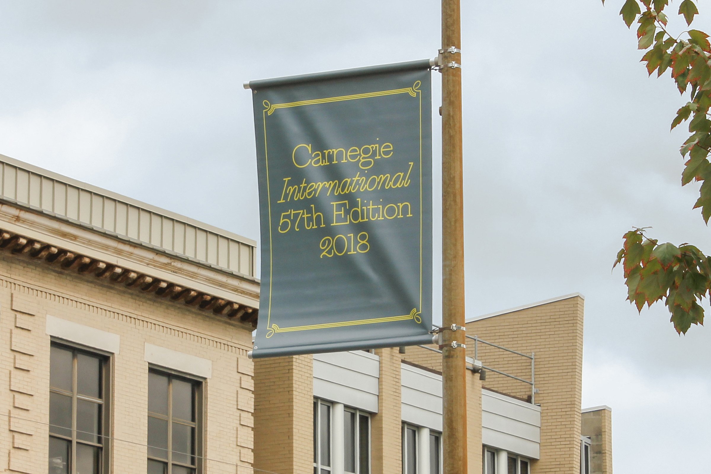
For the 57th Carnegie International — the design, editorial, and curatorial process for which stretches over years — the creative team that was assembled sought to expose process. Curator Ingrid Schaffner proposed three distinct phases that she termed “Truss” (the lead-up), “Fuss” (the exhibition on display), and “Catenary” (the archiving, the send-off).
As such, we proposed that both the design and the naming should reflect this as well.
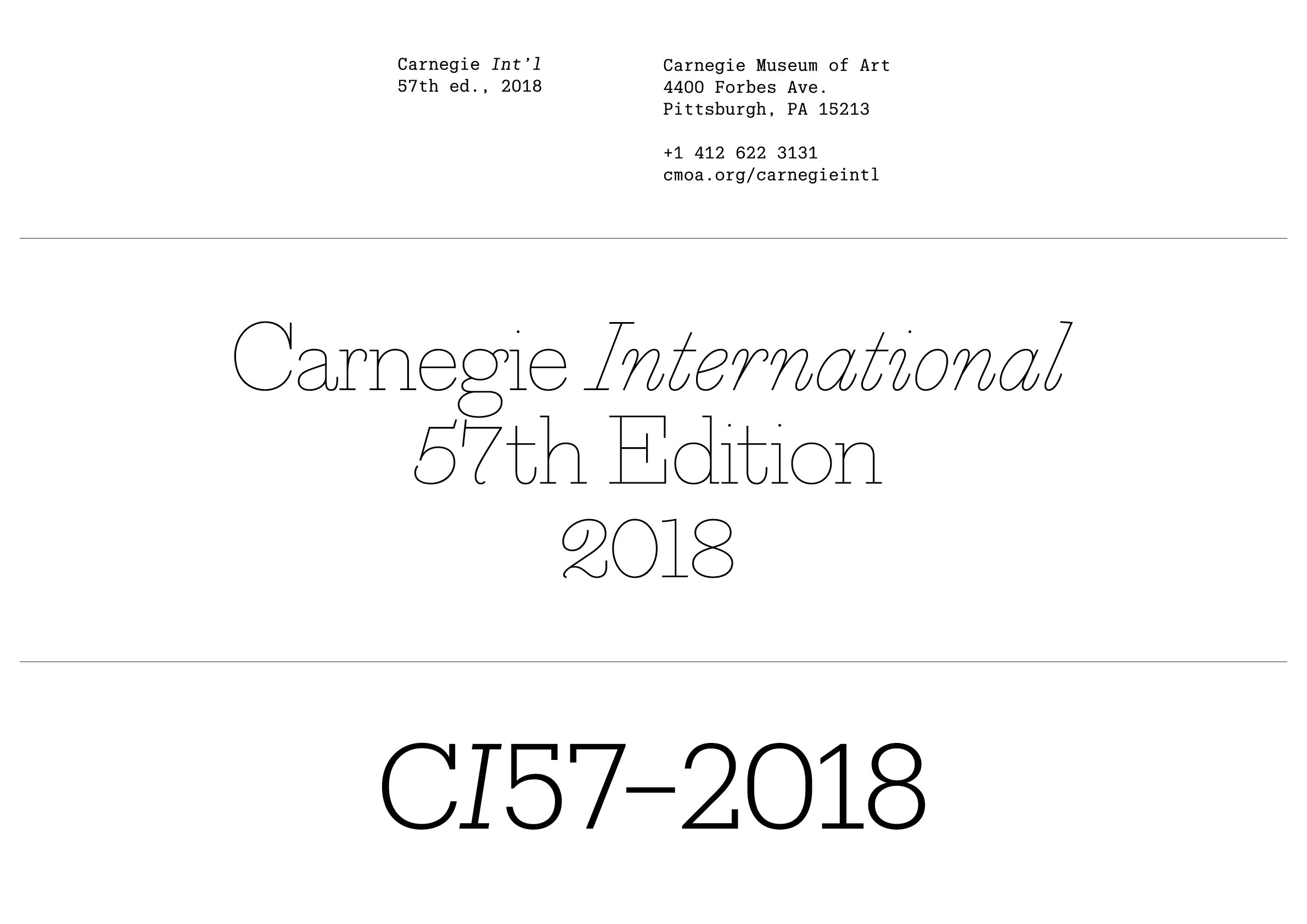
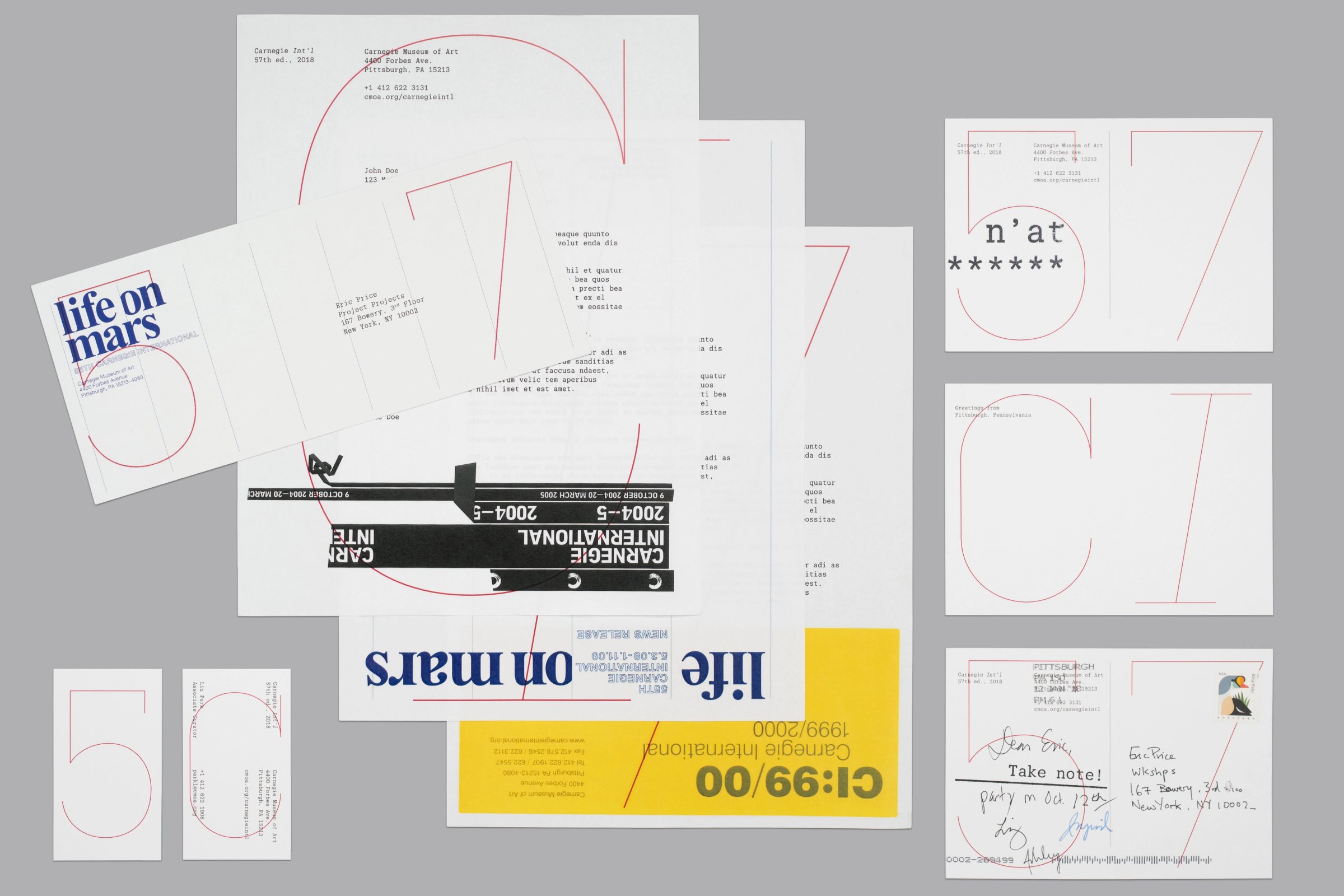
Materials produced during Truss, under the truncated name “Carnegie Int’l 57th Ed. 2018,” would be overprinted on recycled collateral from previous Internationals (including the website). A monospaced version of Christian Schwartz’s Produkt typeface was commissioned for a rougher, more preliminary feel, and always set at a consistent size, with simple capitalization, spacing, and lots of hyphens used for hierarchy.
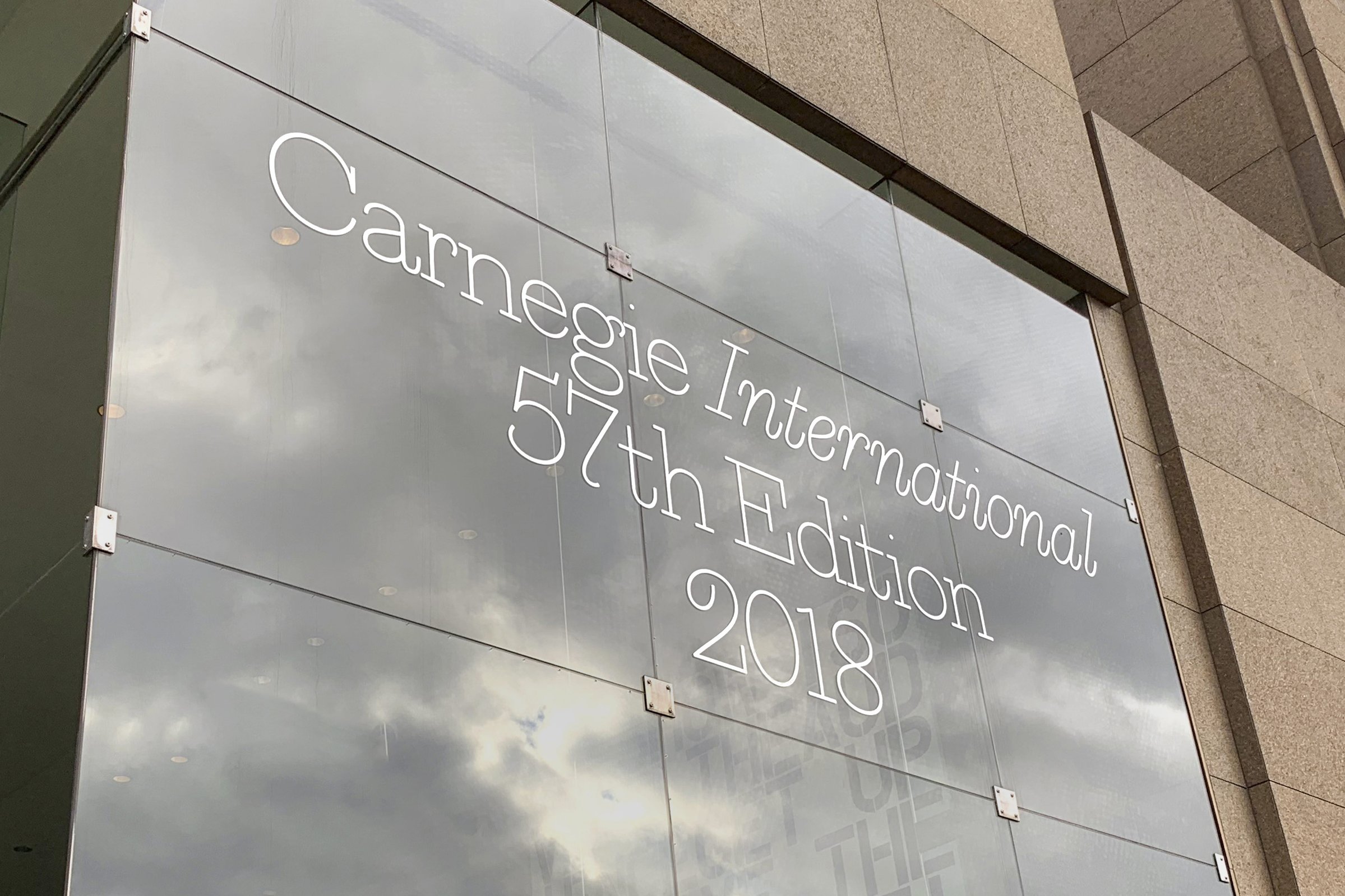
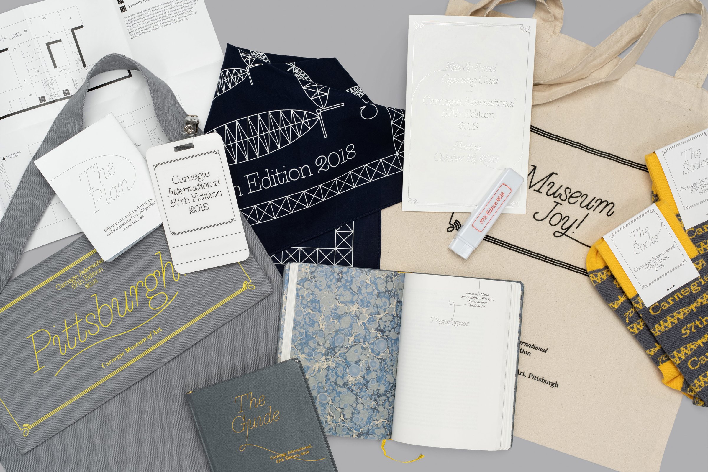
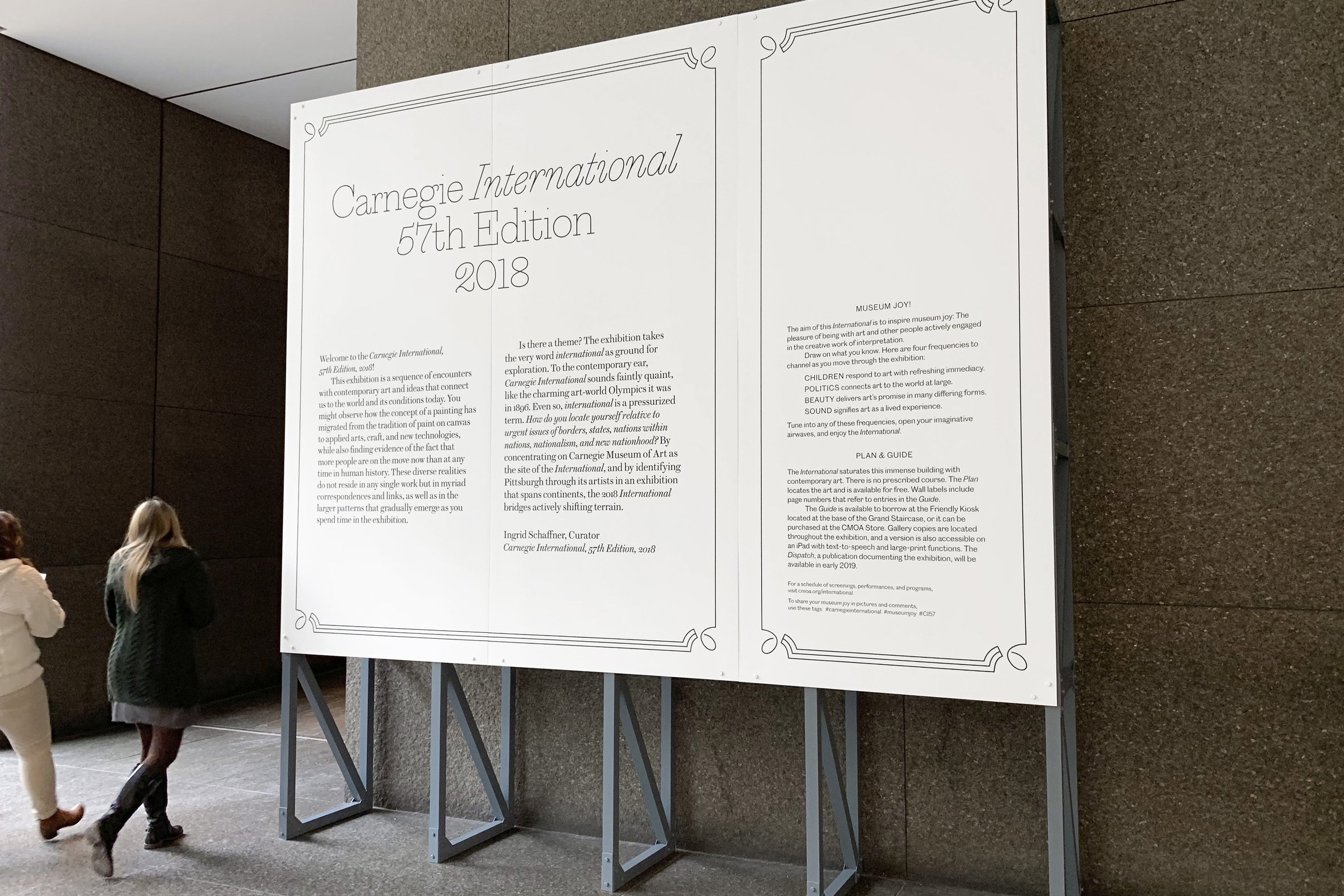
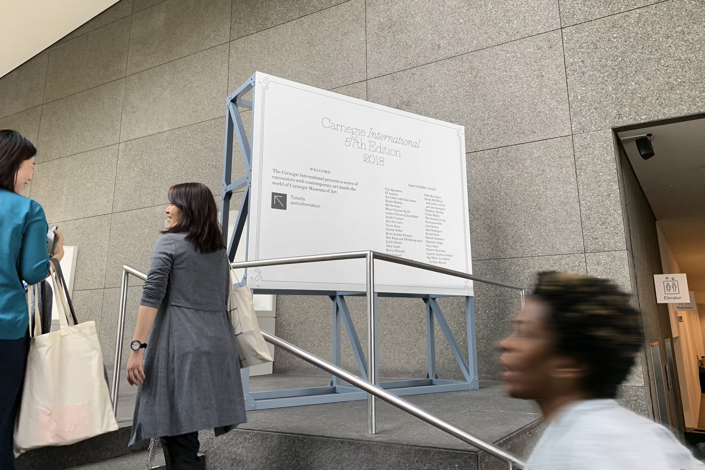
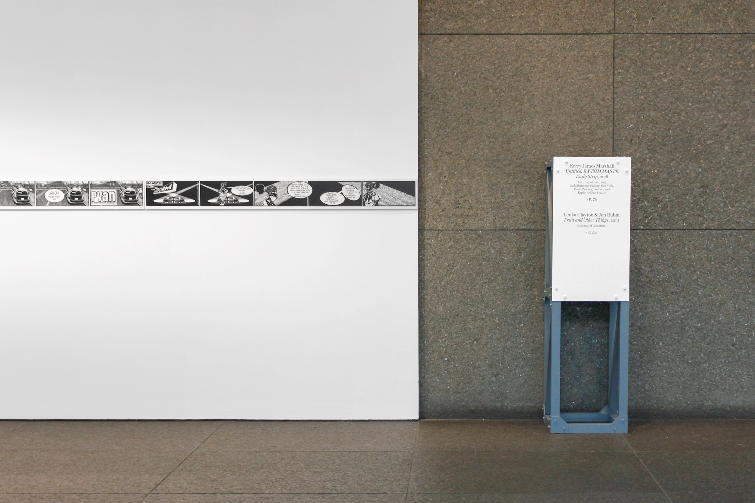
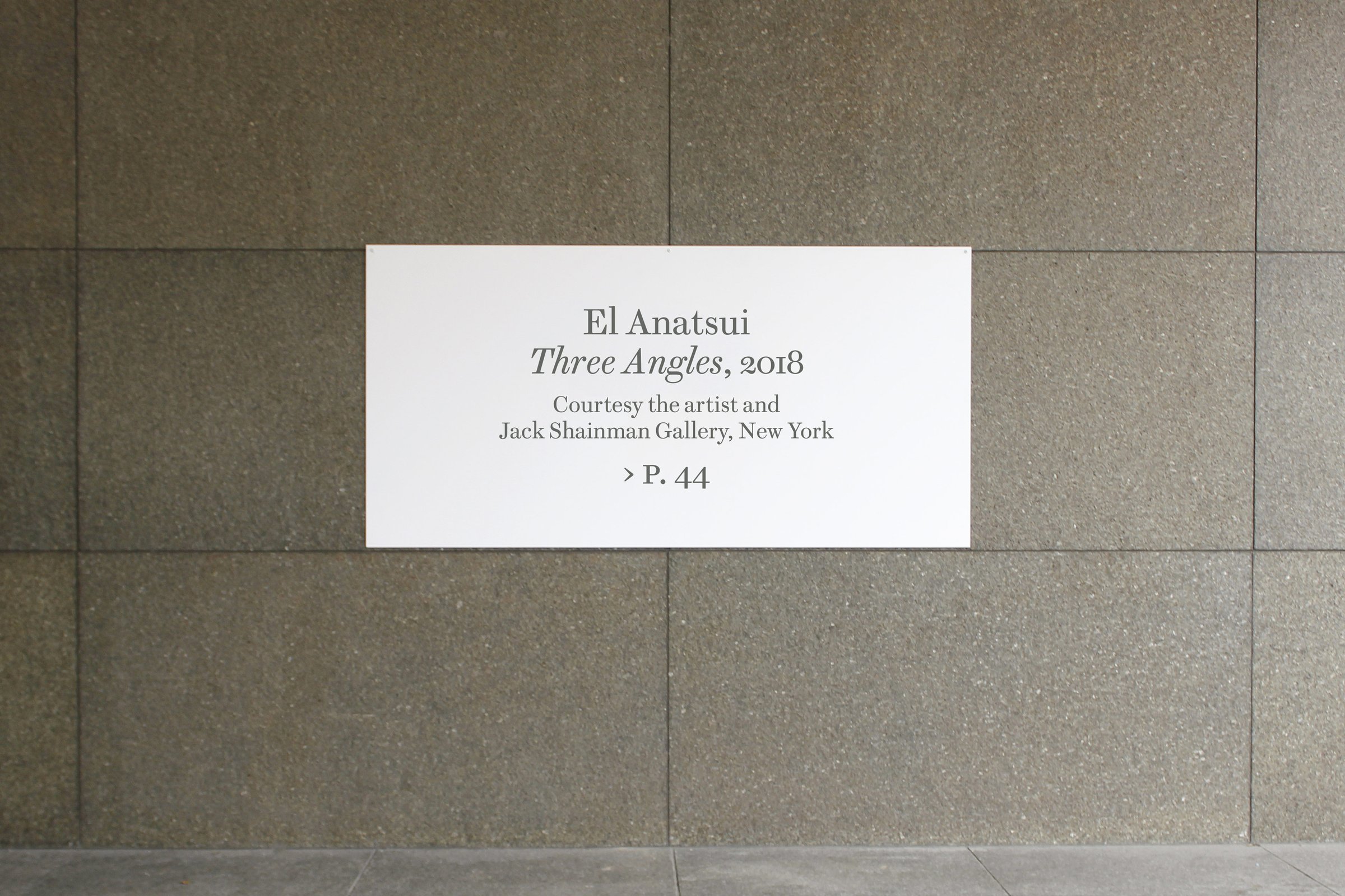
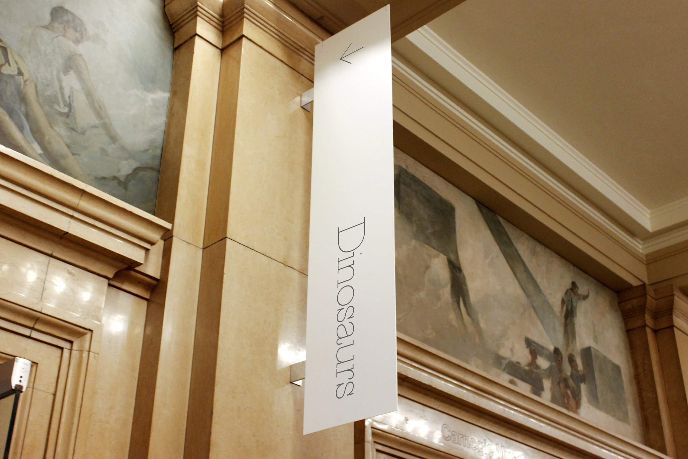
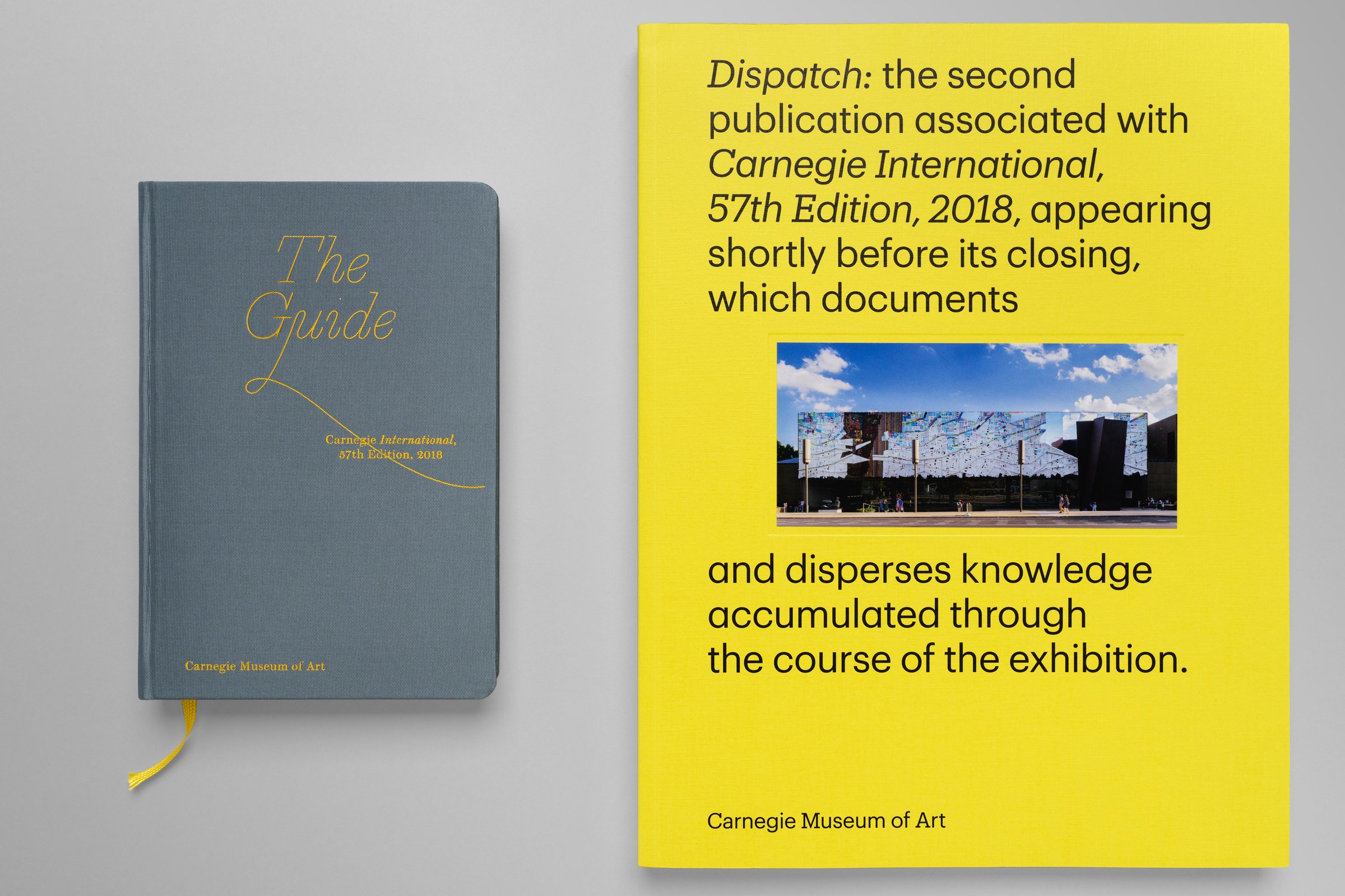
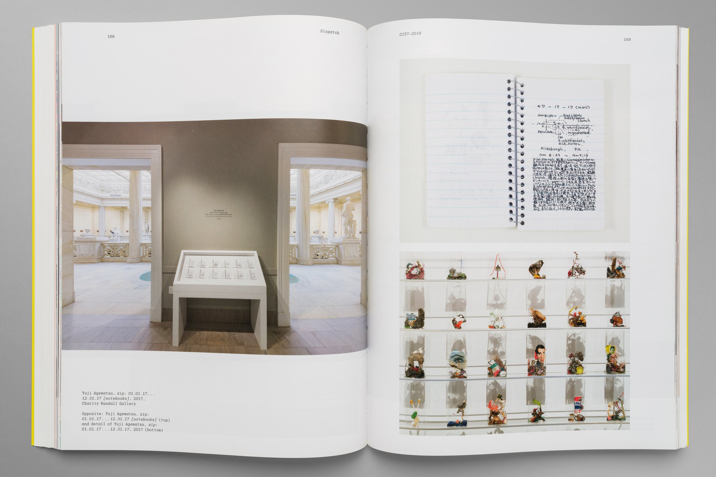
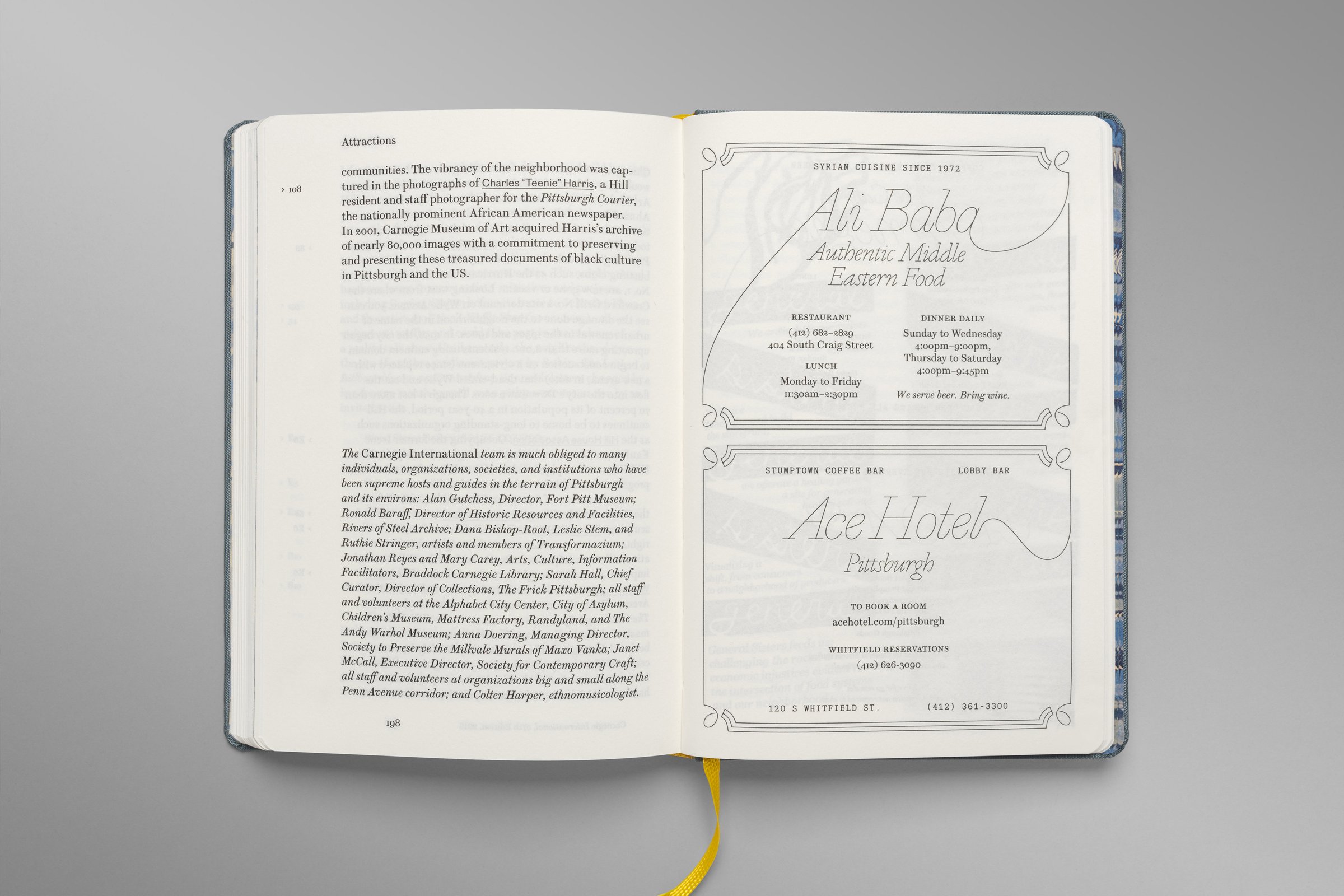
In Fuss, the name was untruncated, and in stark contrast to the design aesthetic of comparable exhibitions, the design was allowed to flourish and grow quite fanciful, in line with Ingrid’s mantra of “museum joy” and desire to create narratives connected to the institution’s past. We also wanted to connect it to the city, and to that end designed large truss-like structures for everything from the title wall to didactics. It was also during this time that we designed and published the Guidebook, in a format recalling pocketable Baedeker travel guides with which to welcome international visitors not just to the exhibition, but Pittsburgh as a city.
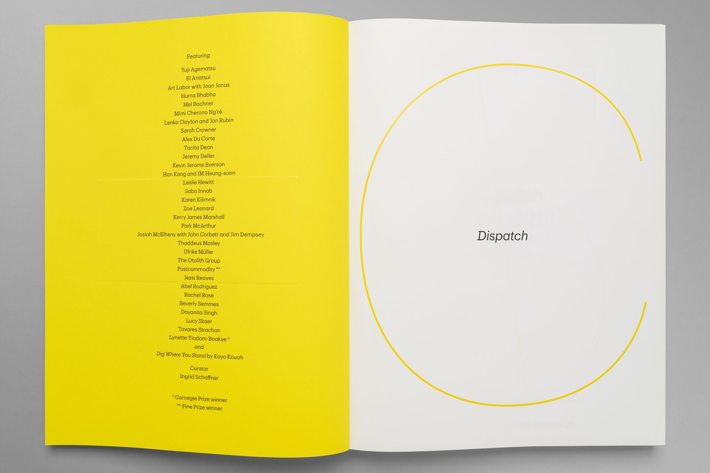
In Catenary, the name and identity was designed to “snap back” to a more archival form. Previous Internationals, consistency inconsistently named, were to be retroactively recategorized according to our chosen format of CI 57–2018. We designed the Dispatch, which returned to Produkt, mixed with Christian’s Graphik, and variable-width. Seeing that its structure would allow for it, we designed it such that each successive section would be set in smaller and smaller type, receding into the distance.