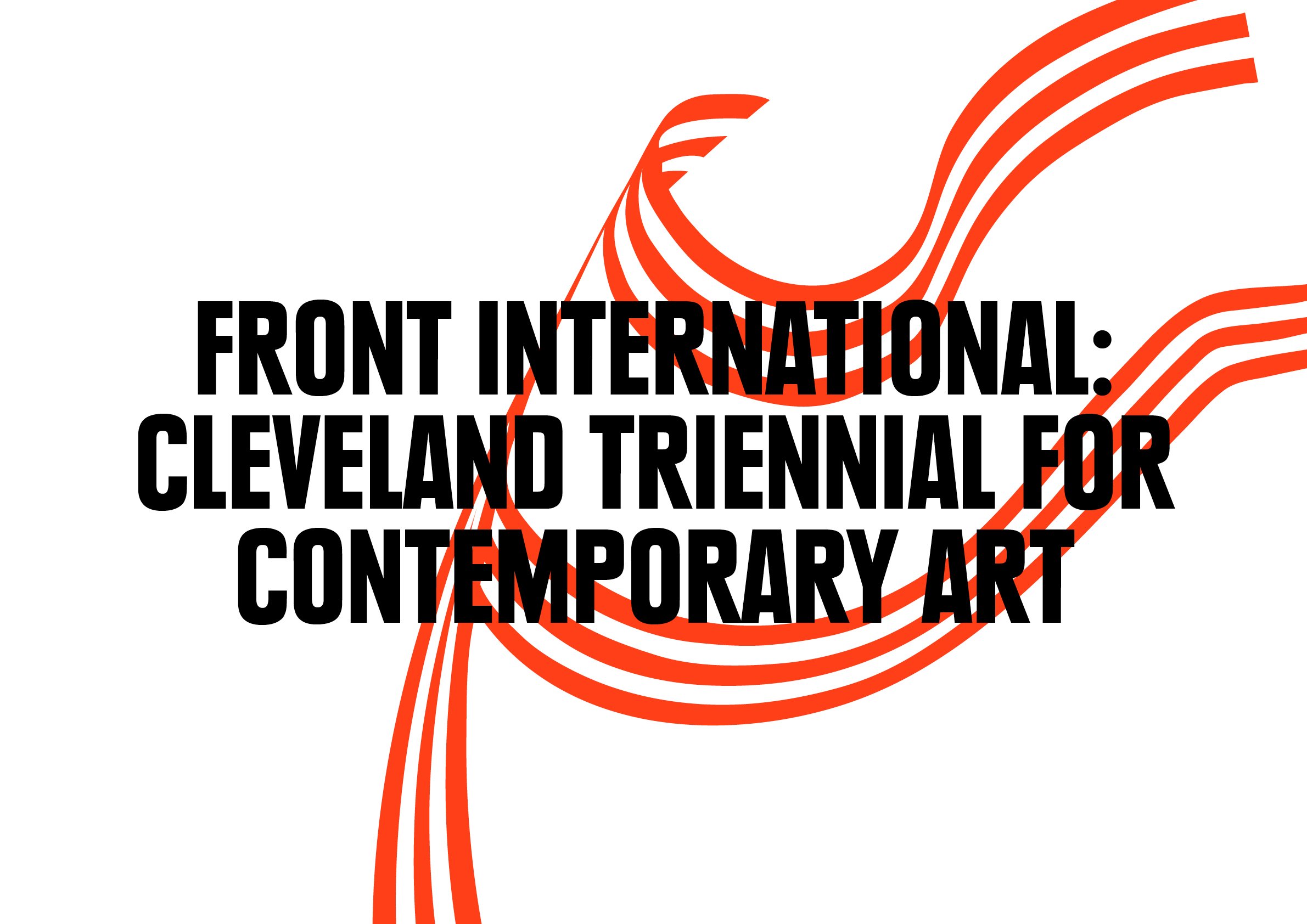
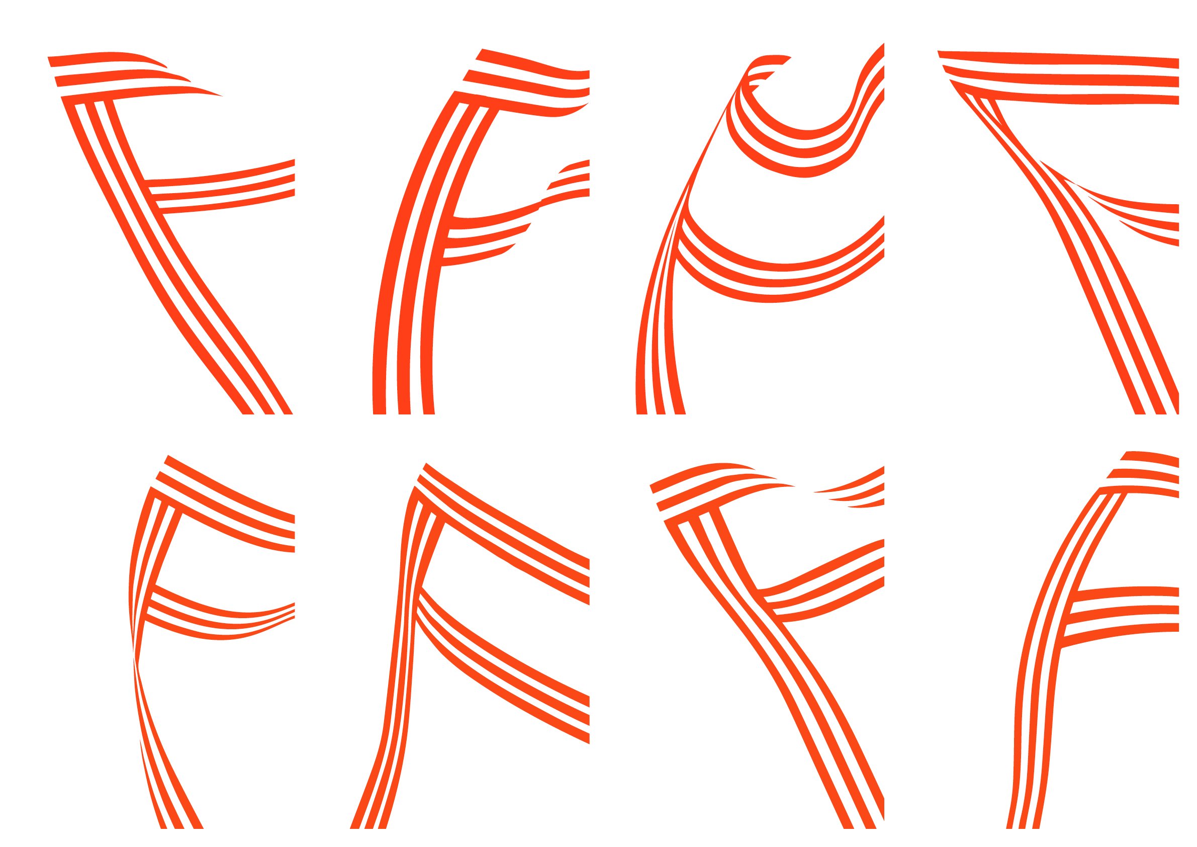
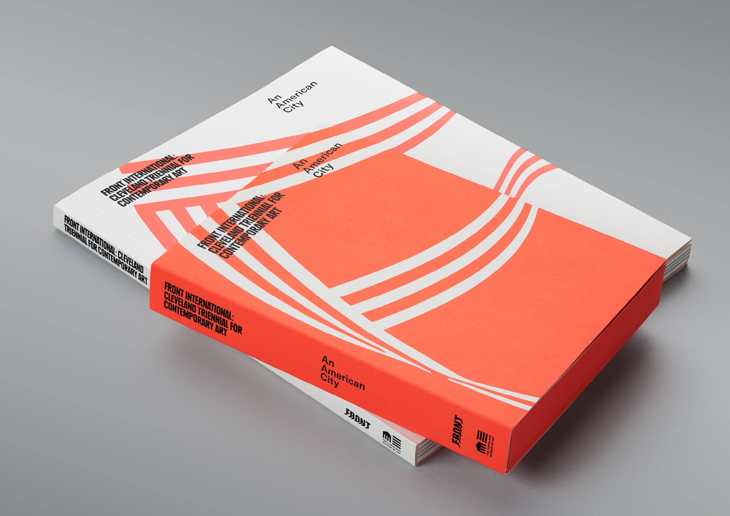
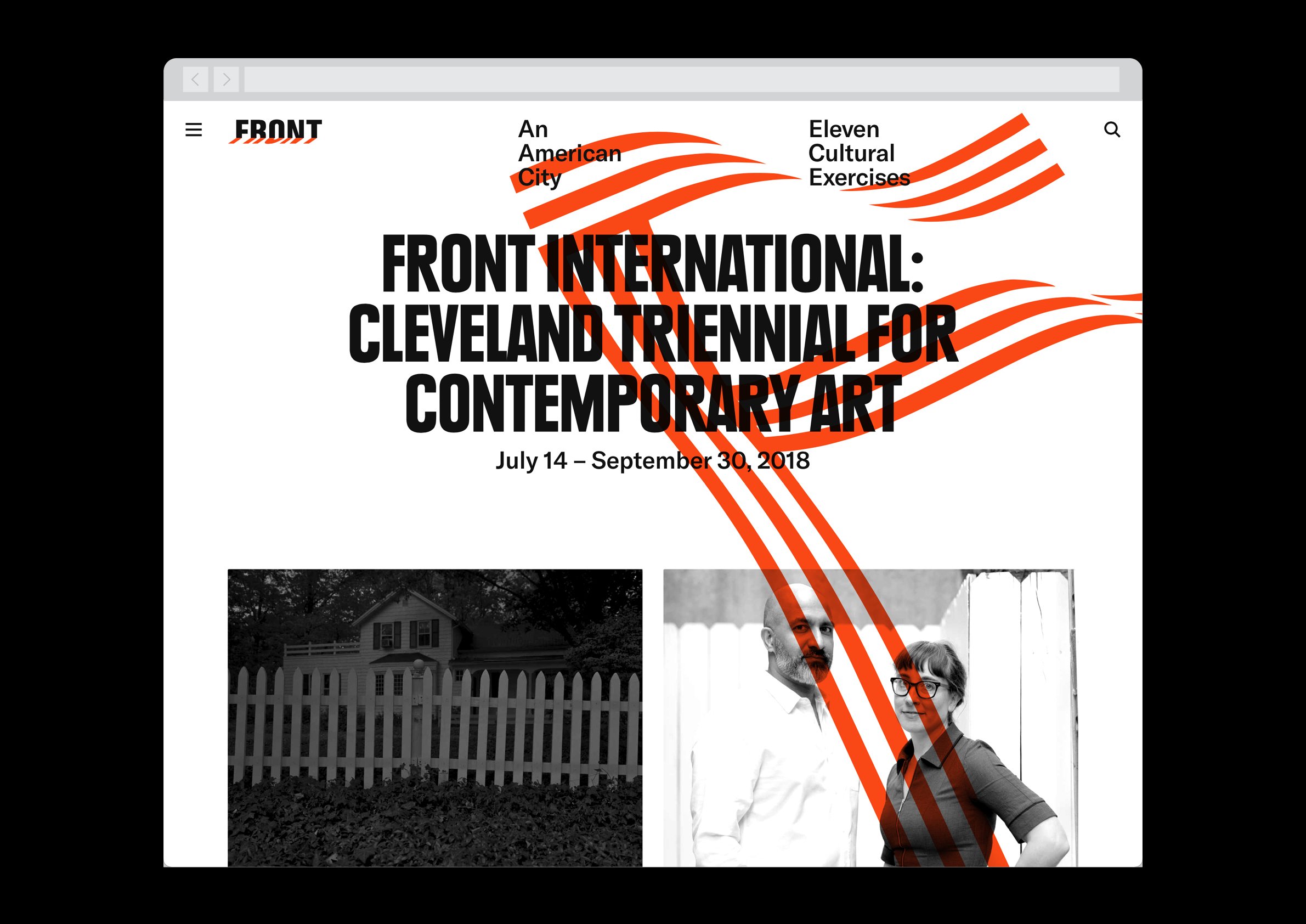
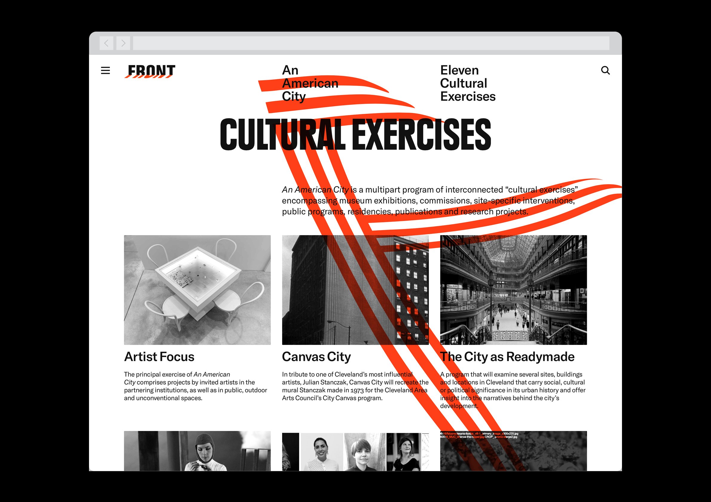
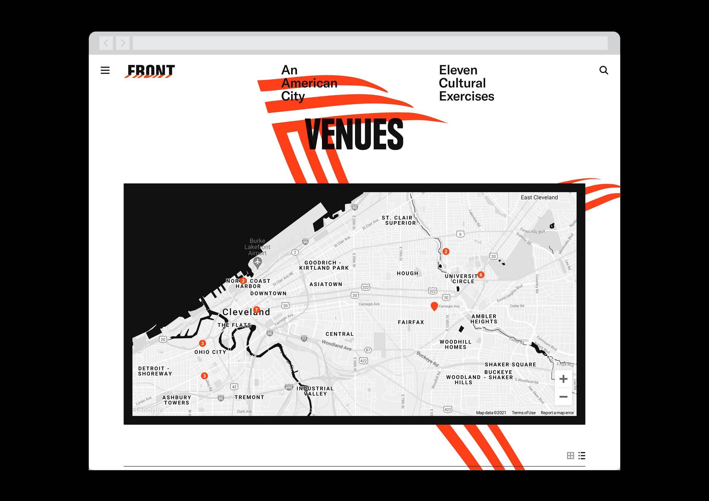
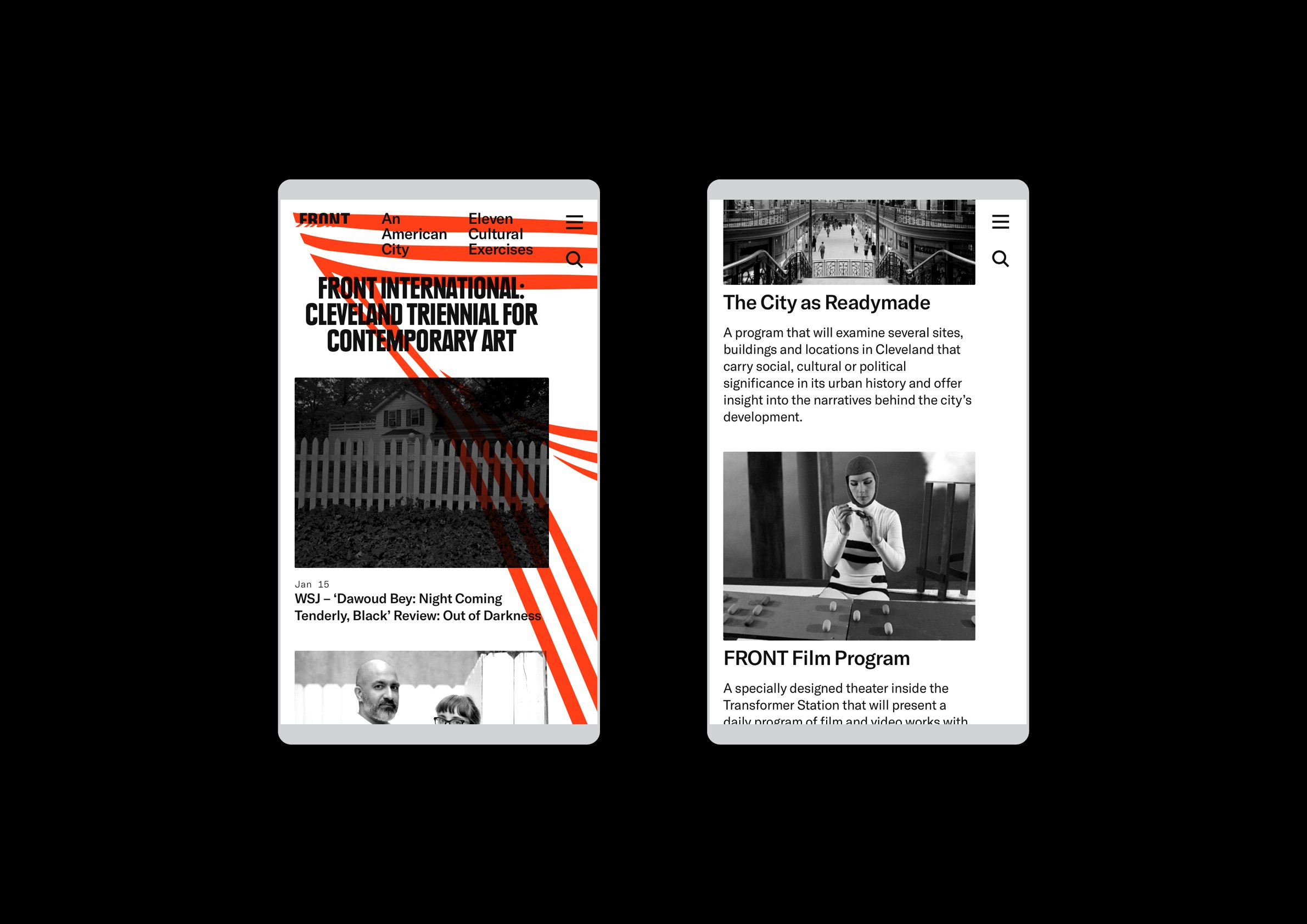
Front International is an art triennial taking place at locations all over the city of Cleveland. For its first iteration, we developed an identity system that combined a large “F” (introducing the Front organization to the city) with a striped flag motif that hinted towards the title and theme — An American City.
The mark, while ever-changing, serves not just as branding but as a signpost for the variety of venues hosting the triennial; it’s visible from a distance and, as wayfinding of sorts, legible even without text.
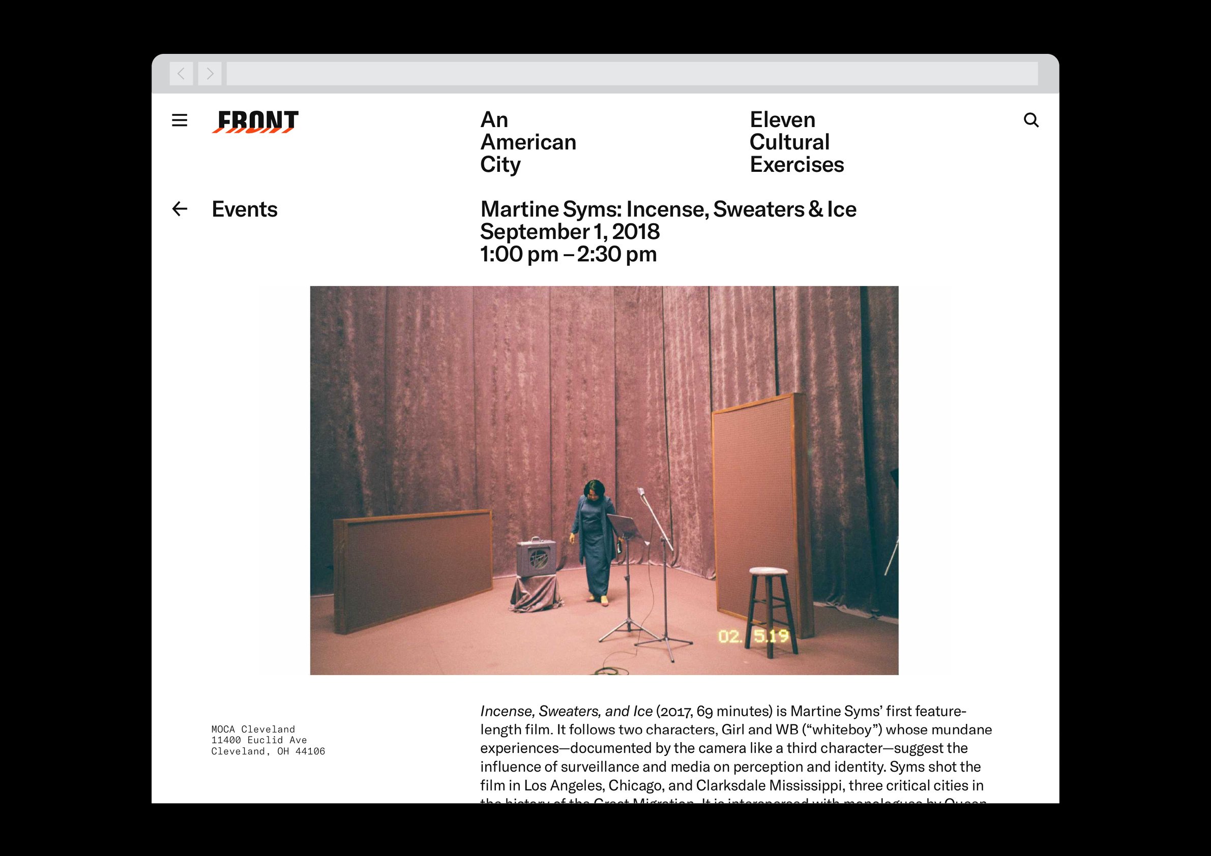
When appropriate, blunt, bold text set in Paul Renner’s Plak announces both the title and the name of any particular venue or event without pretense. Perhaps cheekily, but appropriately, all other text is set in Grilli Type’s GT America.