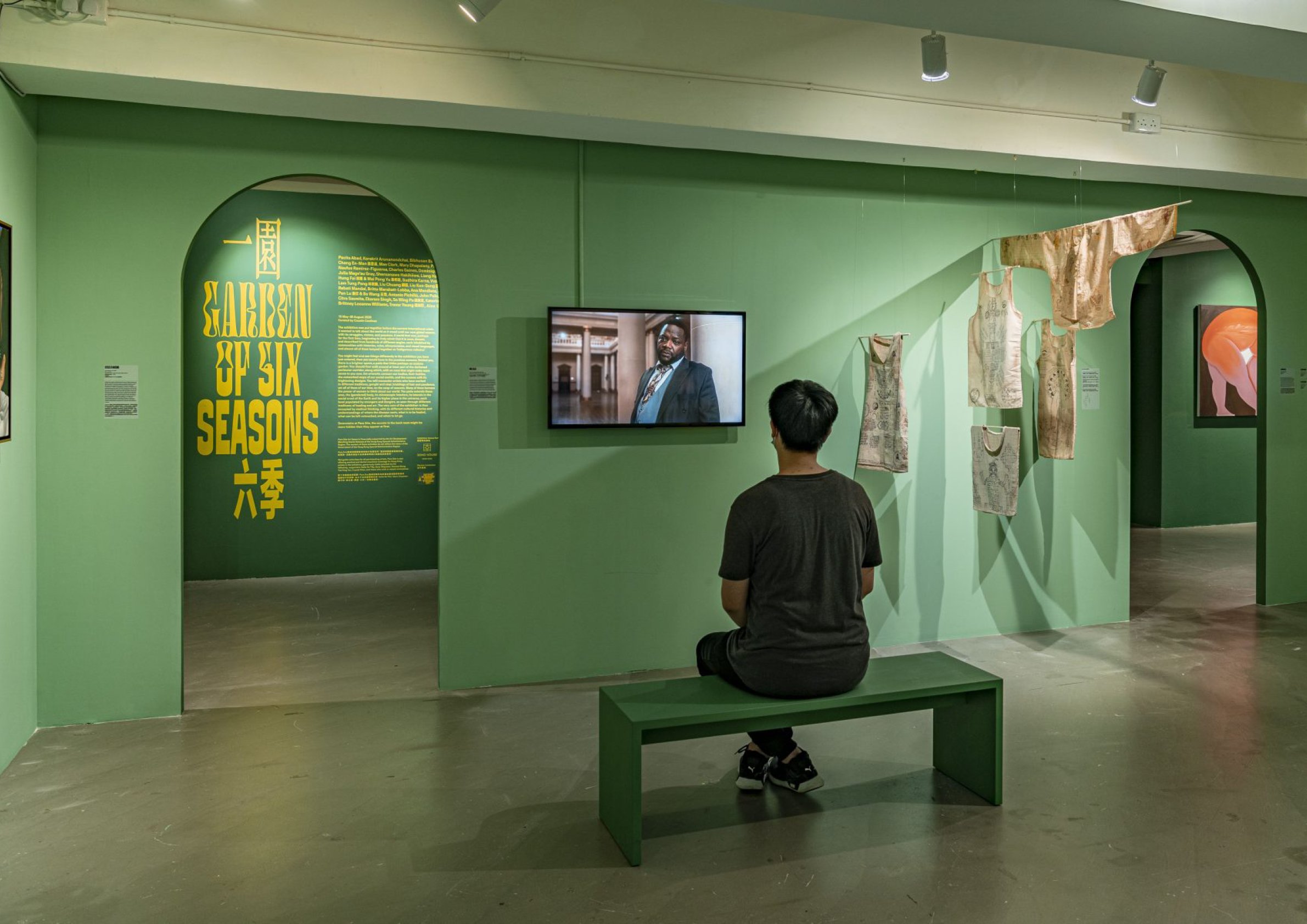
Garden of Six Seasons was an exhibition exploring the idea of a world seen and understood from innumerable angles, from innumerable cultures, with innumerable histories, and all the swirling technological and biological questions that entails. If I can summarize the creative brief in a single phrase, it was “fever dream.”
With a mandate to express this in the exhibition’s identity, I combined two sets of typefaces with similar proportions but wildly different aesthetics. One, Signal Compressed by Emmanuel Besse, is bold, sober, and straightforward. The second, Digestive by James Edmondson, is a psychedelic, idiosyncratic typeface that pushes legibility. Paired with matching Chinese typefaces and sliced in half, these combine to express competing visual languages, and offer a opportunity to place disparate images (some the artworks, some sourced from elsewhere) directly adjacent to each other, touching, interacting, and suggesting connections beyond the scope of the exhibition itself that ultimately serve to further its message, ideas, and influence.


