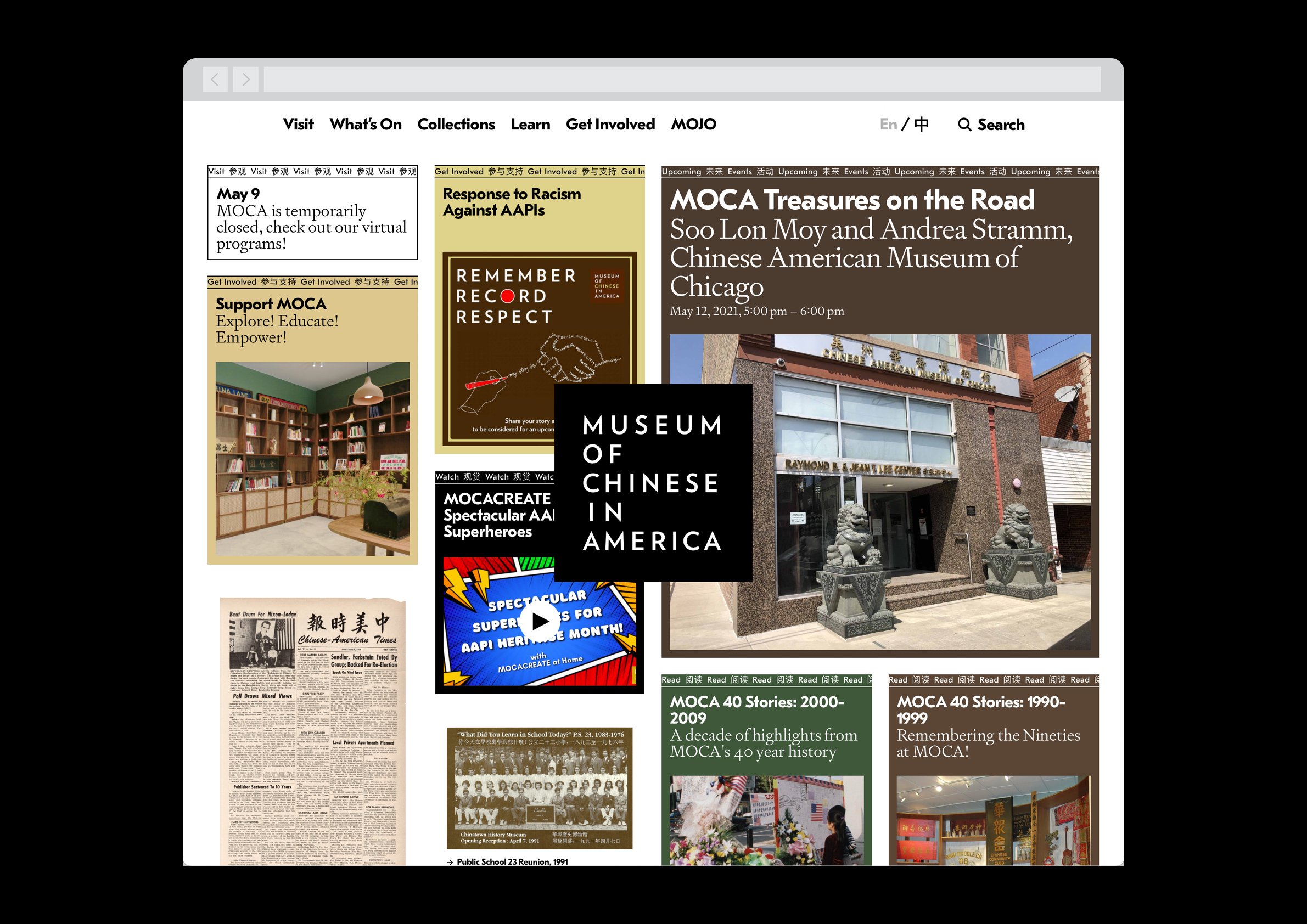
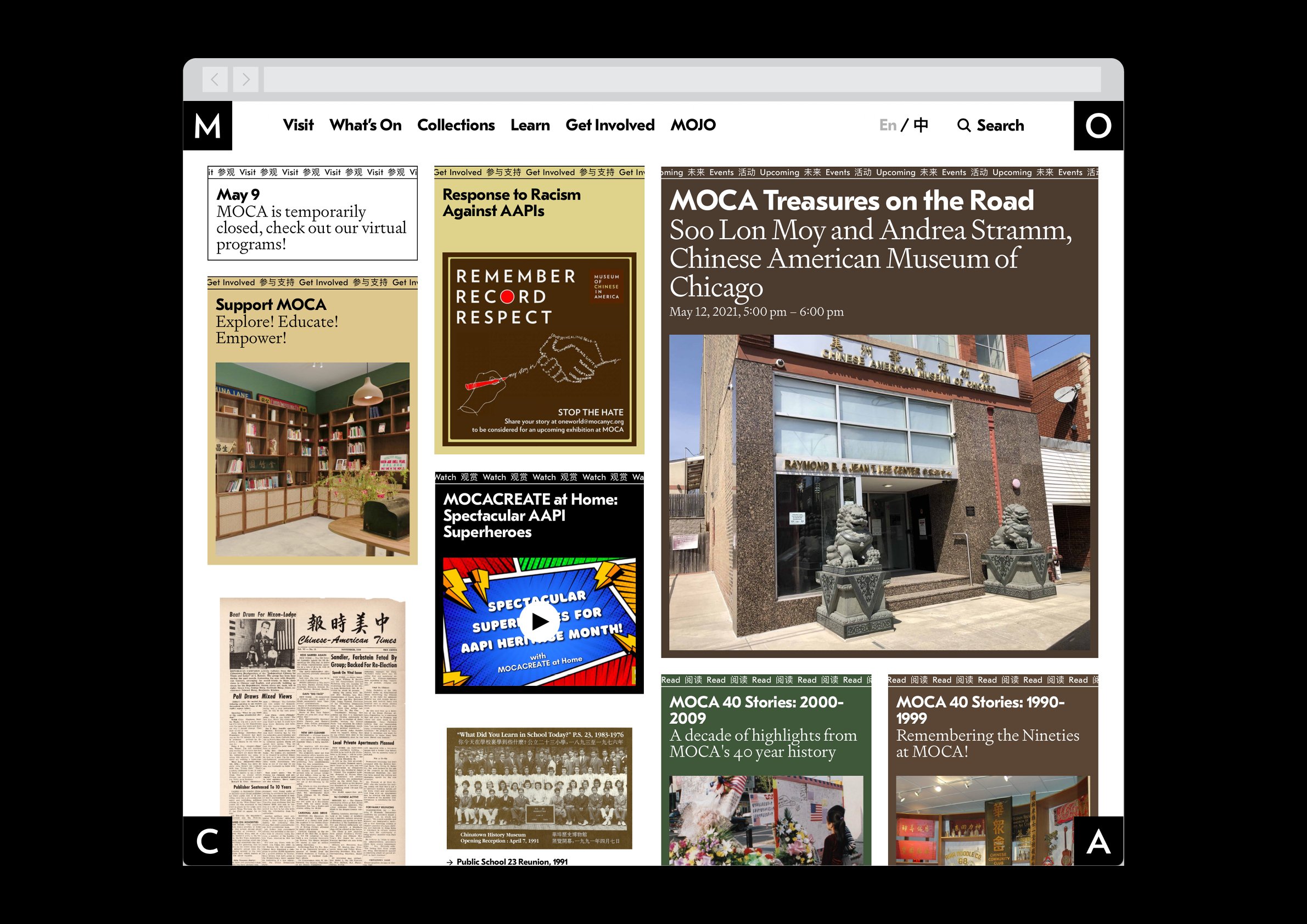
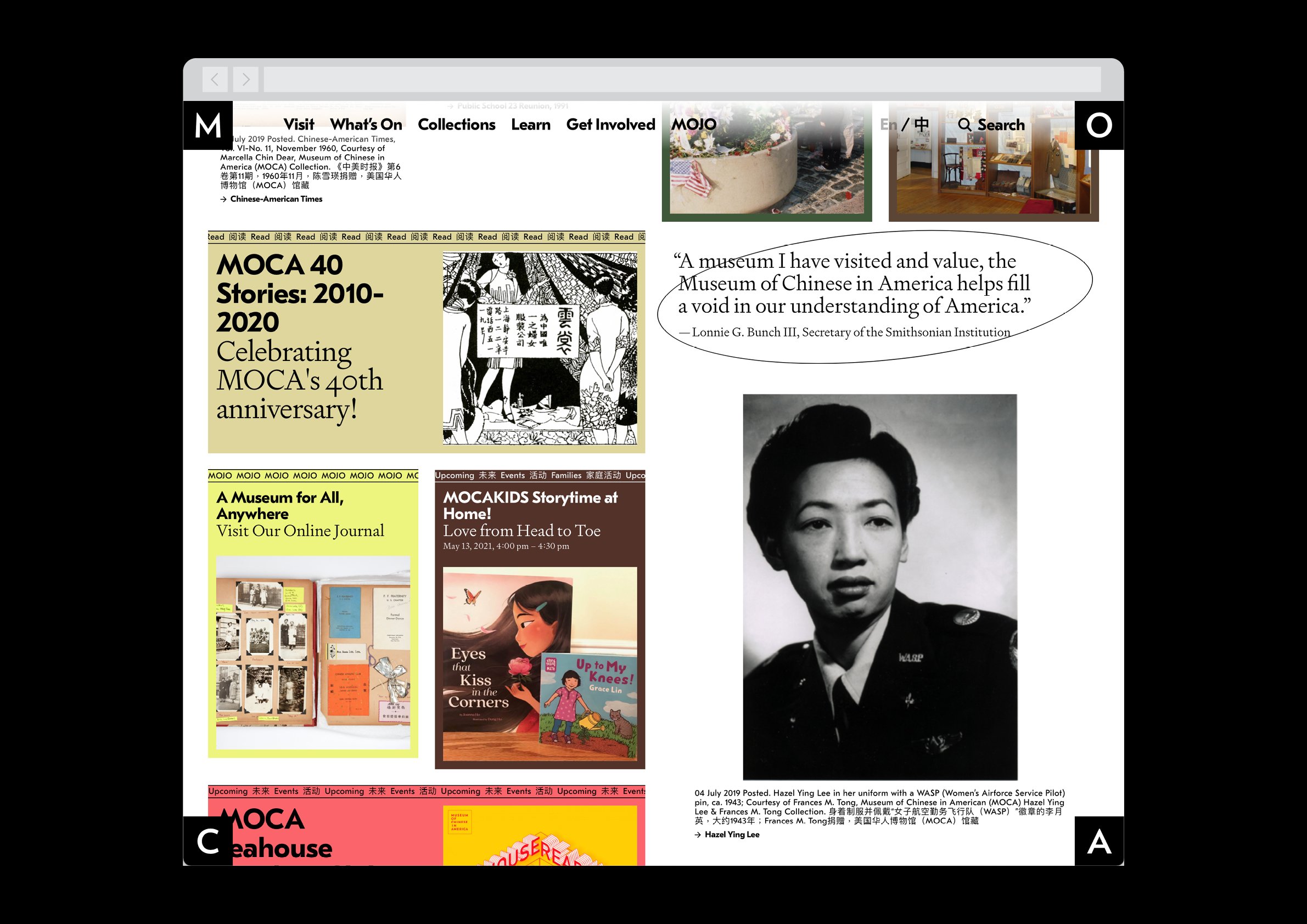
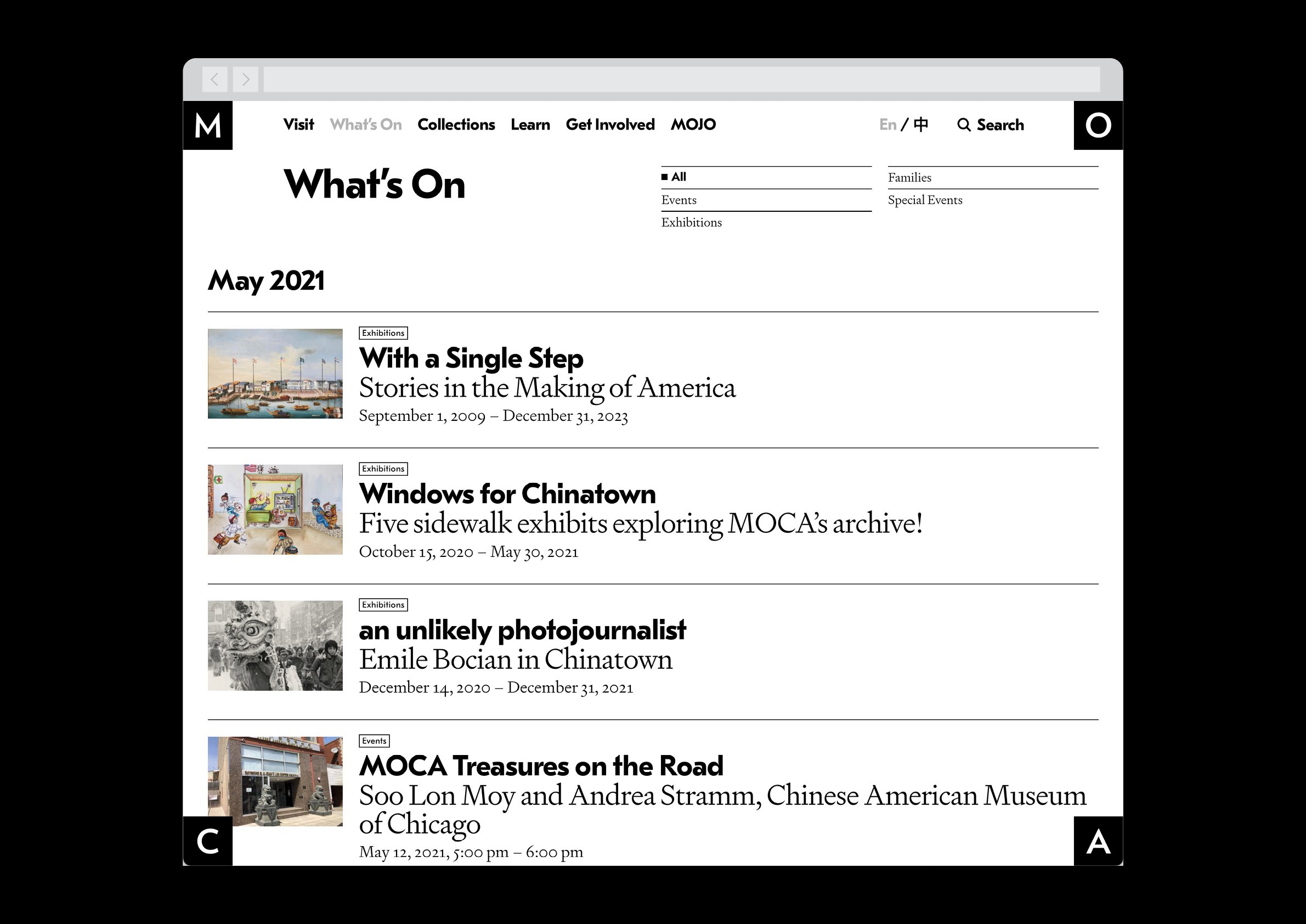
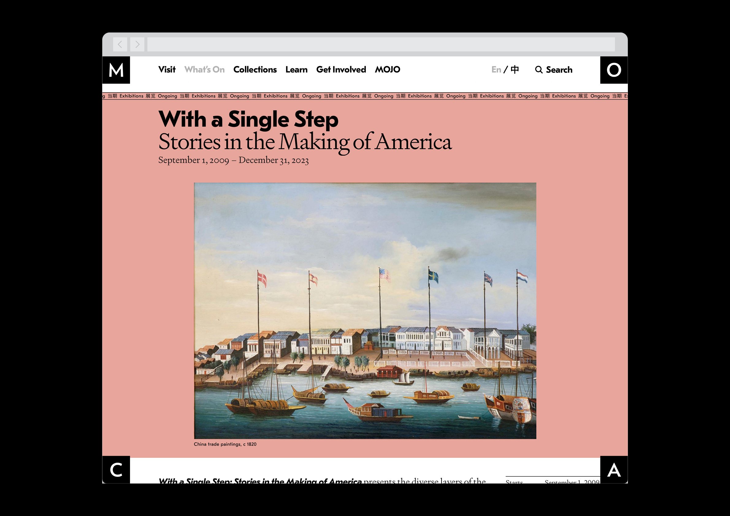
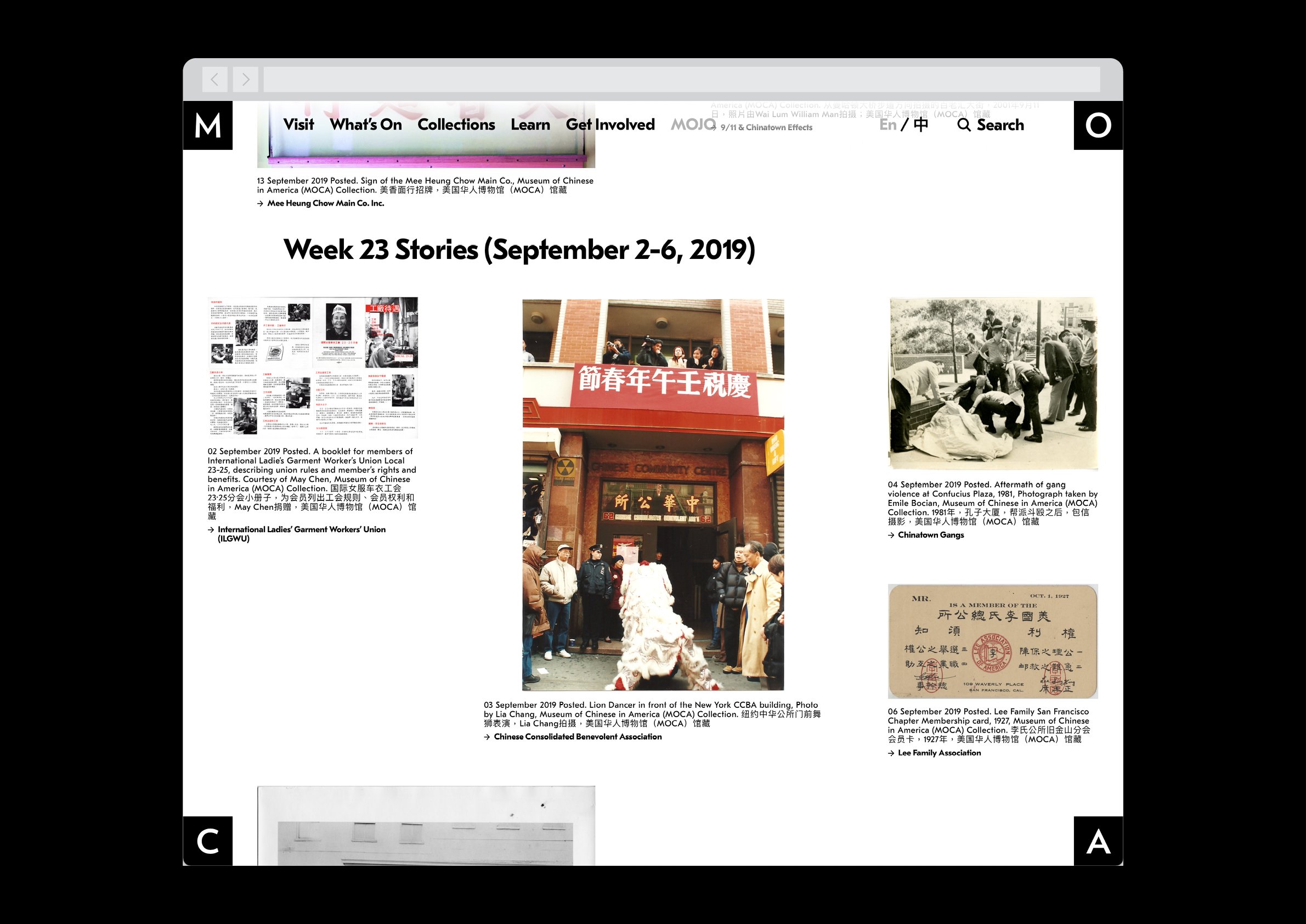
In redesigning the website of Museum of Chinese in America, an institution with extensive programming and even more extensive archives, I sought to bring these to the forefront and highlight the ever-shifting and multifaceted activities in play all the time.
Through a complex system of rules around sizing and placement, as well as colors programmatically pulled from the images, the dynamically-generated homepage reorganizes itself daily with the latest events, videos, and articles posted to a new online journal. It also surfaces artifacts from the archive, providing not just visual variety but inroads into the deeper, more research-driven sections of the site, for which new ways of grouping the archival items into ongoing series were designed and built. The stories around them live in an editorial space, rather than being relegated to a collections database interface.
The MOCA branding is integrated into the structure of the site itself, appearing in its full form upon first load before morphing and splitting into a four-corner frame upon interaction with the site, allowing the rich content to take center stage.
