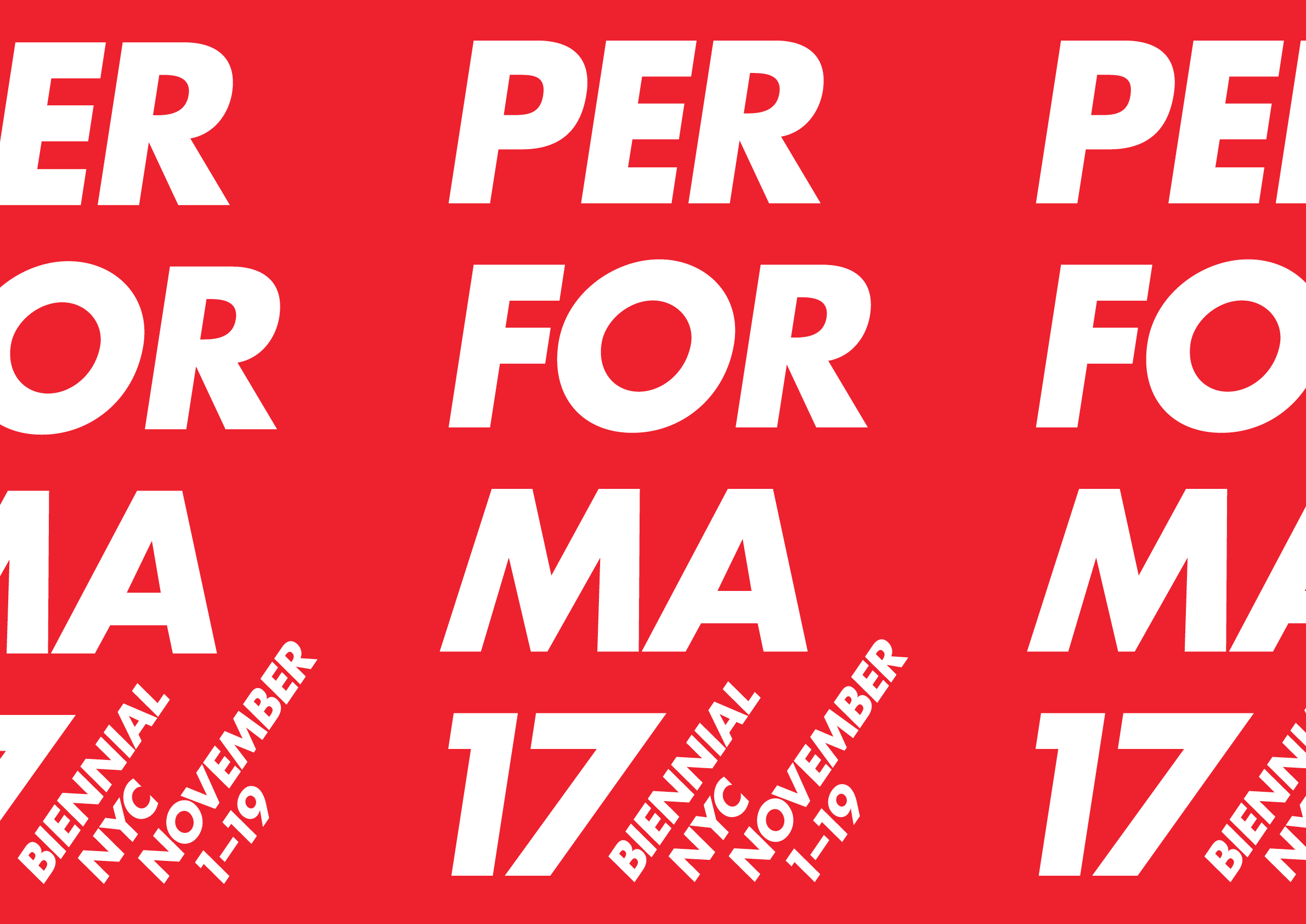
We had already presented nine concepts for Performa 17. None had landed. Barbara Kruger, who was participating in that year’s festival, was brought in to collaborate. Now to design a Barbara Kruger design in front of Barbara Kruger.
Her visual language is so recognizable that you can refer to it in a few words. Having the person there is a different matter. You can hardly explain that you are “referencing Barbara Kruger.” She knows. You still have to decide where the letters go.
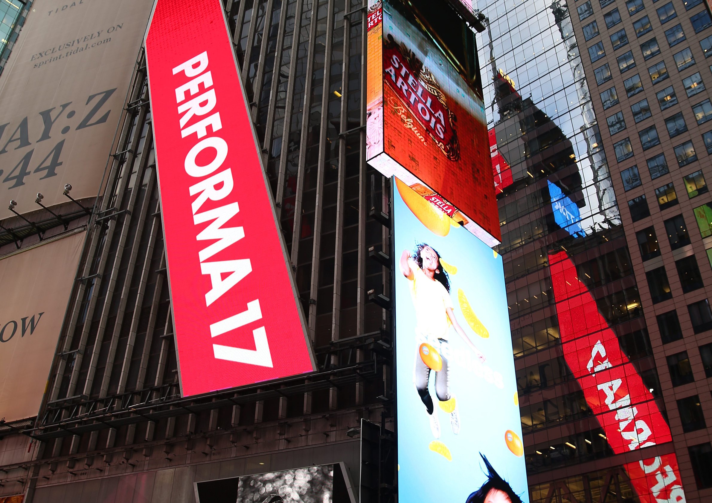
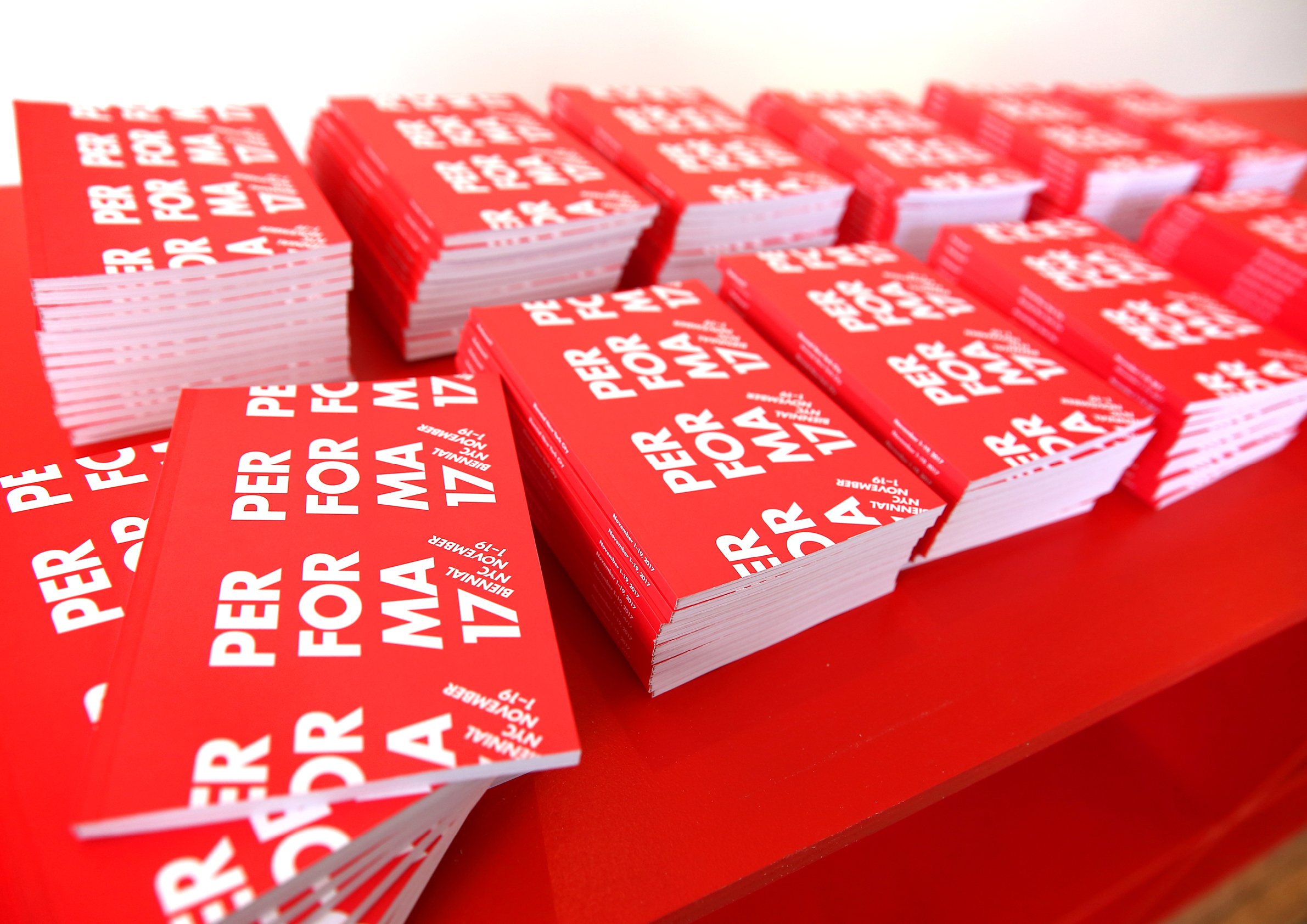
We split Performa into three beats: “Per,” “for,” “ma.” The name becomes a small score for saying it out loud. Graphic design and language could get involved in the performance, too. The repeating logotype was cropped across books and posters; those same materials could be repeated at a larger scale to mark the festival’s performance spaces, many of which were temporary and required some frugality.
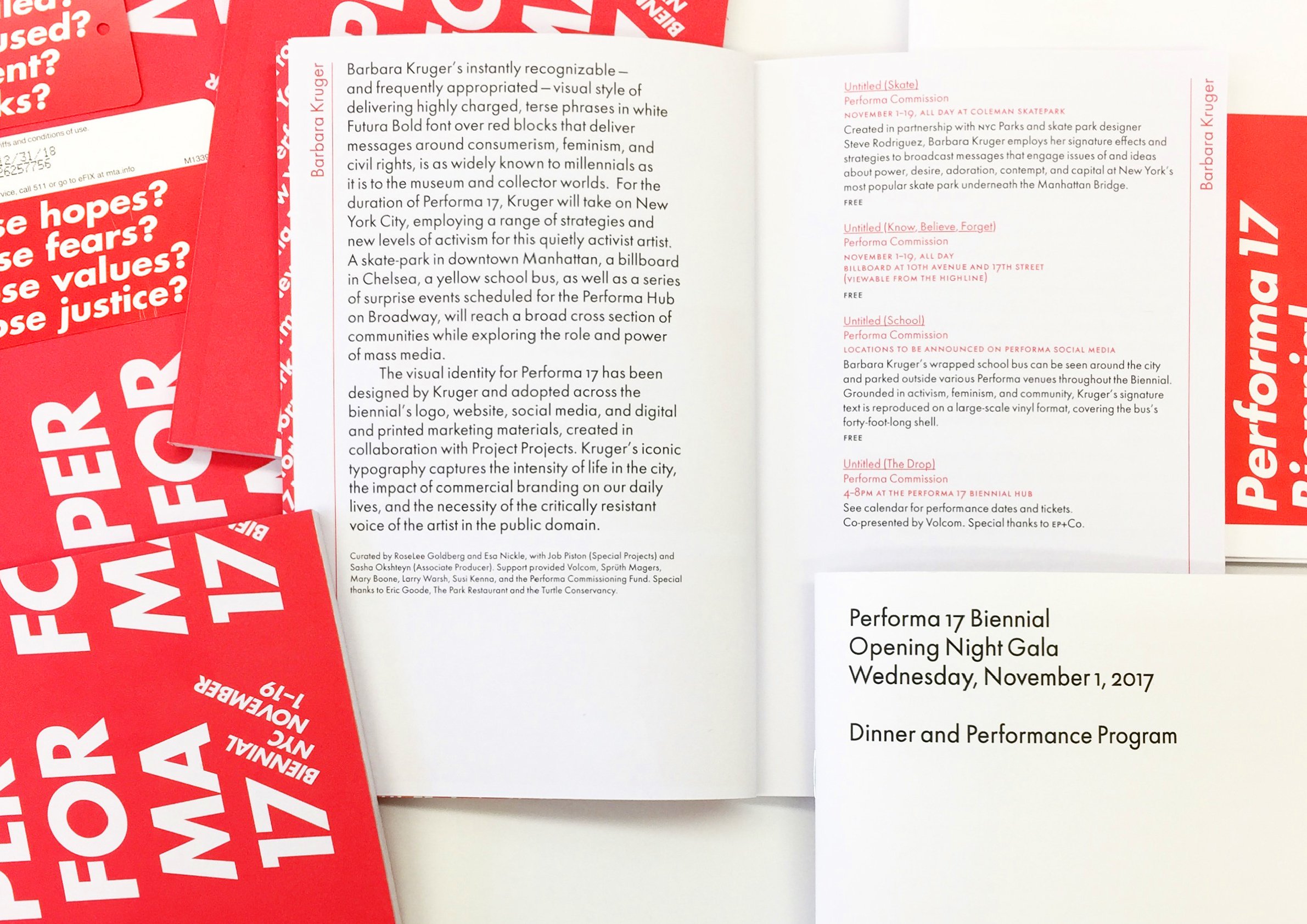
Smaller diagonal patterns take their 57° angle from the italic 7. Inside the programs and the book, a special cut of Futura by Elsner+Flake provided subtler details than the more familiar versions. There is a quiet piece of typography inside all that shouting.