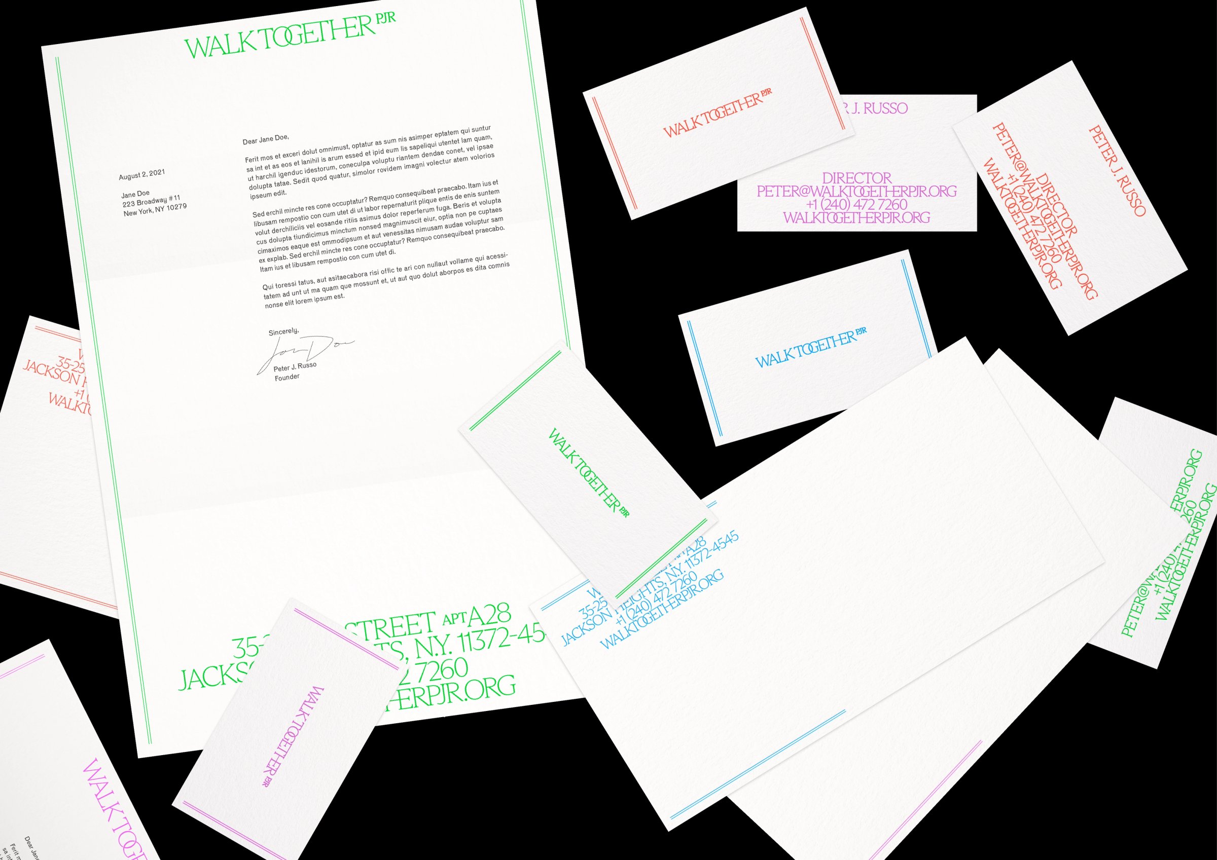
Walk Together PJR is Peter J. Russo’s consultancy for cultural nonprofits. Its wordmark is set in a custom weight of Dinamo’s Arizona, with bespoke ligatures joining the letters together. The name gives them something to do, and they do it: the text itself walks together.
There’s a slightly old-fashioned formality to all this joining up. Depending on your disposition, you could call it baroque, antiquated, or classic. The letters take a little extra trouble over their relationships. In a contemporary typeface, those flourishes feel both familiar and slightly out of time.
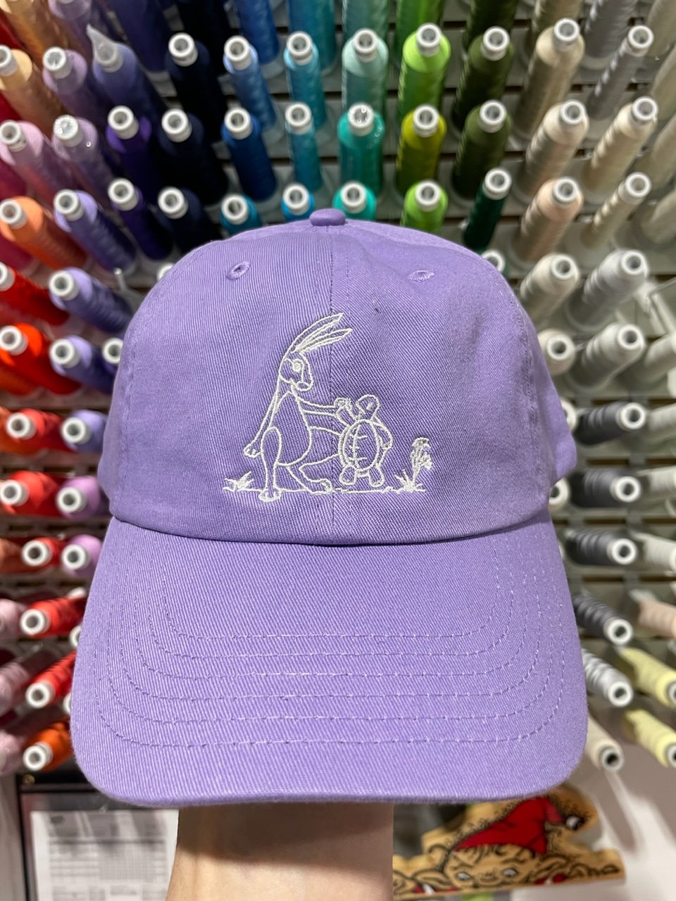
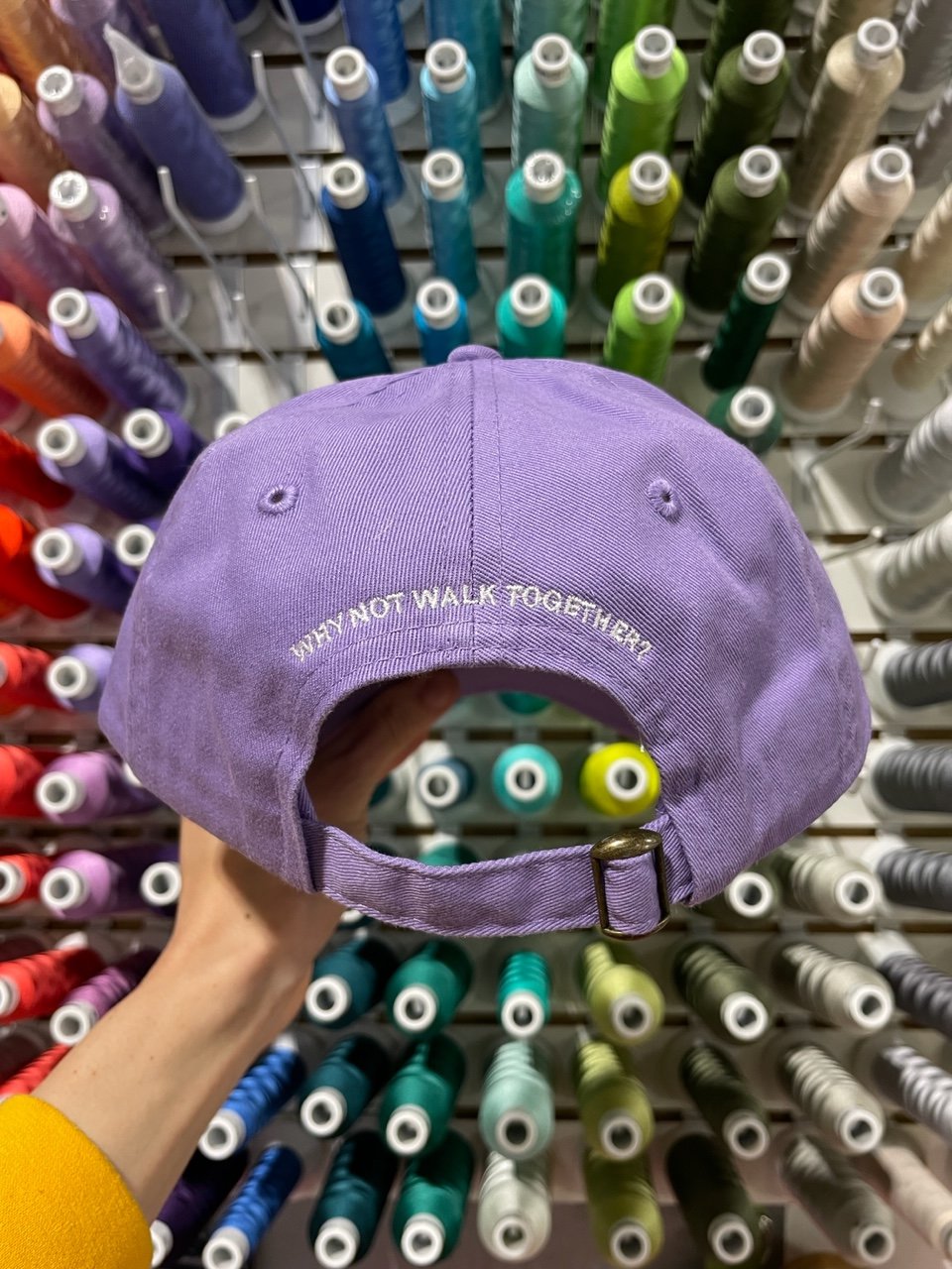
The identity comes in four colors and extends to motion, stationery, and a dad hat.