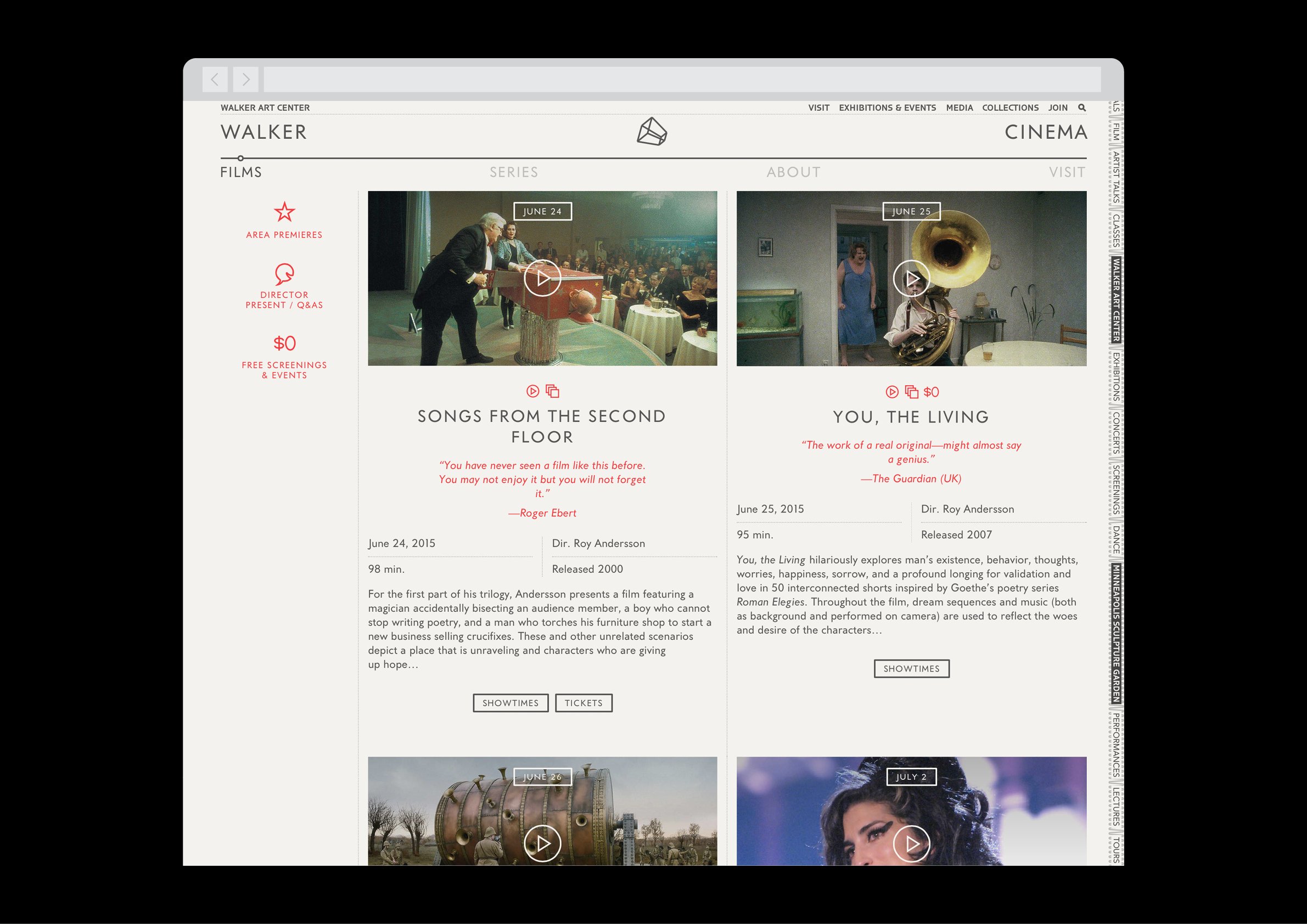
In my five years designing at the Walker Art Center in Minneapolis, I had the opportunity to work on a great number of incredibly interesting and challenging projects surrounding all things digital (and sometimes not-so-digital). This is a sampling of some of them.
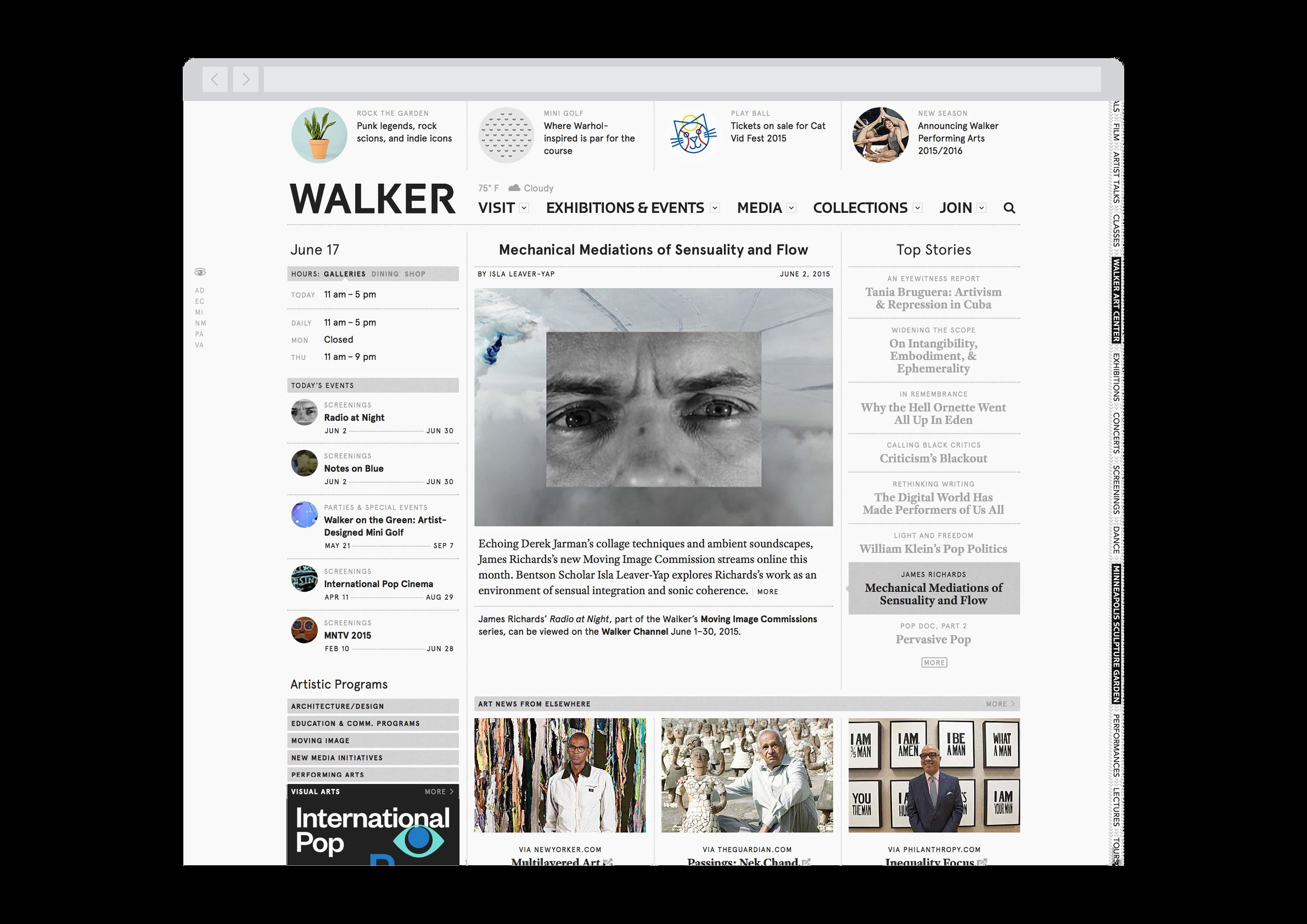
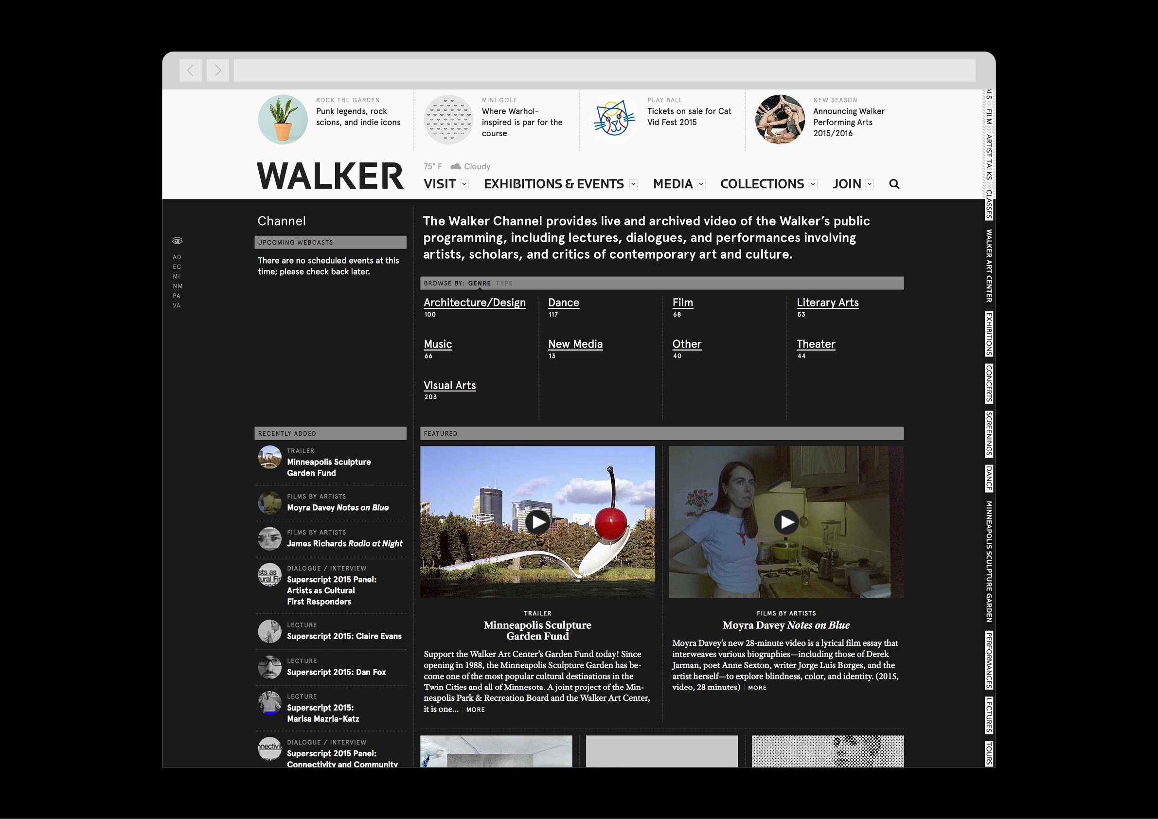
They tend, to various degrees, to point back to the main Walker website, which I redesigned upon joining the Walker in 2010. One of the unique things about the institution is the dichotomy between its international influence and its regional setting in the middle of the country. Our goal was to turn the site into a true “virtual Walker,” a digital representation of the mission statement that could further support the global reach of its programming.
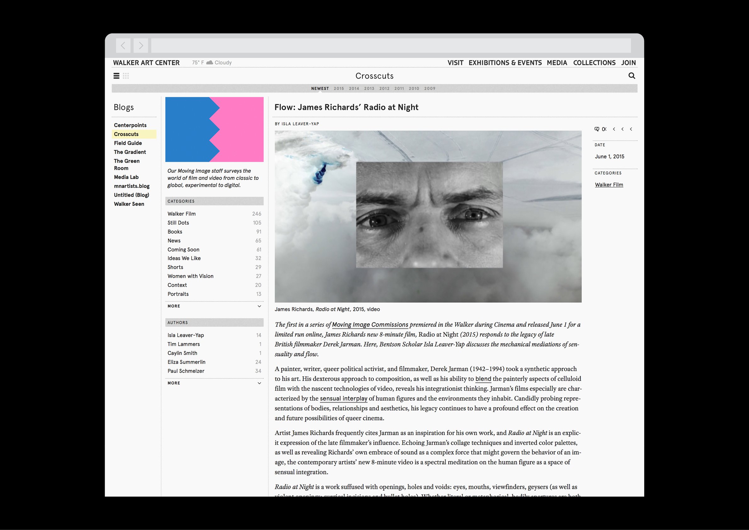
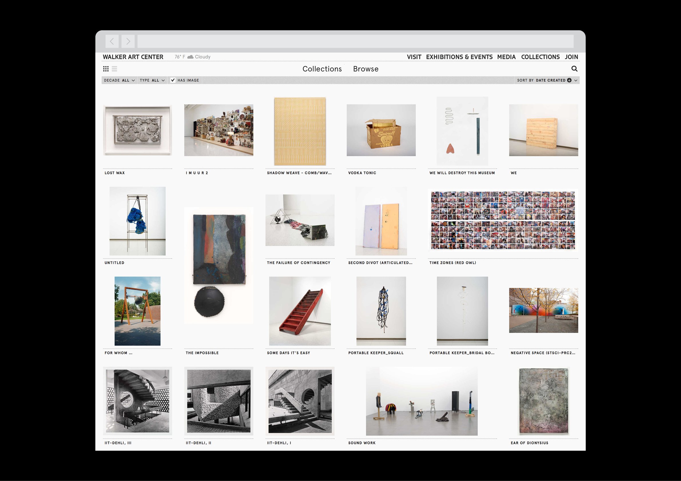
To that end, through the redesign, the site was reimagined as a true publishing platform. The blogs, influential among a few but long hidden, were rebranded and brought to the forefront. An editor was hired to write long-form feature stories, work on branded long-running editorial series, and aggregate topical art and socio-political news of the day. Content was indexed and interlinked, exposing the “long tail” of the archive.
I designed the site with these principles in mind — particularly the homepage, which was designed as one would design the website of a major newspaper or journal.
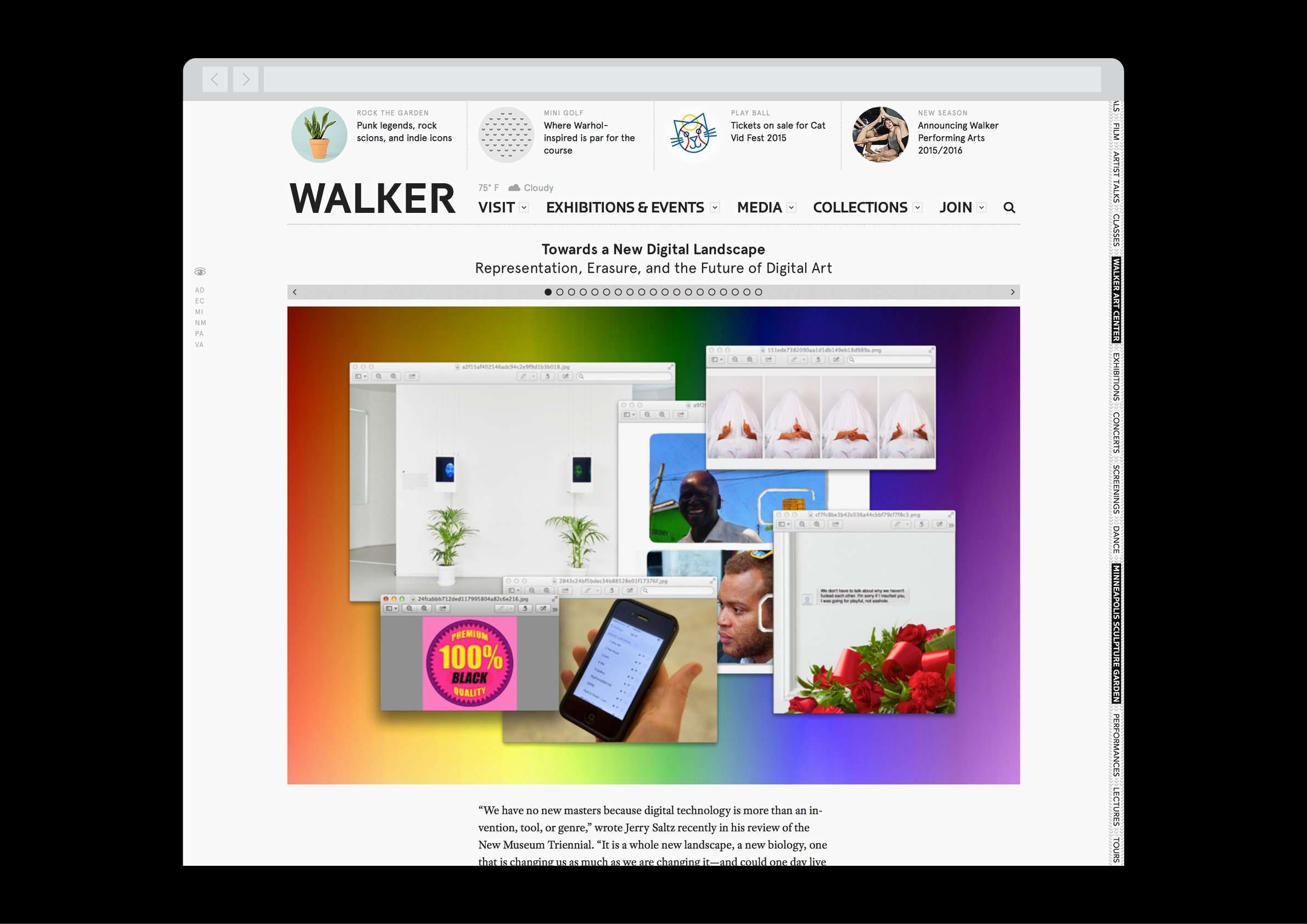
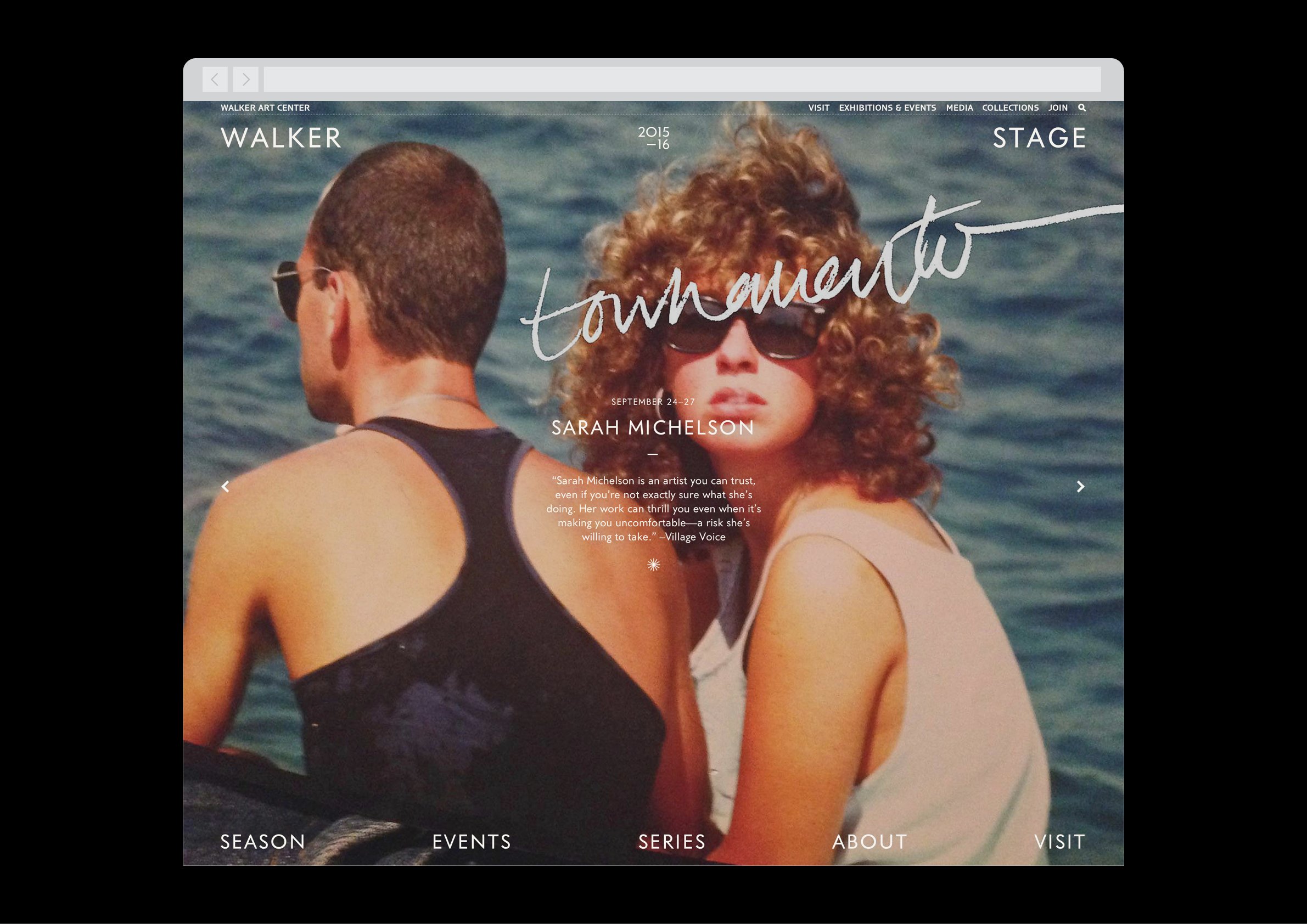
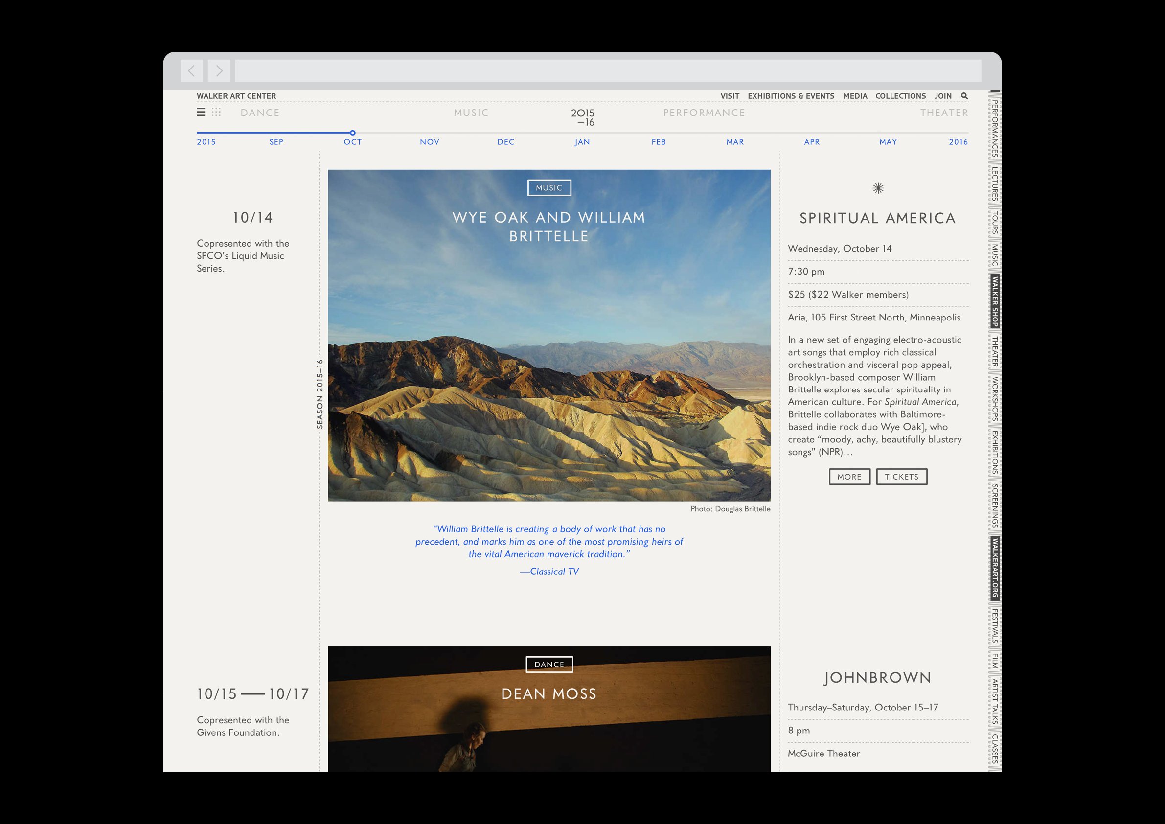
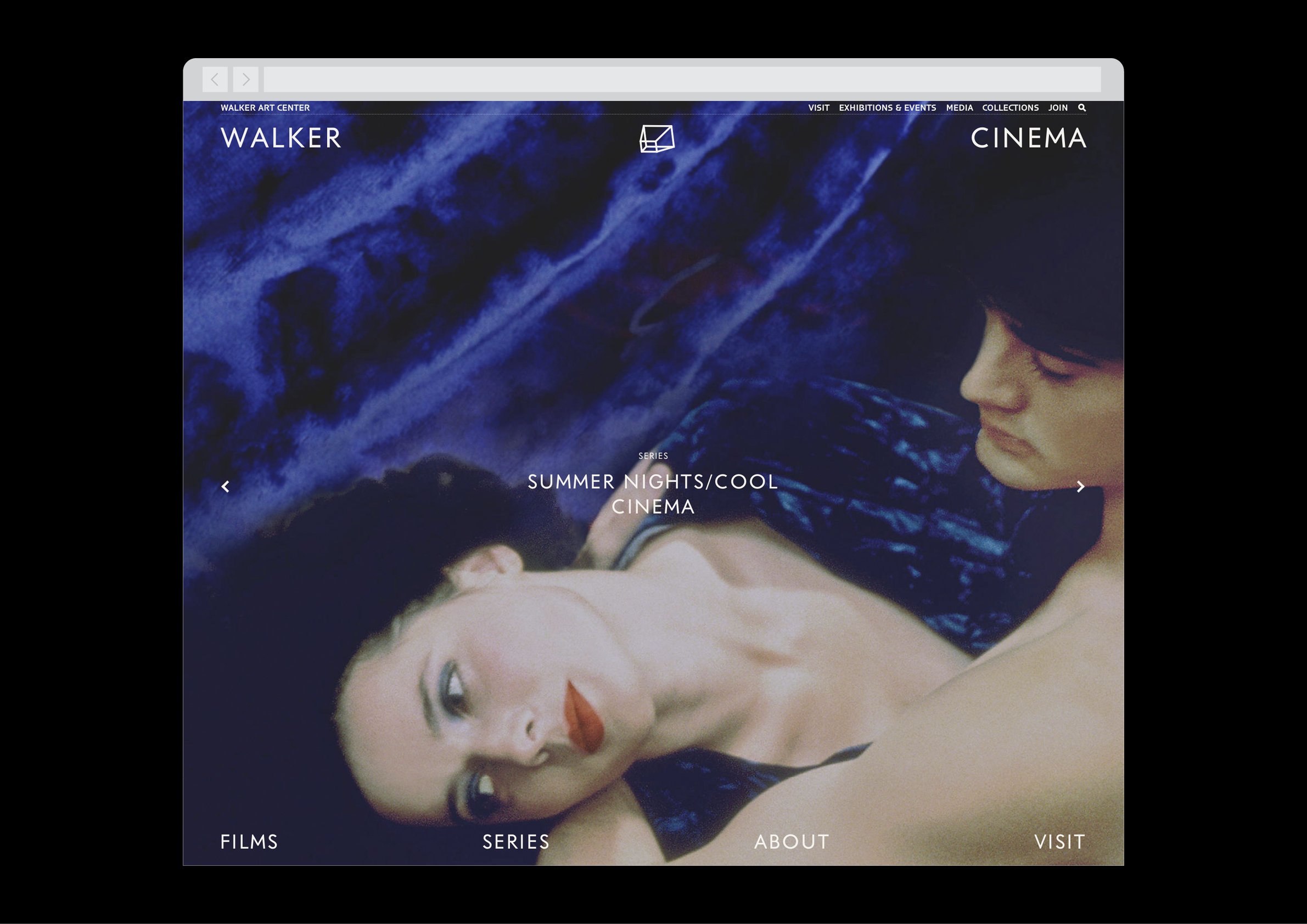
With the advances in web technology around that time, the site as a whole was designed with precise typography, a flexible grid system for building out-of-the-box, a library of modular interactive components, and the ability to go “off the grid” and create many a totally customized microsite for special projects.
