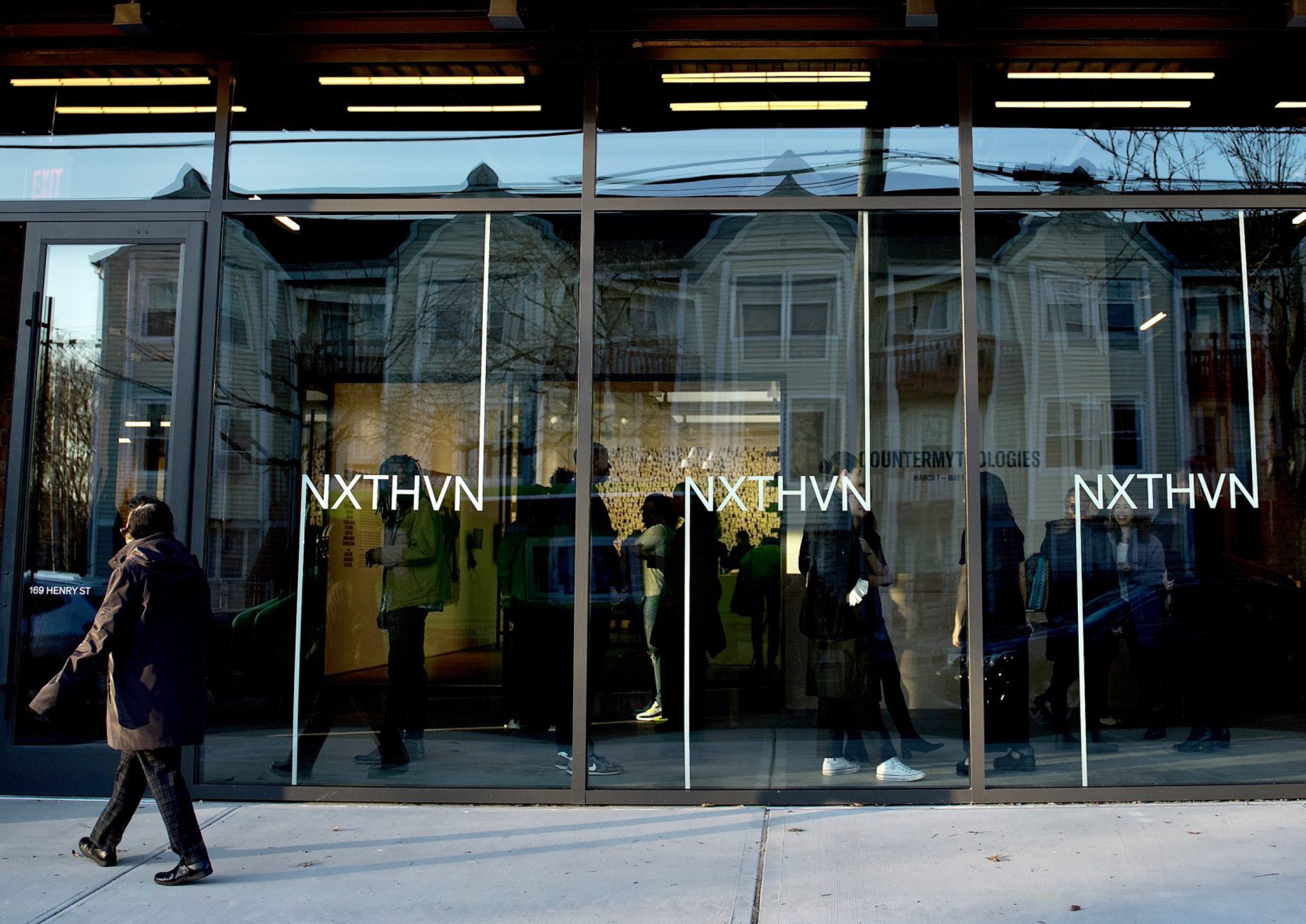
NXTHVN is an artist-run studio space, performance venue, coworking space, and residency program located and firmly rooted in the community of the Dixwell neighborhood of New Haven.
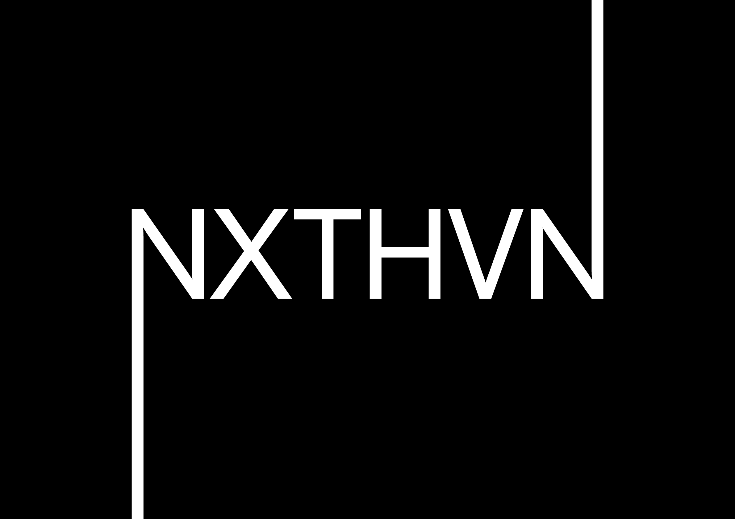
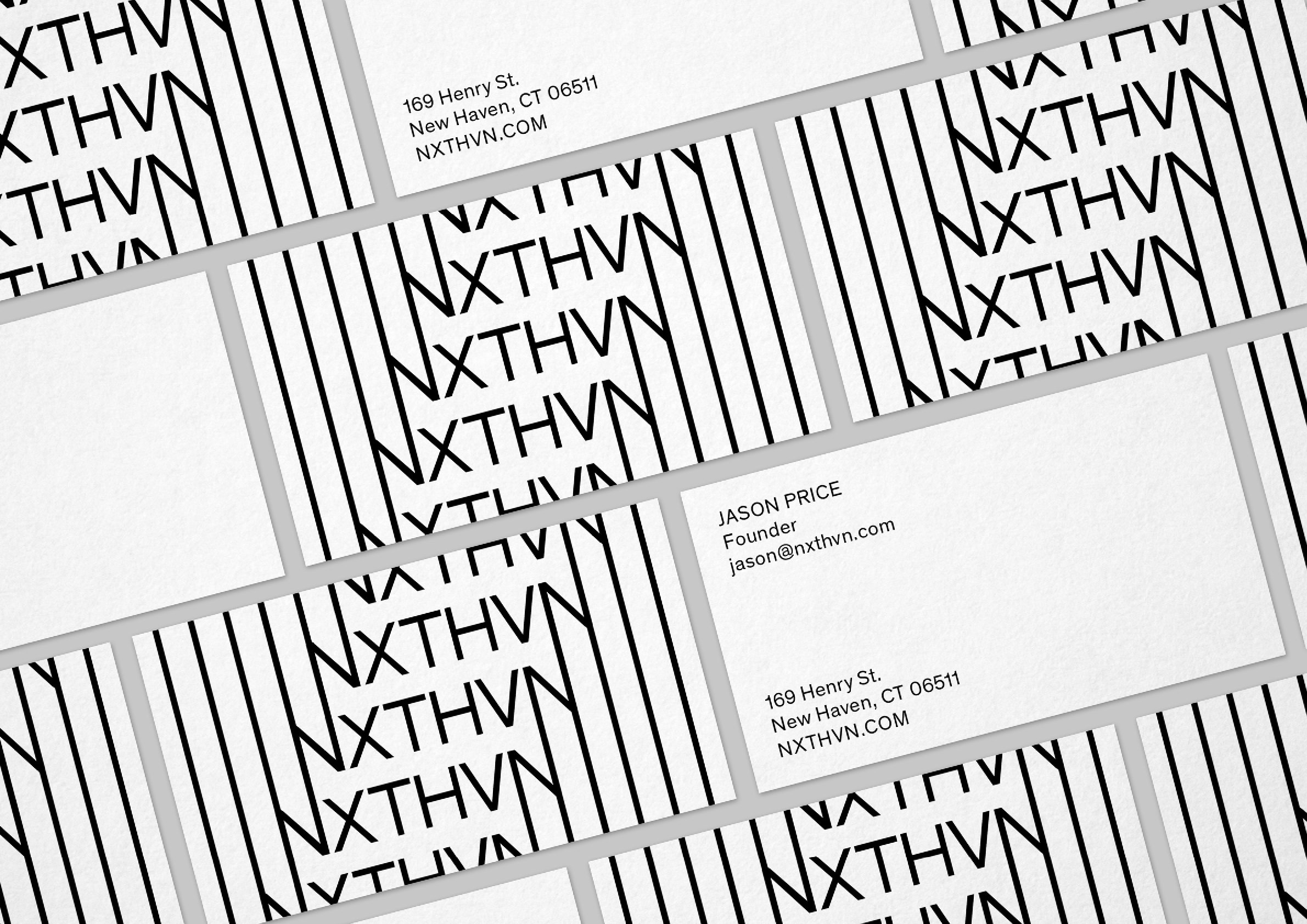
Tasked with designing an identity for something so multifaceted — an identity that needed to be applied simply and easily to a variety of both surfaces and programming — we took one of cofounder Titus Kaphar’s initial directives to heart: it needed to be smart, but ultimately “it needs to look cool on a T-shirt.”
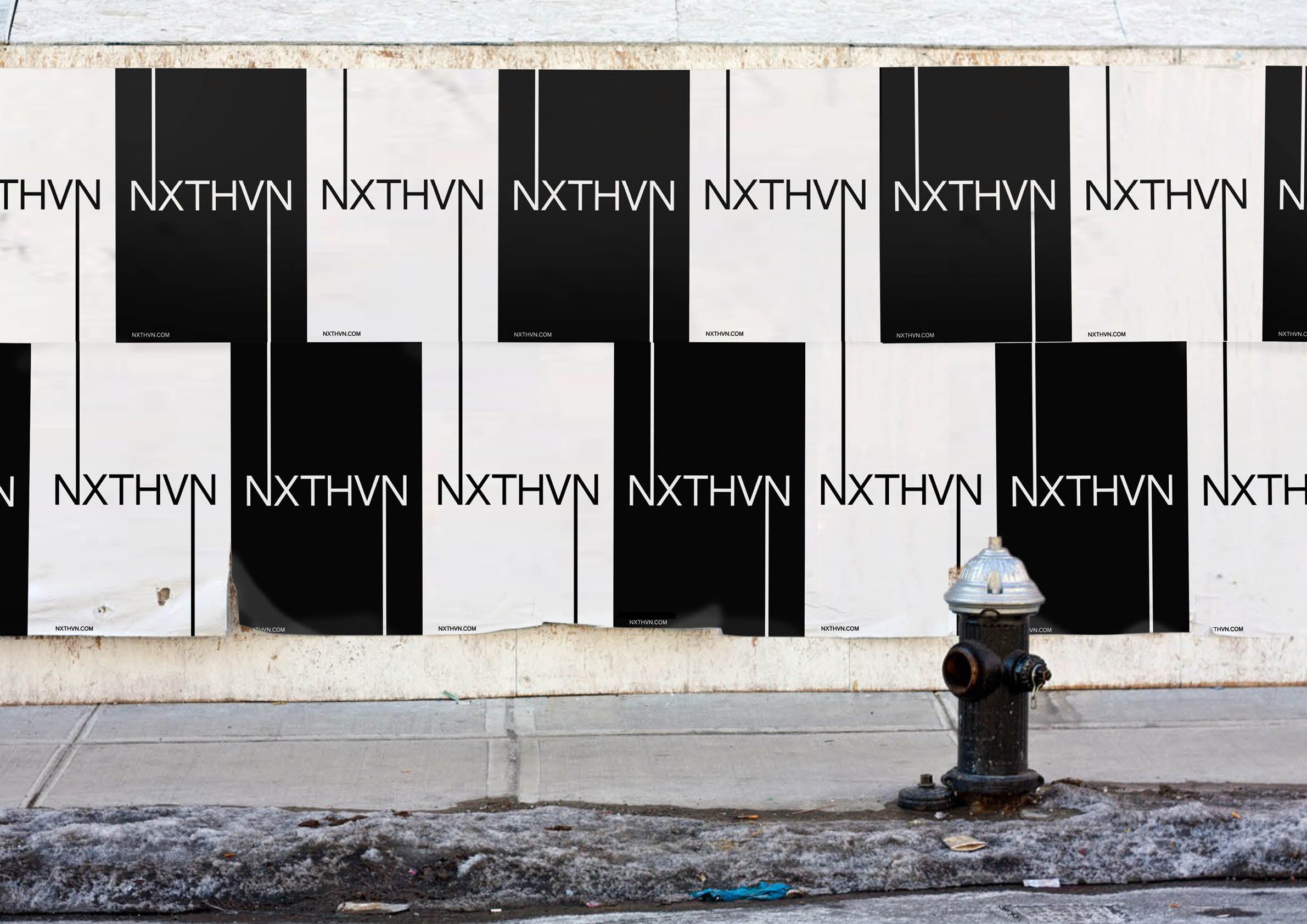
Realizing the symmetry in the name, we chose François Rappo’s typeface Theinhardt — sharp, sturdy, and “cool” but not pretentious — as the basis for which to extend the terminals of the bookends. This would allow it to stretch to cover a large canvas, and contract to any stationery or ephemera being produced over time.
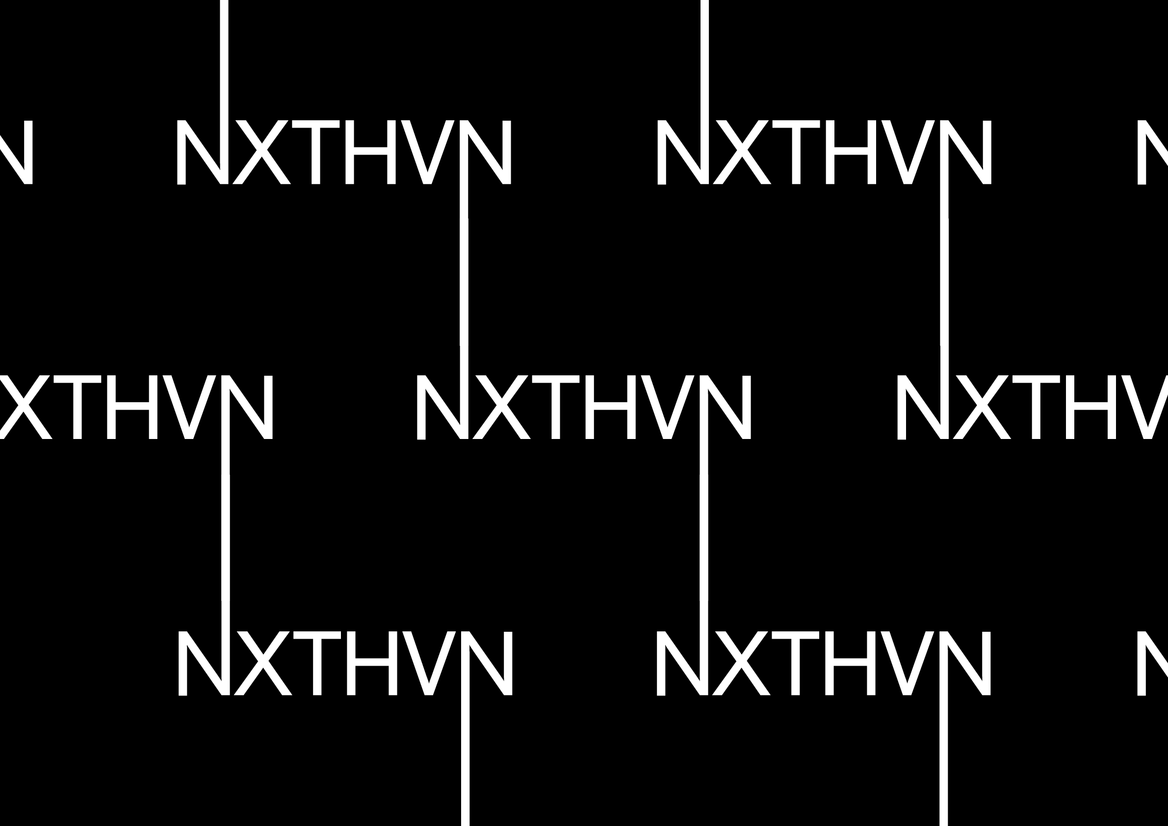
It also has the benefit of extending in another way, through patterns. Multiple logotypes can be locked together, building on each other to create near-psychedelic patterns using, paradoxically, rigid modern forms and no color.