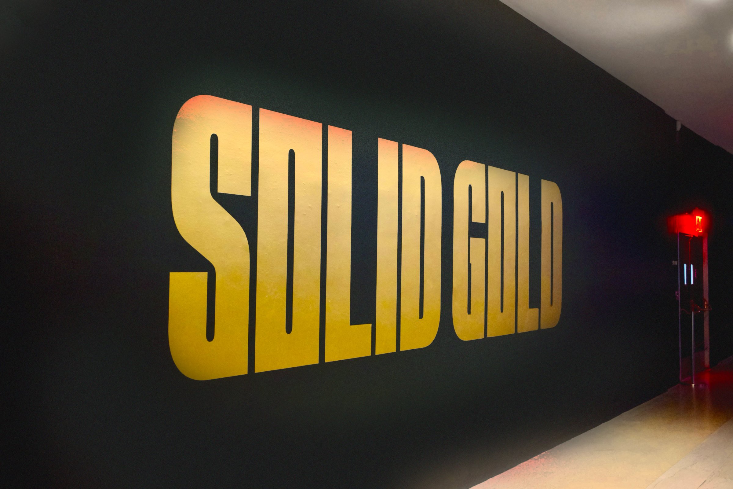
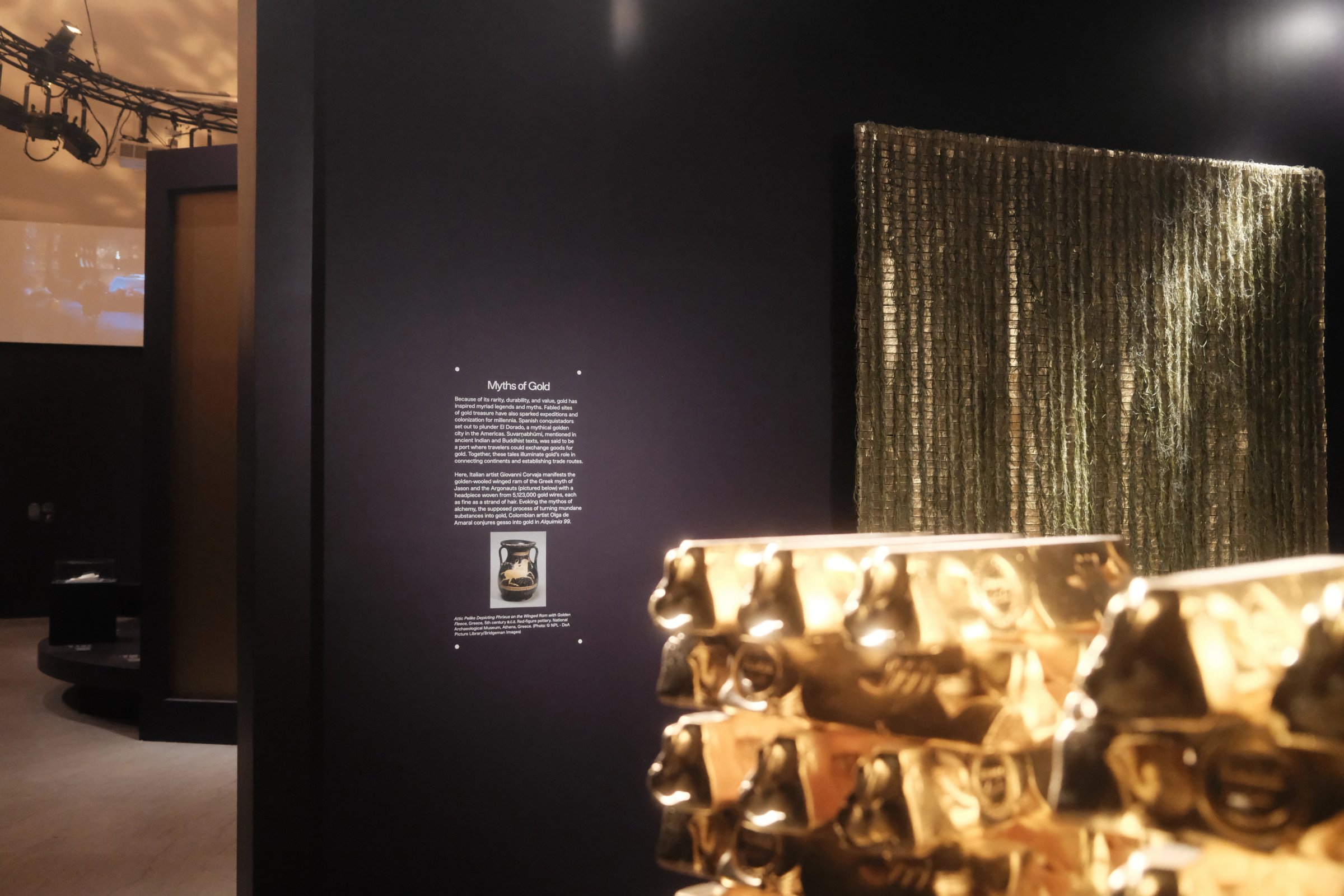
A standard 400-troy-ounce Good Delivery gold bar supplied the shape and proportions for a custom typeface. Gold carries a lot of symbolism. The bar also comes with dimensions, which is useful when you have to draw letters.
A gold bar is a strangely plain object for a material that attracts so much attention. No ornament, no elaborate form. Just a quantity of something people want, made into a shape that can be put beside more of it. There is a certain restraint to this. Restraint is an odd quality to find in a pile of gold.
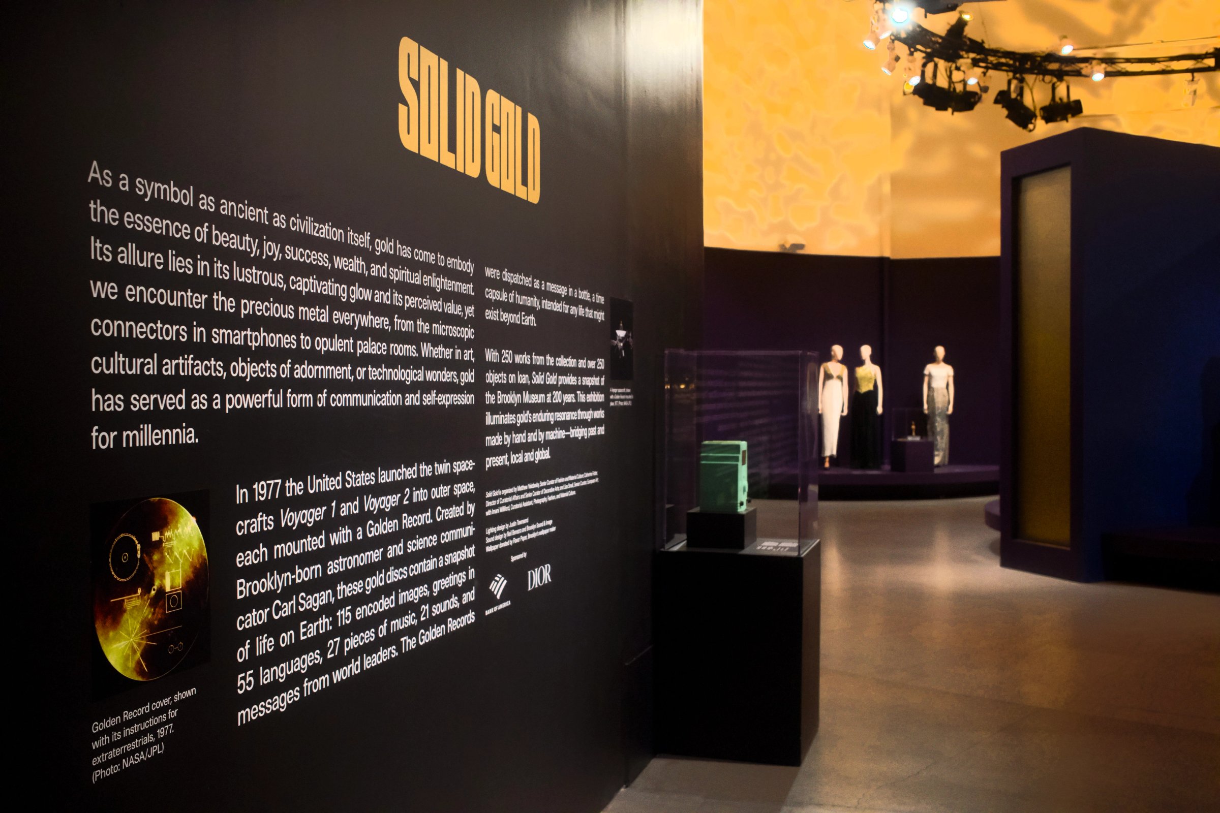
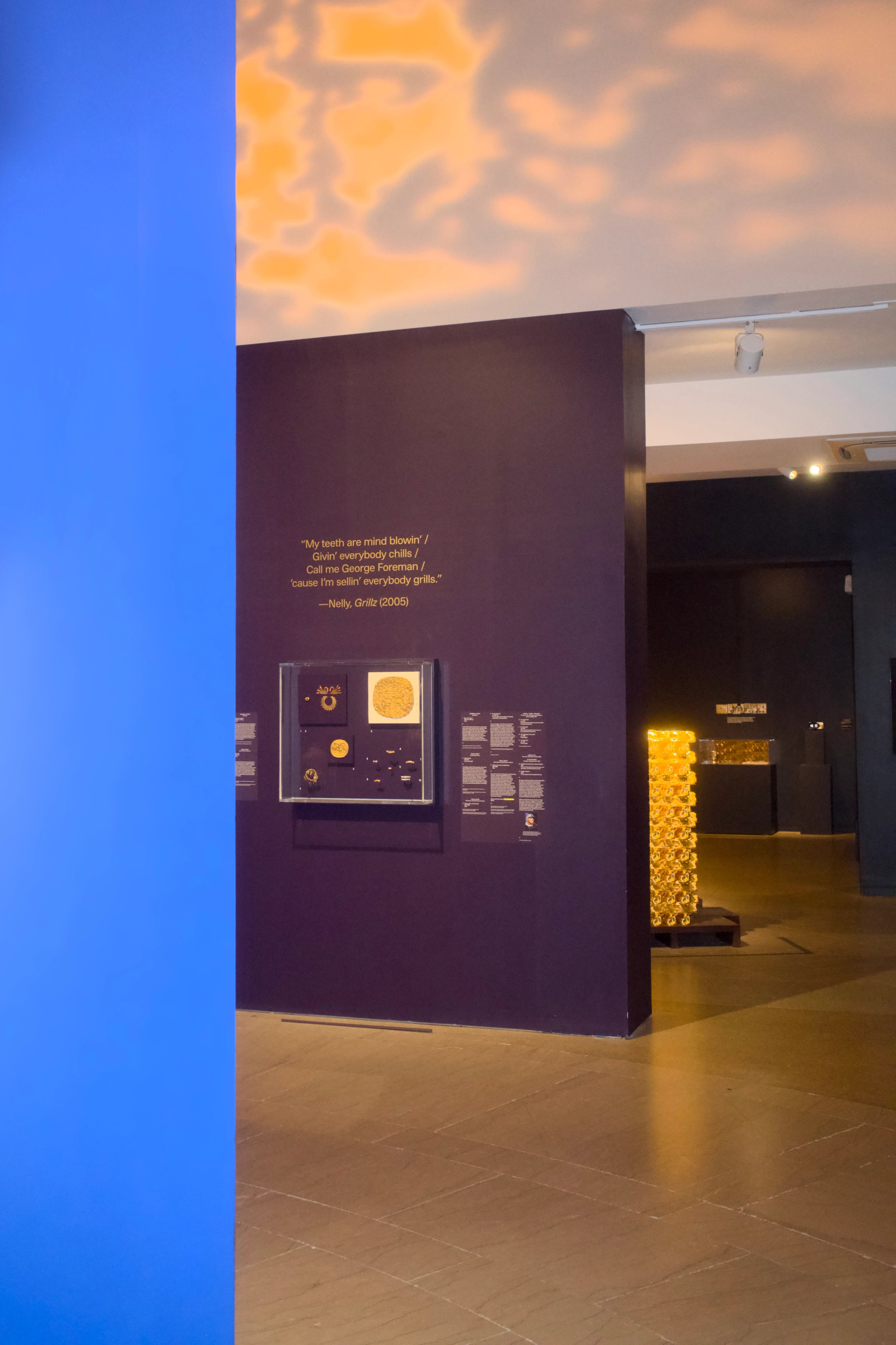
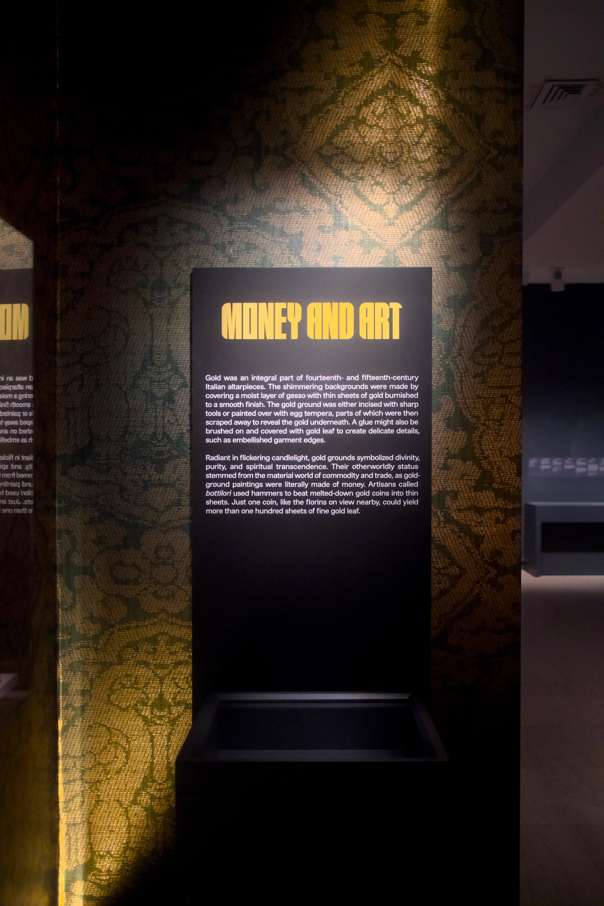
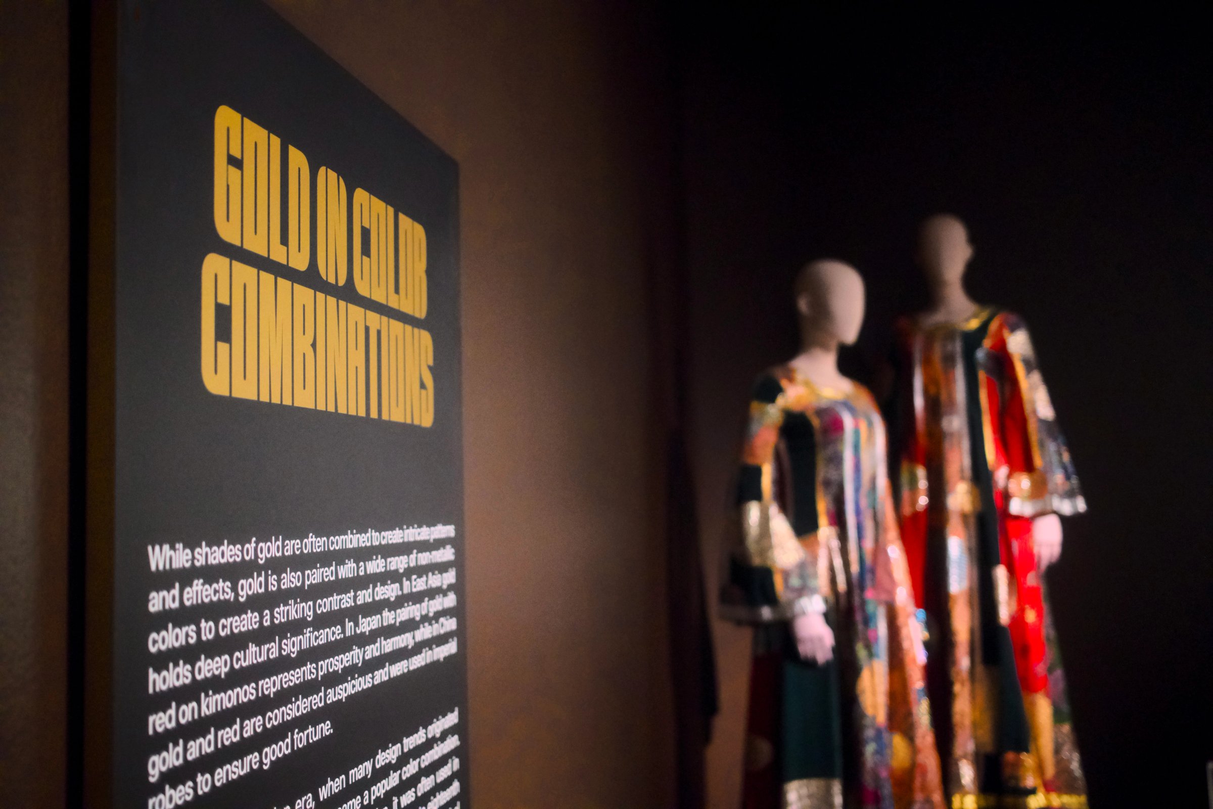
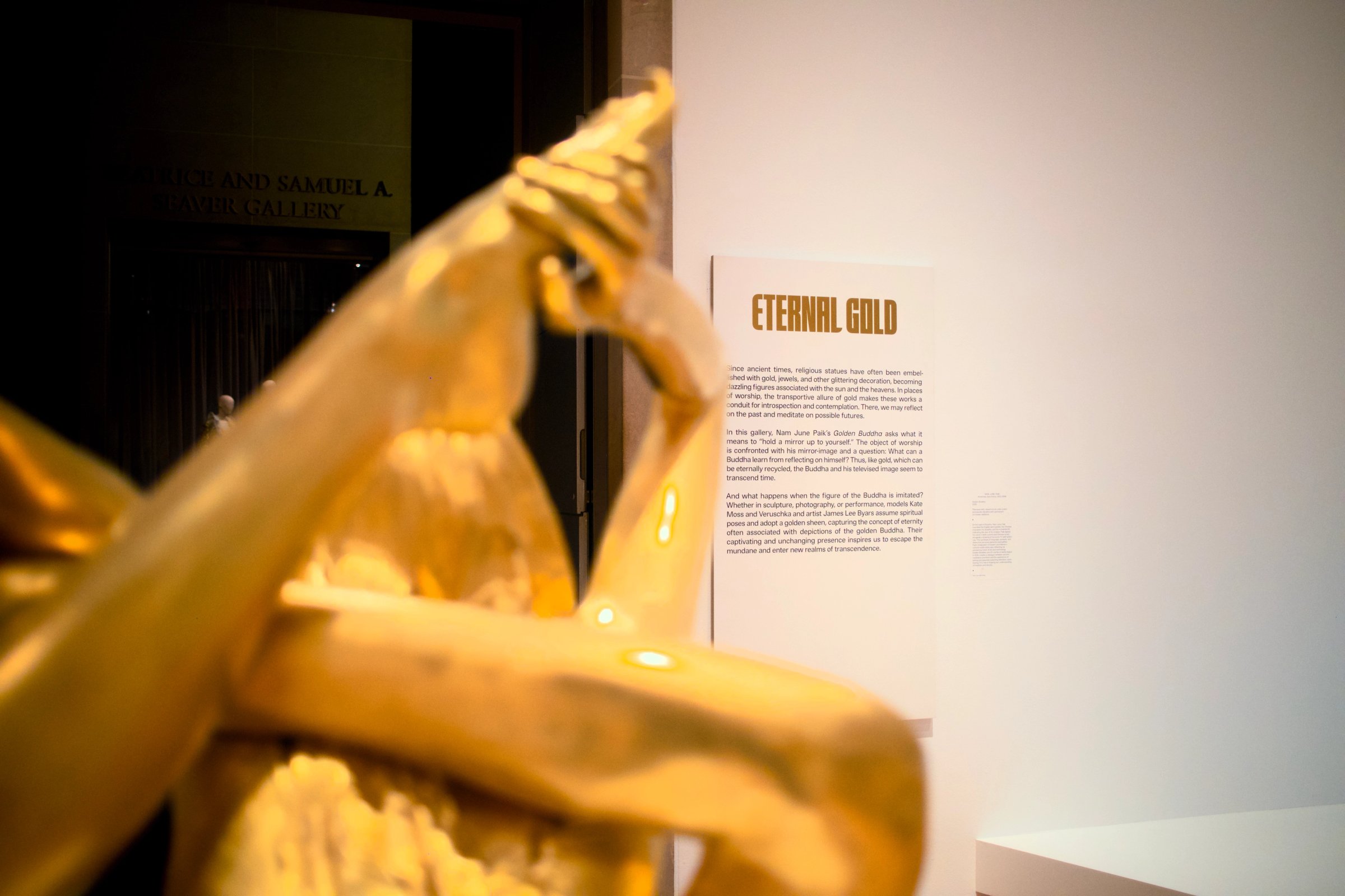
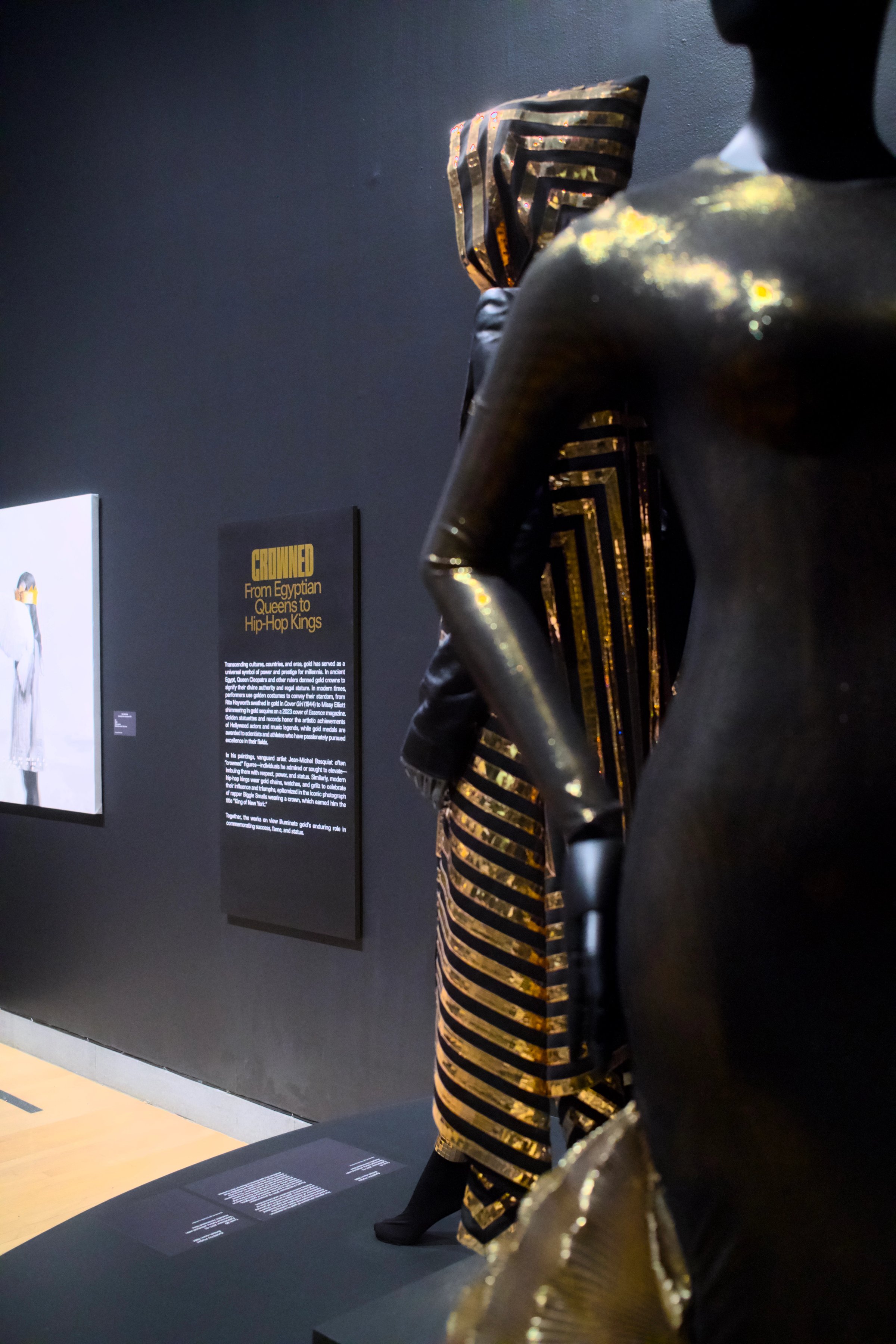
The typeface takes that compact form and gives it something to say. The letters are metallic gold, too, appearing throughout the exhibition from the title wall to the section panels and labels. They signpost the metal’s history and contemporary cultural significance while acquiring a little of its surface appeal.
This makes the exhibition’s writing slightly involved in its subject. An otherwise fairly standard didactic wall panel can explain the attraction of gold and participate in it at the same time. The words ask to be read. Their surface offers another reason to stop in front of them, which may have very little to do with what they say.