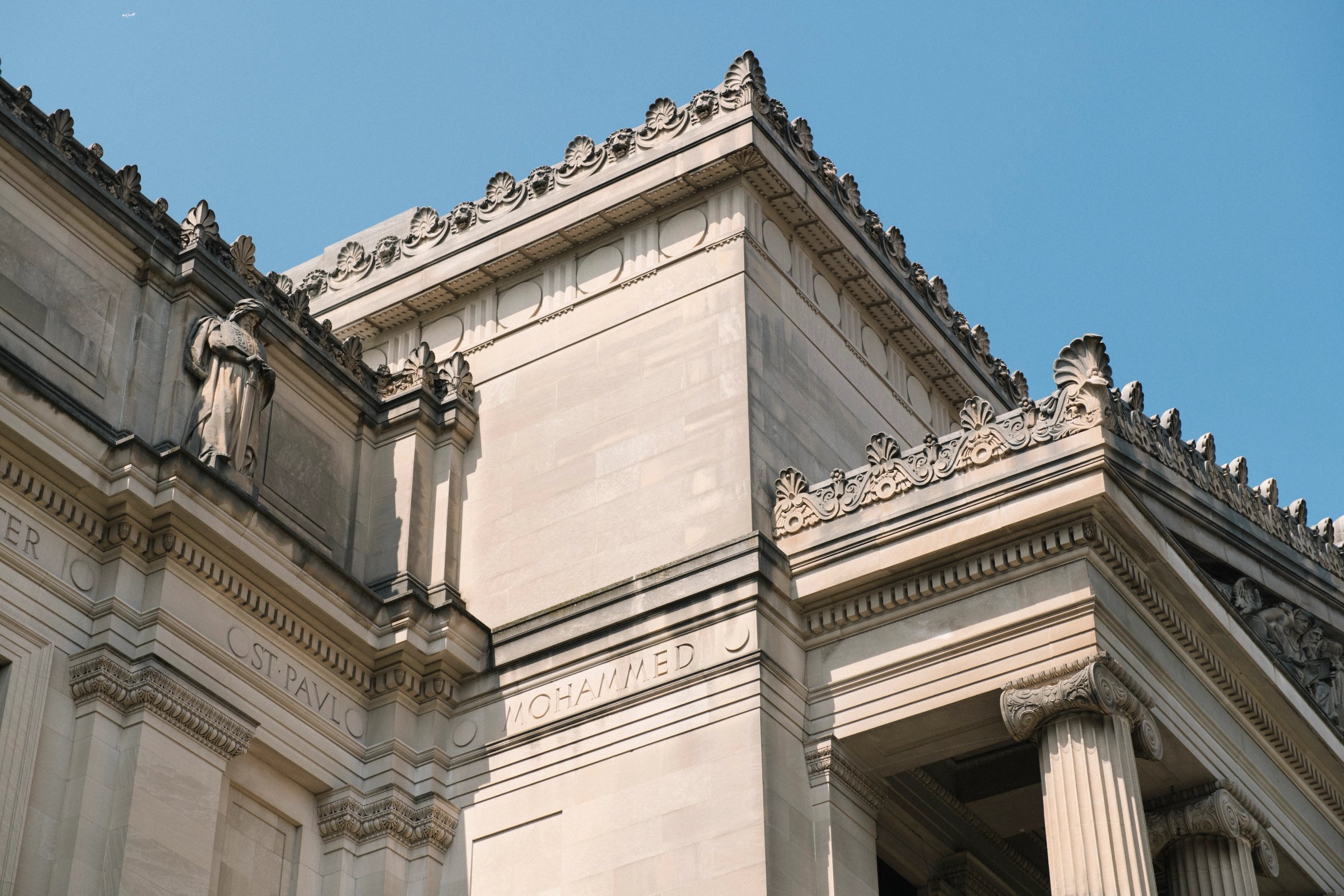
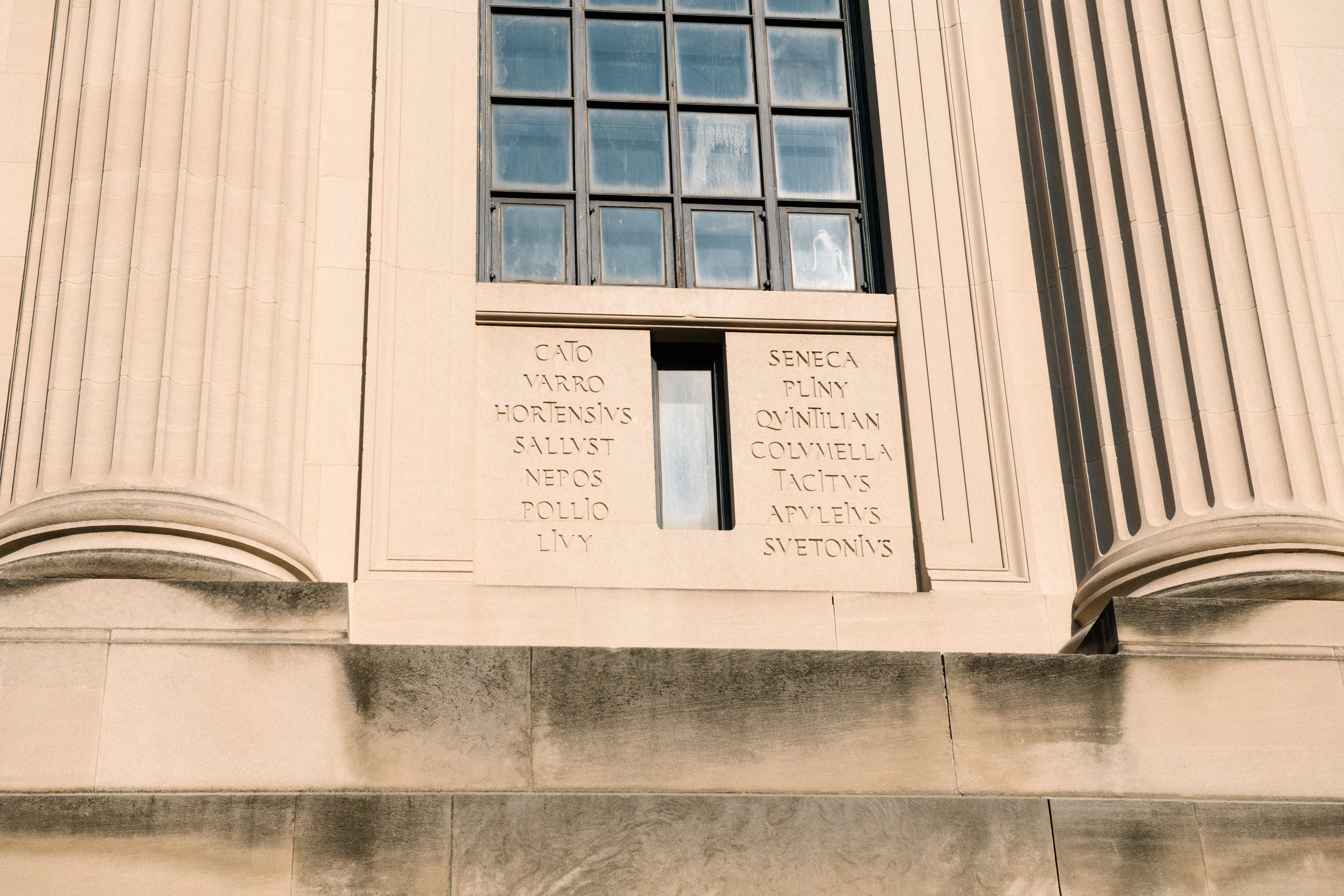
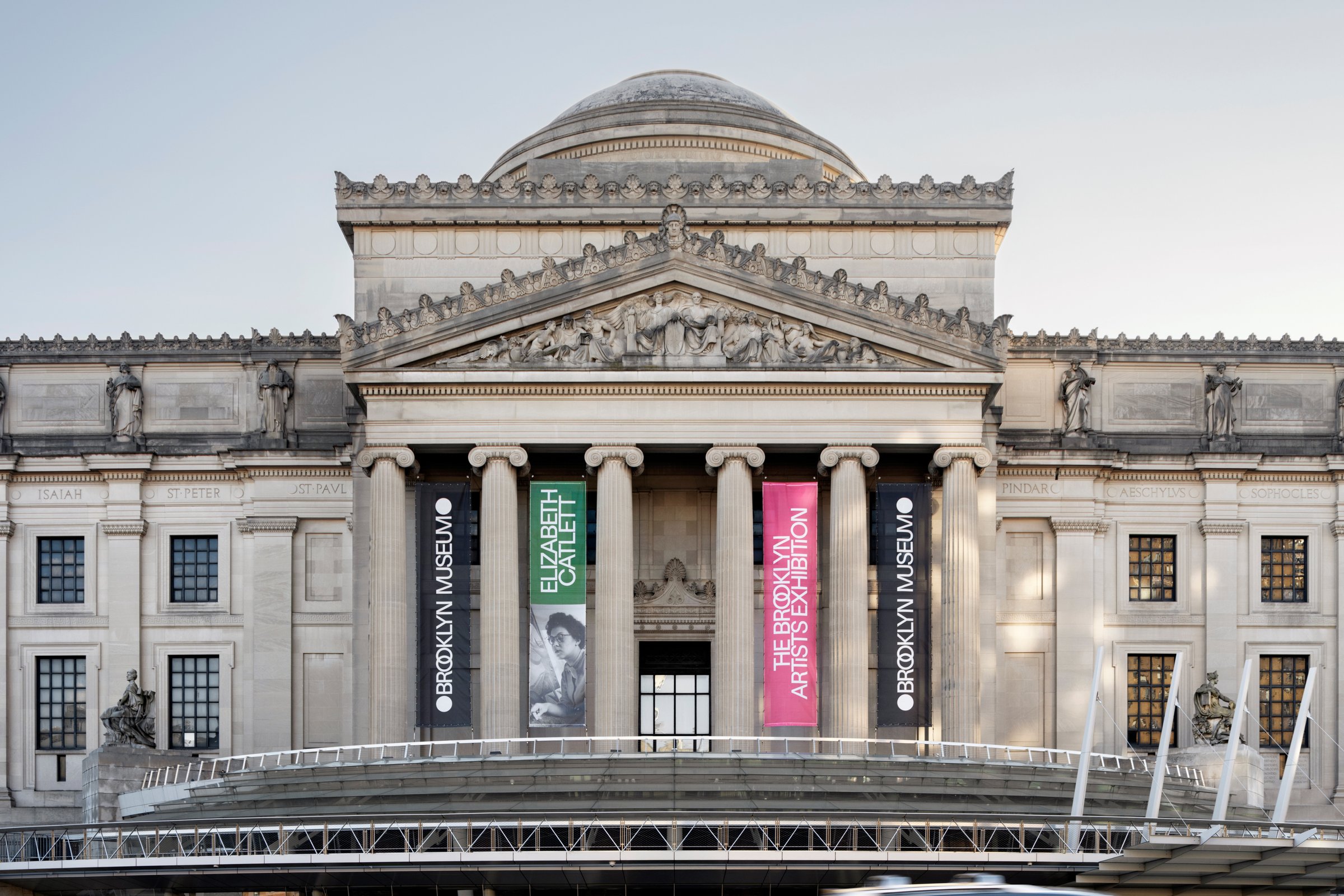
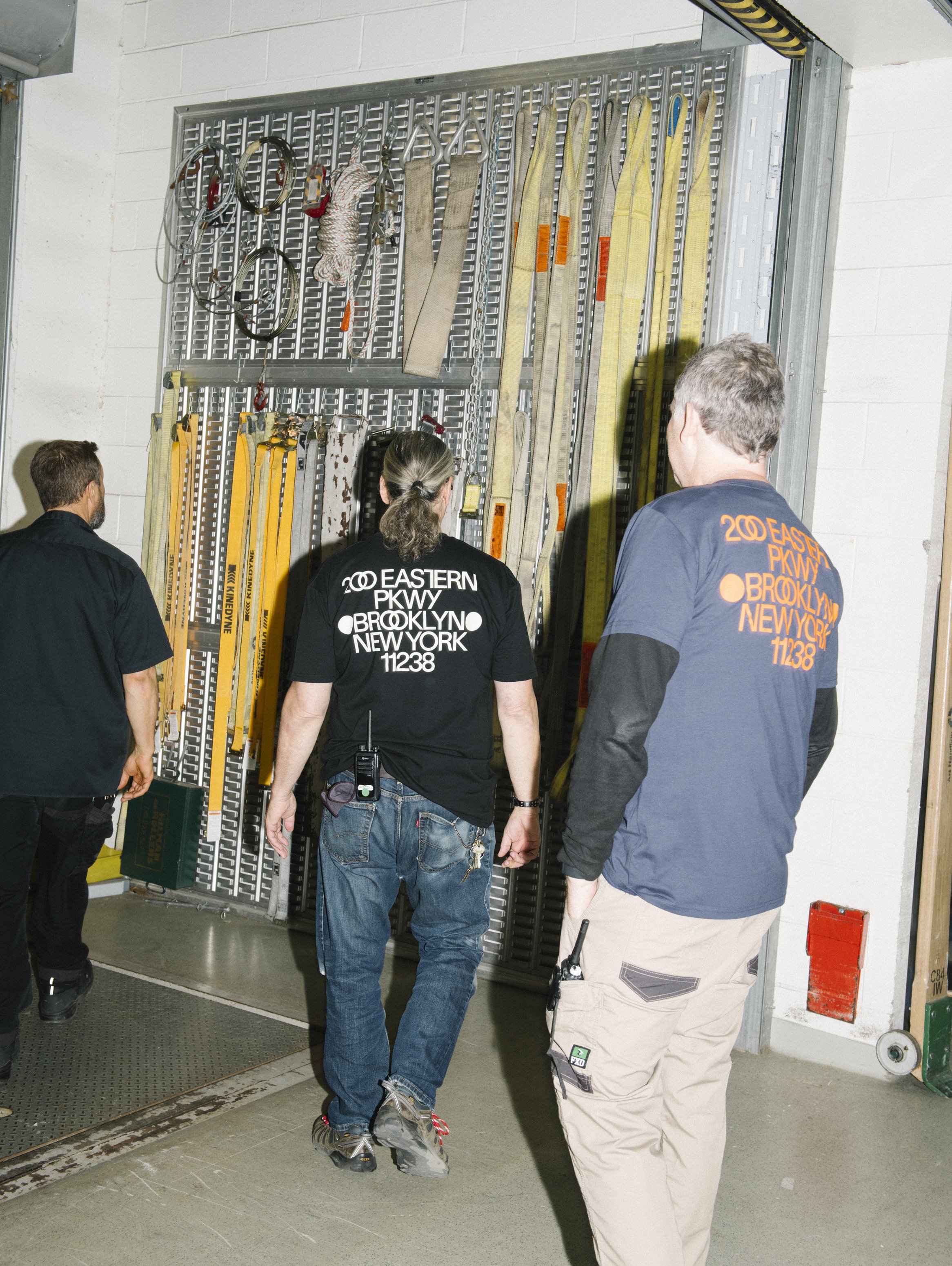
Two dots are a small thing to organize a very large museum around. Brooklyn Museum’s Beaux-Arts home has a monumental portico, classical columns, and sculpted figures keeping watch from above. It makes a fairly substantial introduction. Along the façade, the names of poets, playwrights, and philosophers appear in carved lettering, with unexpected ligatures and two large dots framing each name. There was already quite a lot of graphic design on the building.
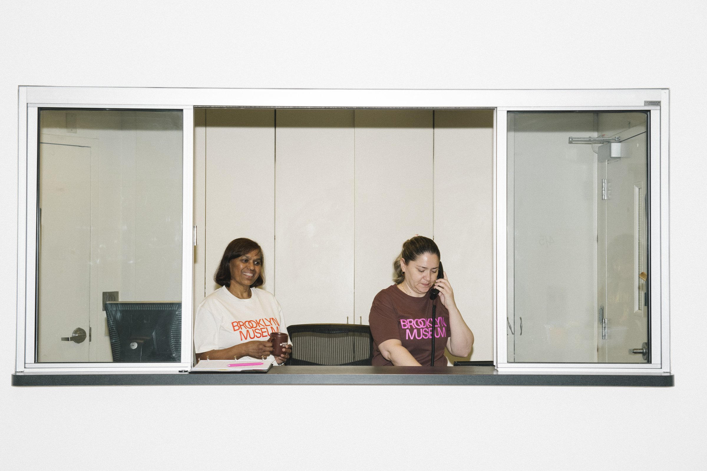
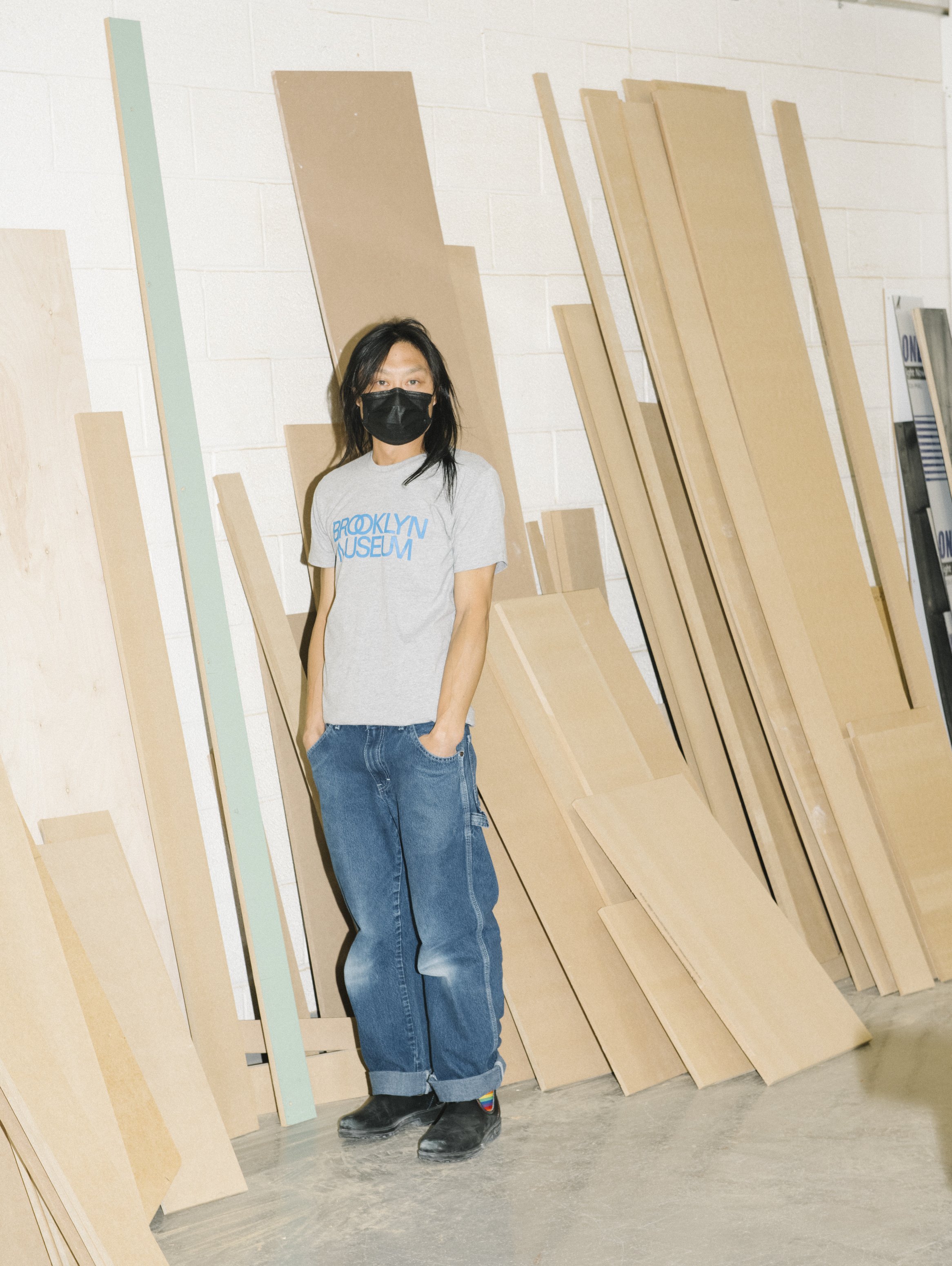
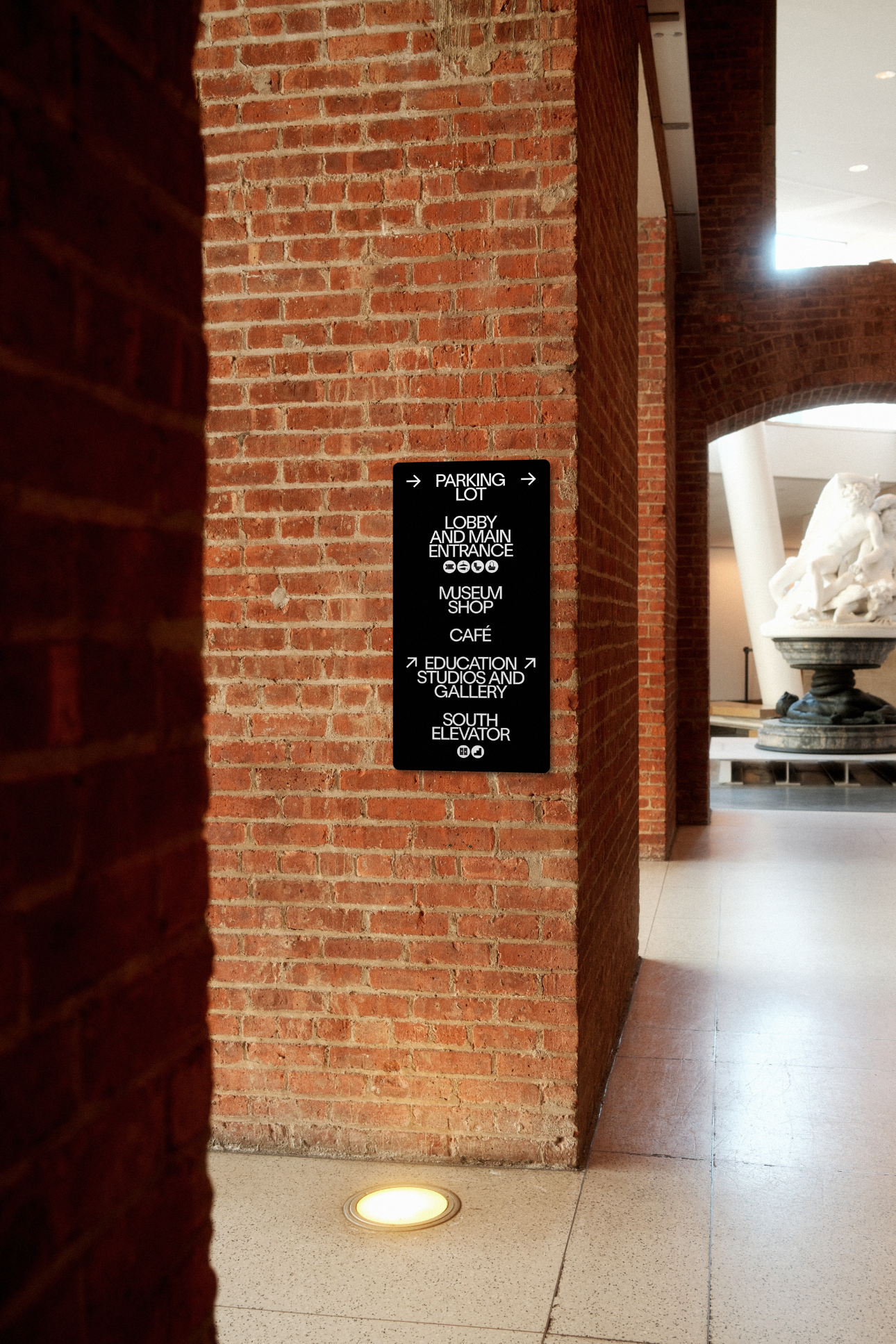
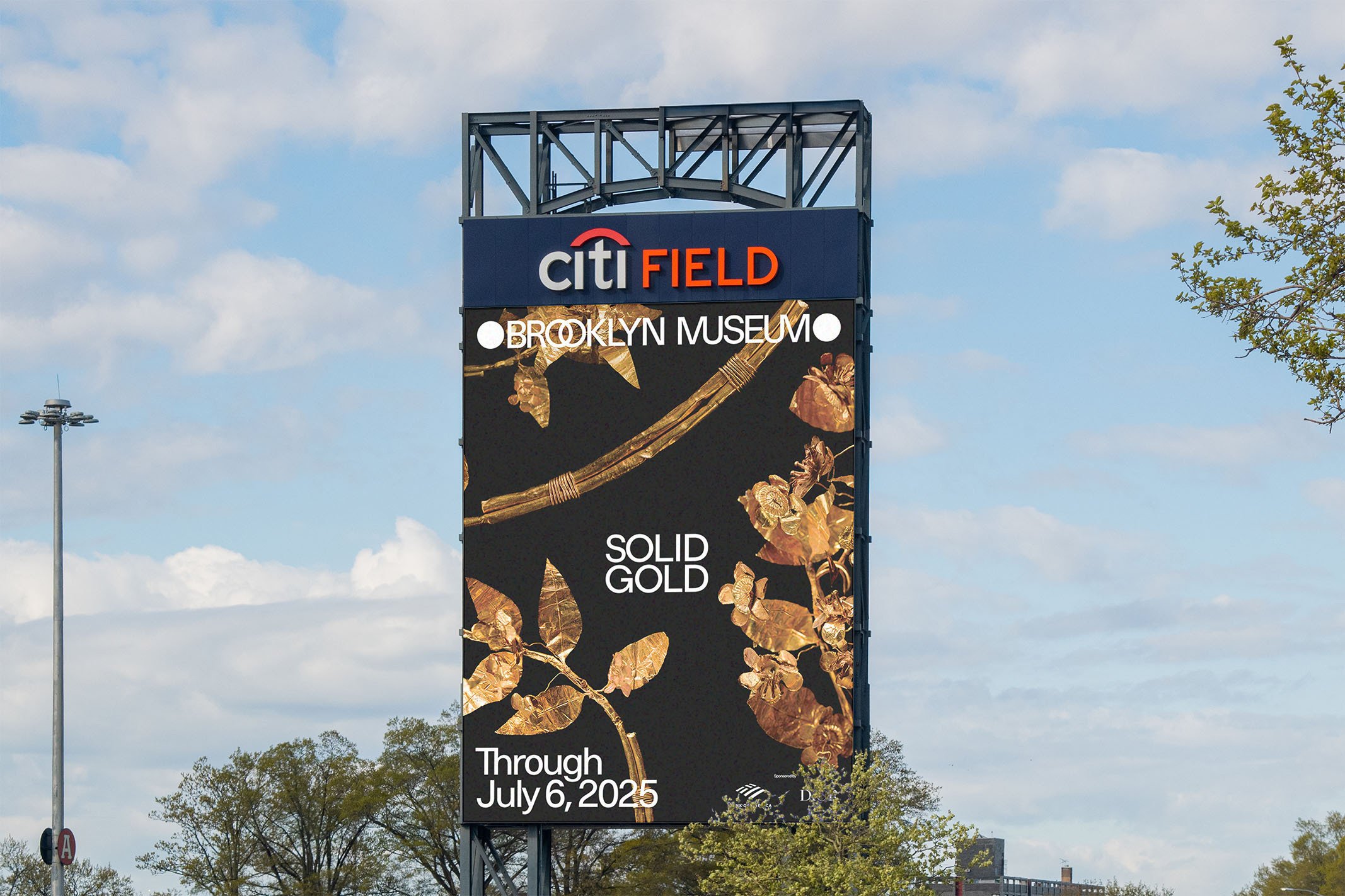
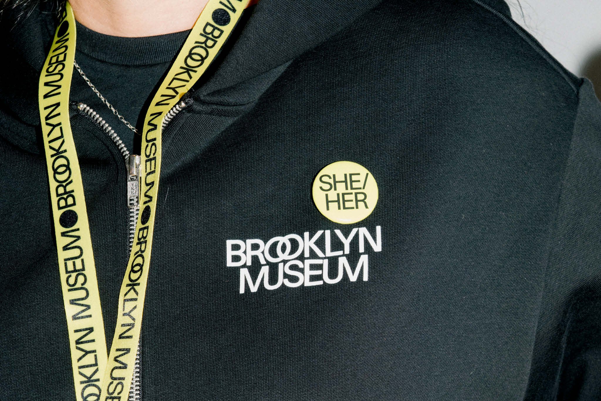
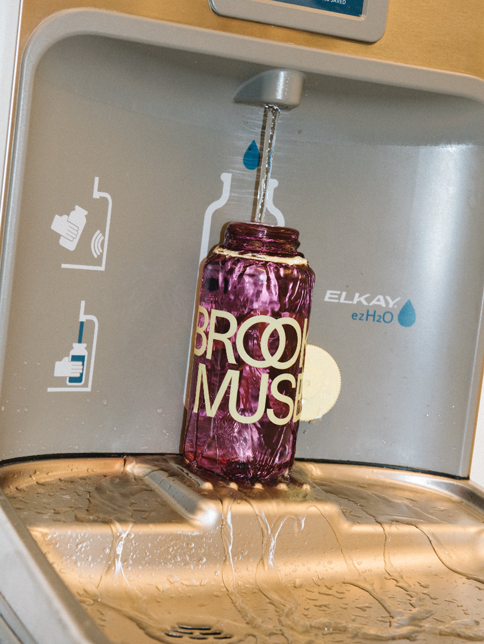
For the museum’s 200th anniversary, we worked with my longtime collaborators Other Means on extending the new visual language across digital and print. This meant developing the digital identity system, wayfinding, shop merchandise, and exhibition identities, and working out how the same ingredients could accommodate very different jobs. An exhibition title and a sign directing someone to the elevator have different things to get on with.
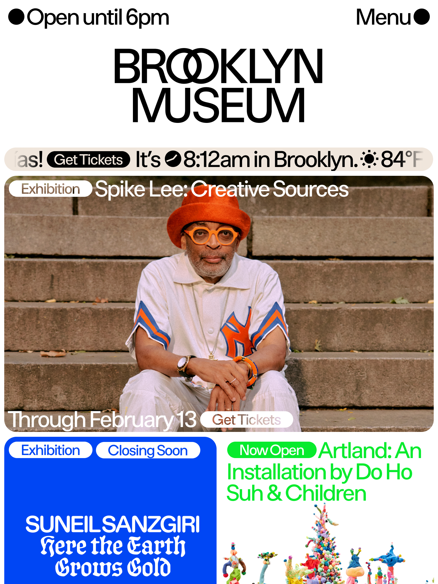
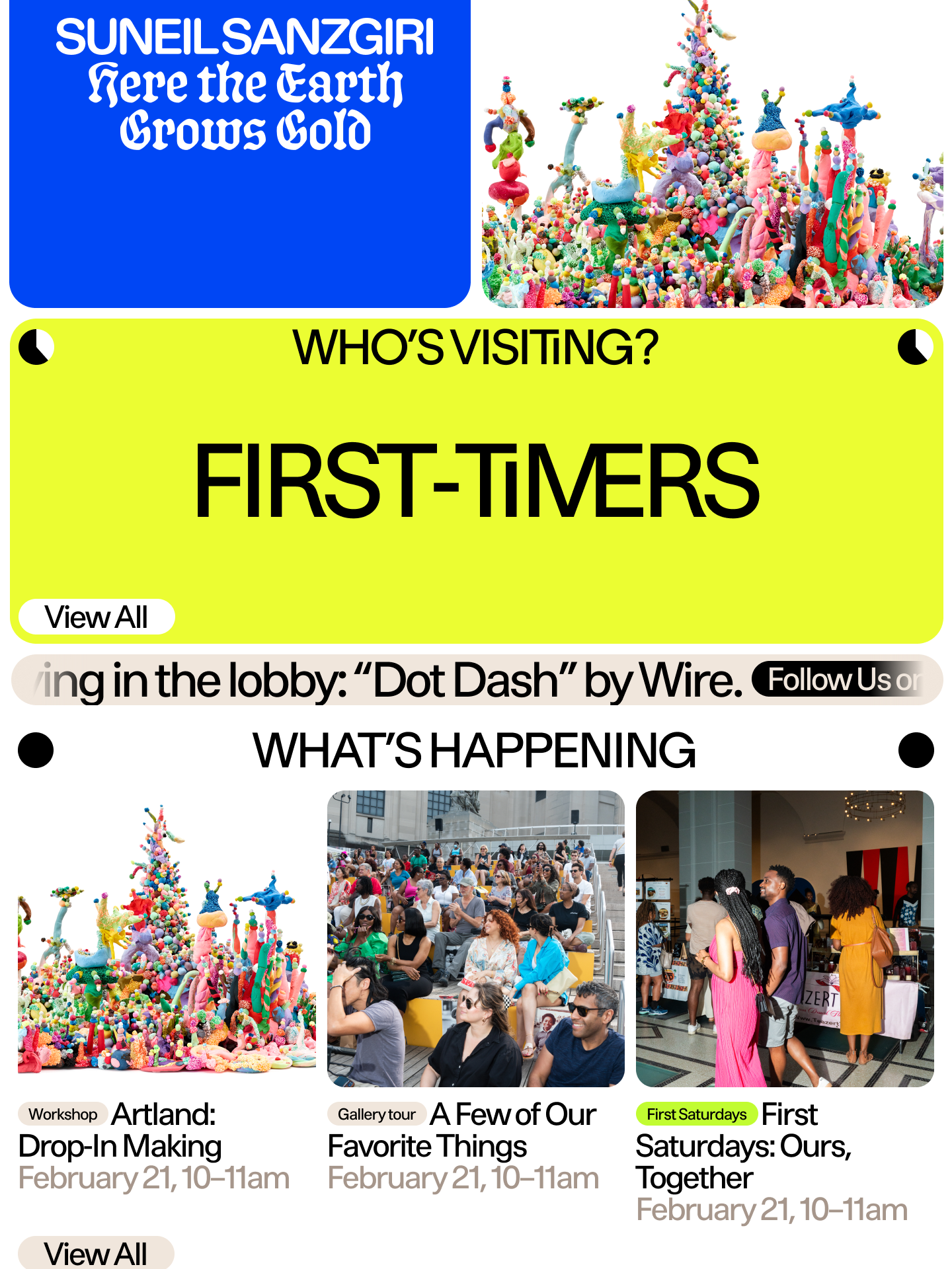
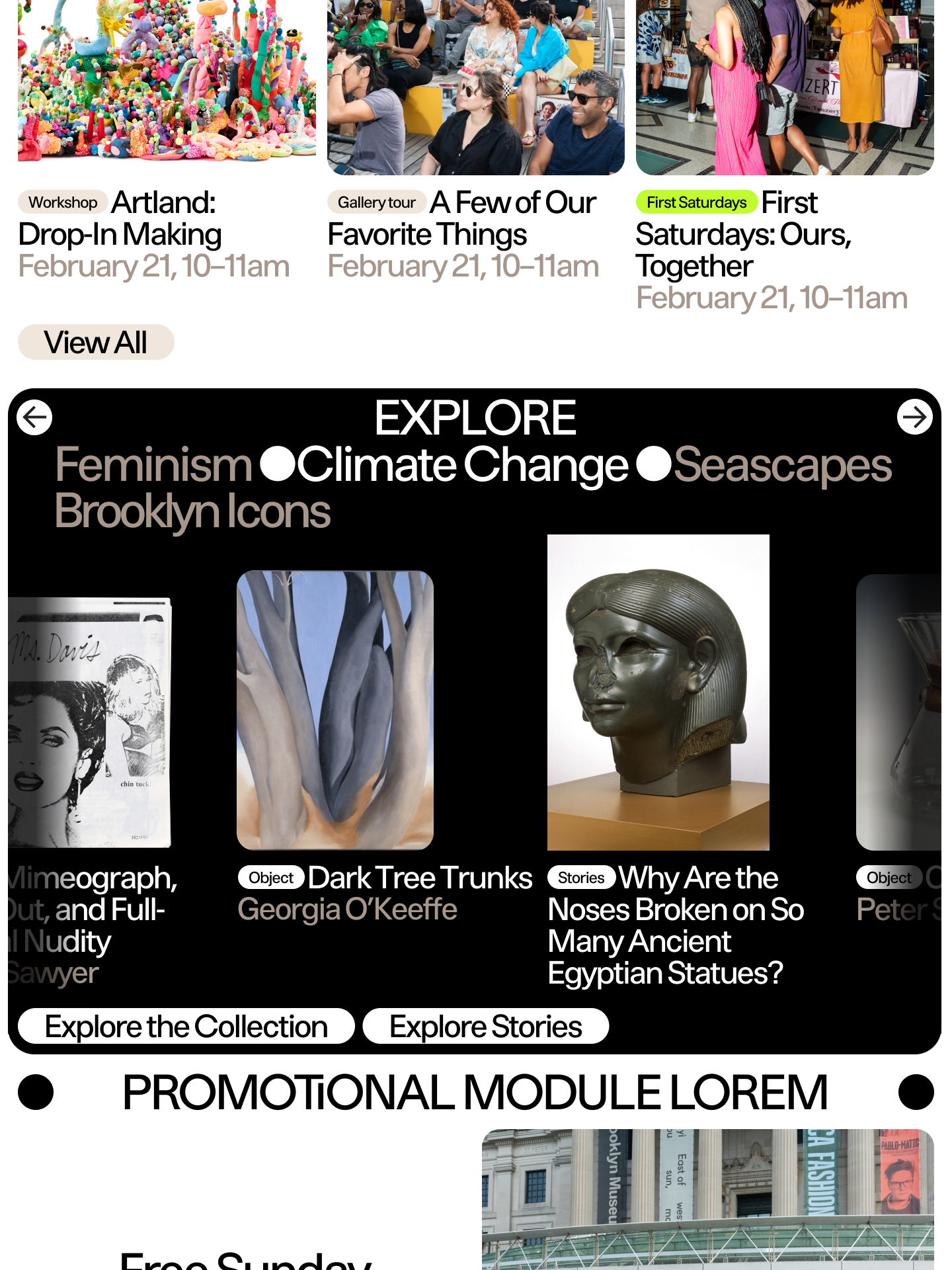
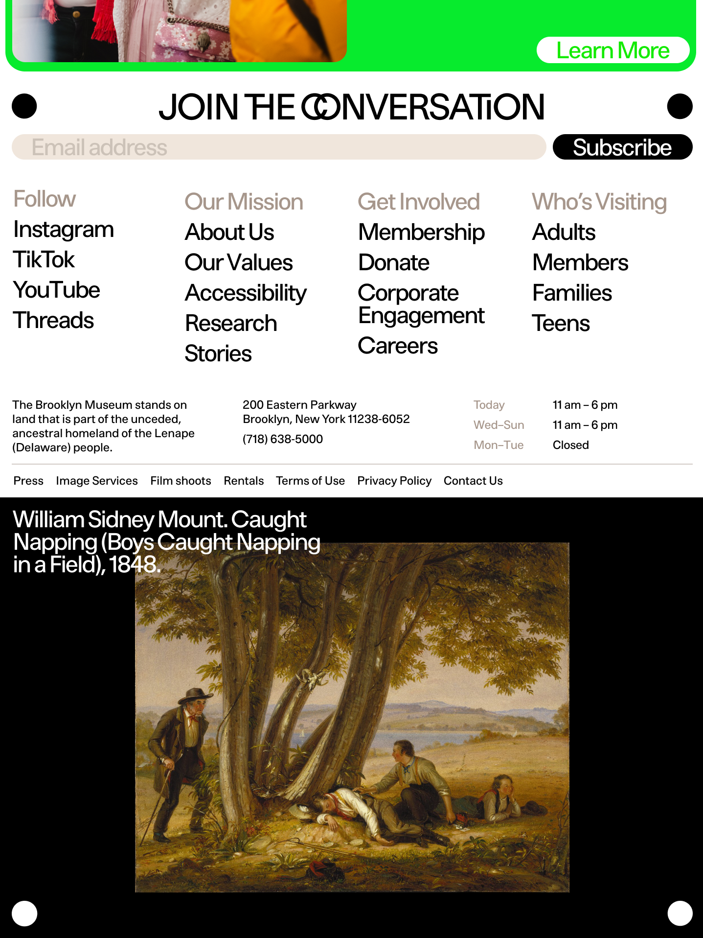
Our website designs were deemed a little too adventurous. I thought they were rather good. A rebrand this large takes a few things with it as it goes. The new website has our eyes, though I’m having trouble placing the face.
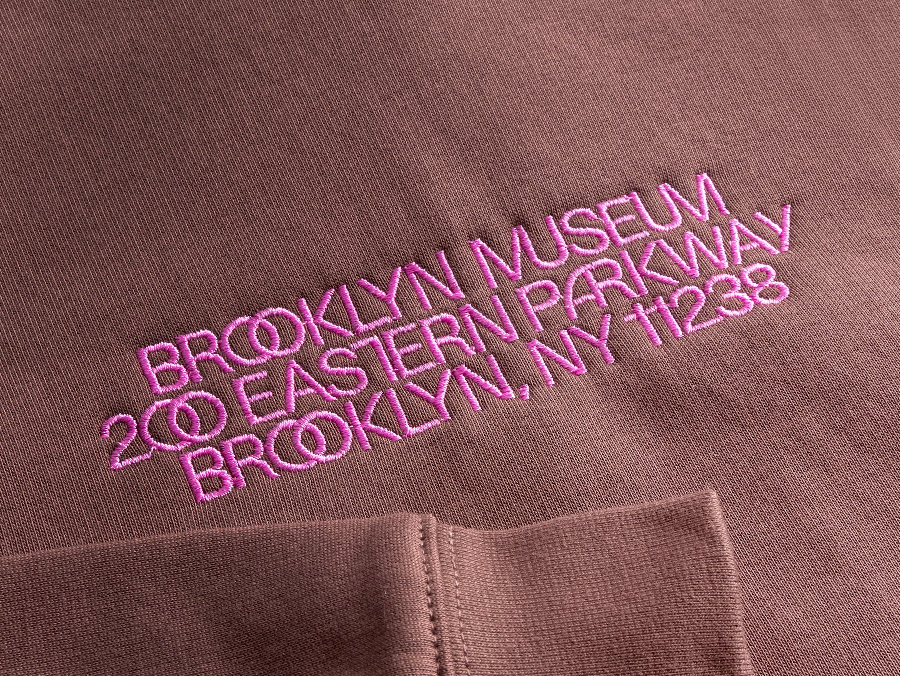
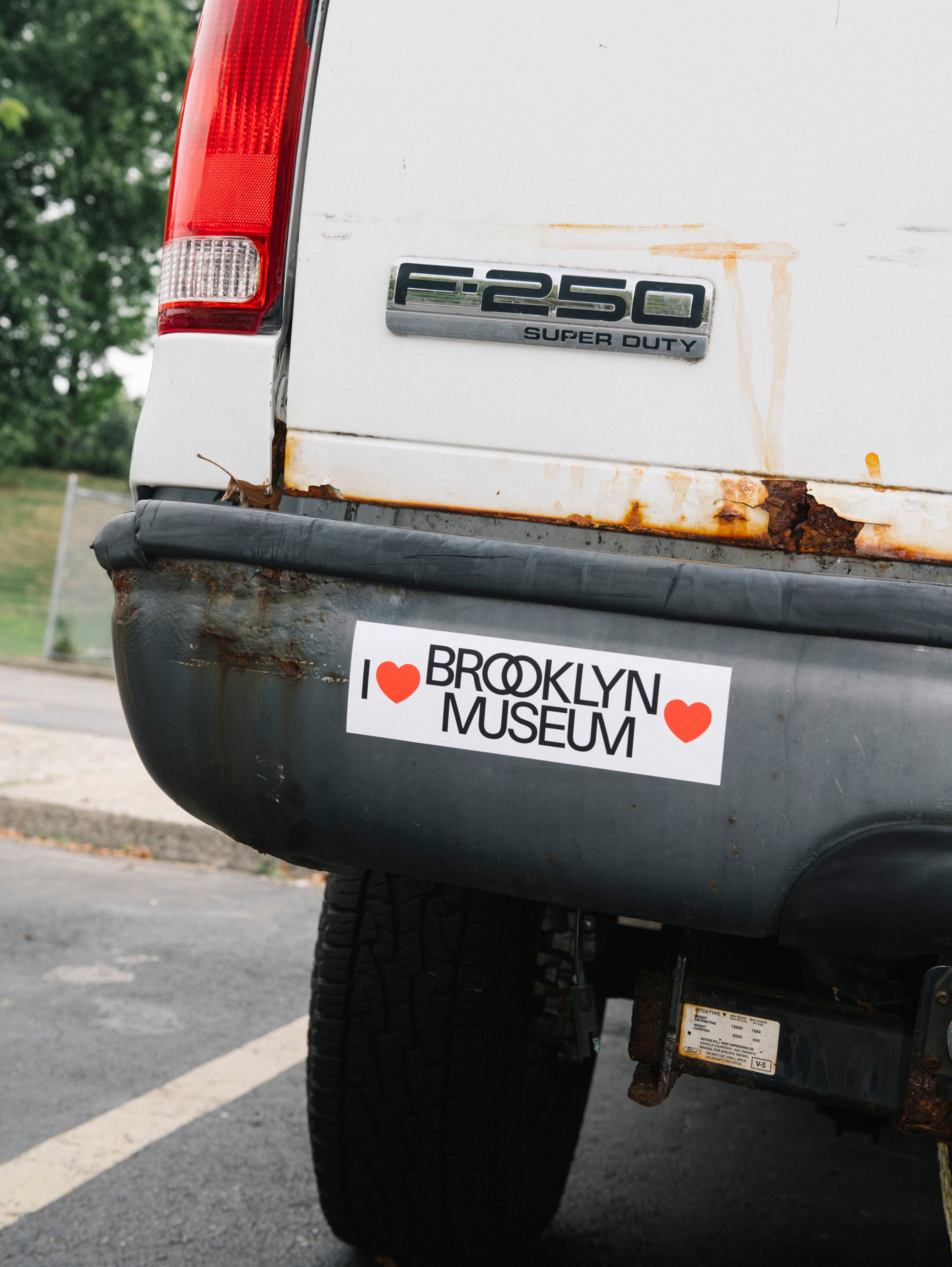
The custom type family, BKM Portico and BKM Façade, is a warm, modern sans-serif with versions for text and display. Some of its mischief is inherited from the façade’s carved ligatures. The two O’s in Brooklyn overlap; the M’s and U’s in Museum share strokes. Elsewhere, letters tuck into one another, while a few seem to be considering life as circles. The amount of entanglement can be adjusted, from an ordinary paragraph to a headline where the letters seem reluctant to separate.
The palette takes the standard color wheel and turns up its vibrancy. Limestone gets its own small palette: three warm grays that refer back to the façade. Among all that saturated color, the building gets to keep some of its composure.
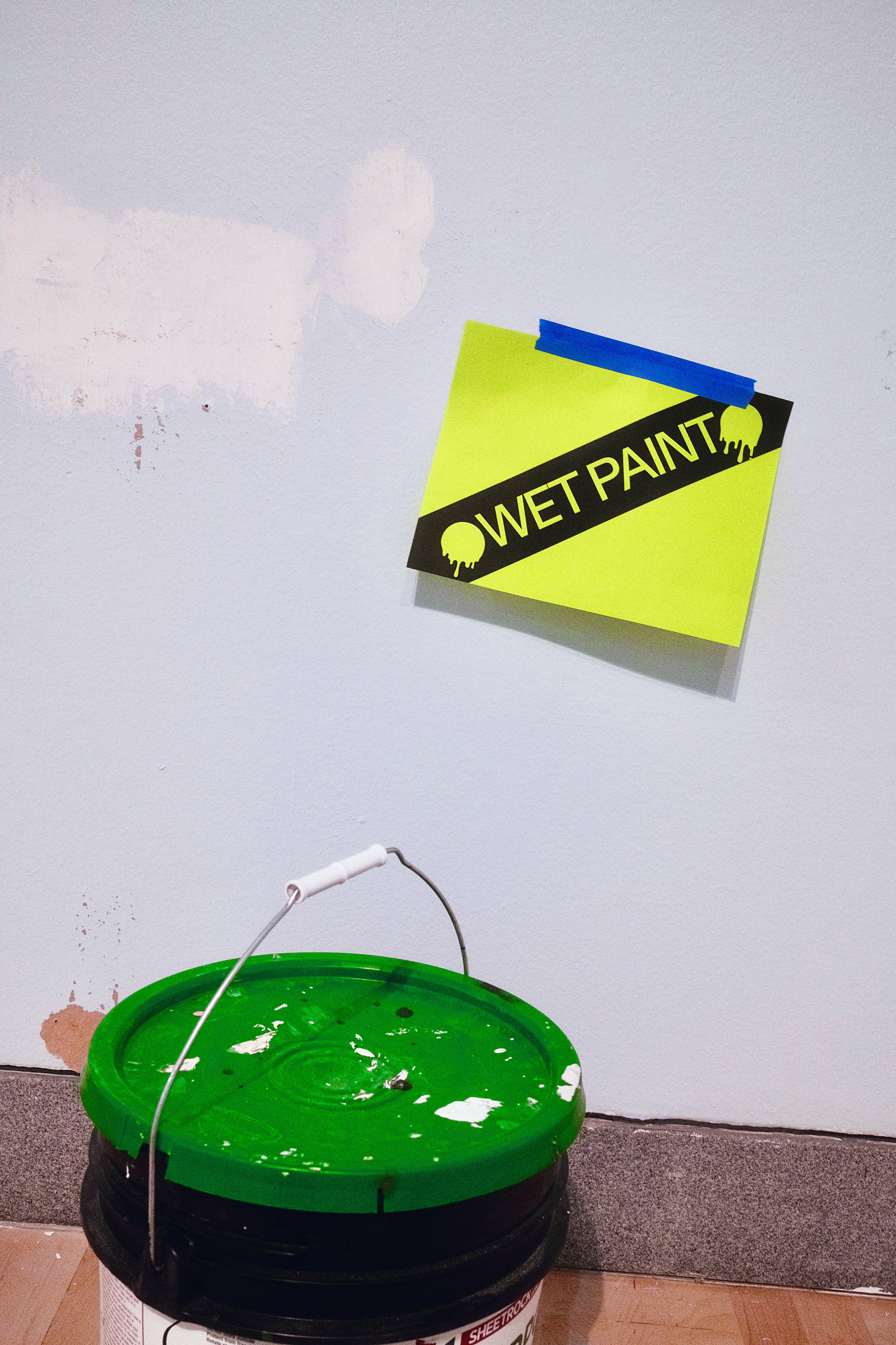
The dots help hold all of this together. They frame text and establish hierarchy; their diameter becomes a unit for measuring the spaces between things. They can move in animations or change occupation altogether: clocks beside “Coming Soon,” screw heads beside “Installation in Progress.” Aeschylus gets two dots. So does a wet paint notice. And sometimes the dots just hold the sign up.