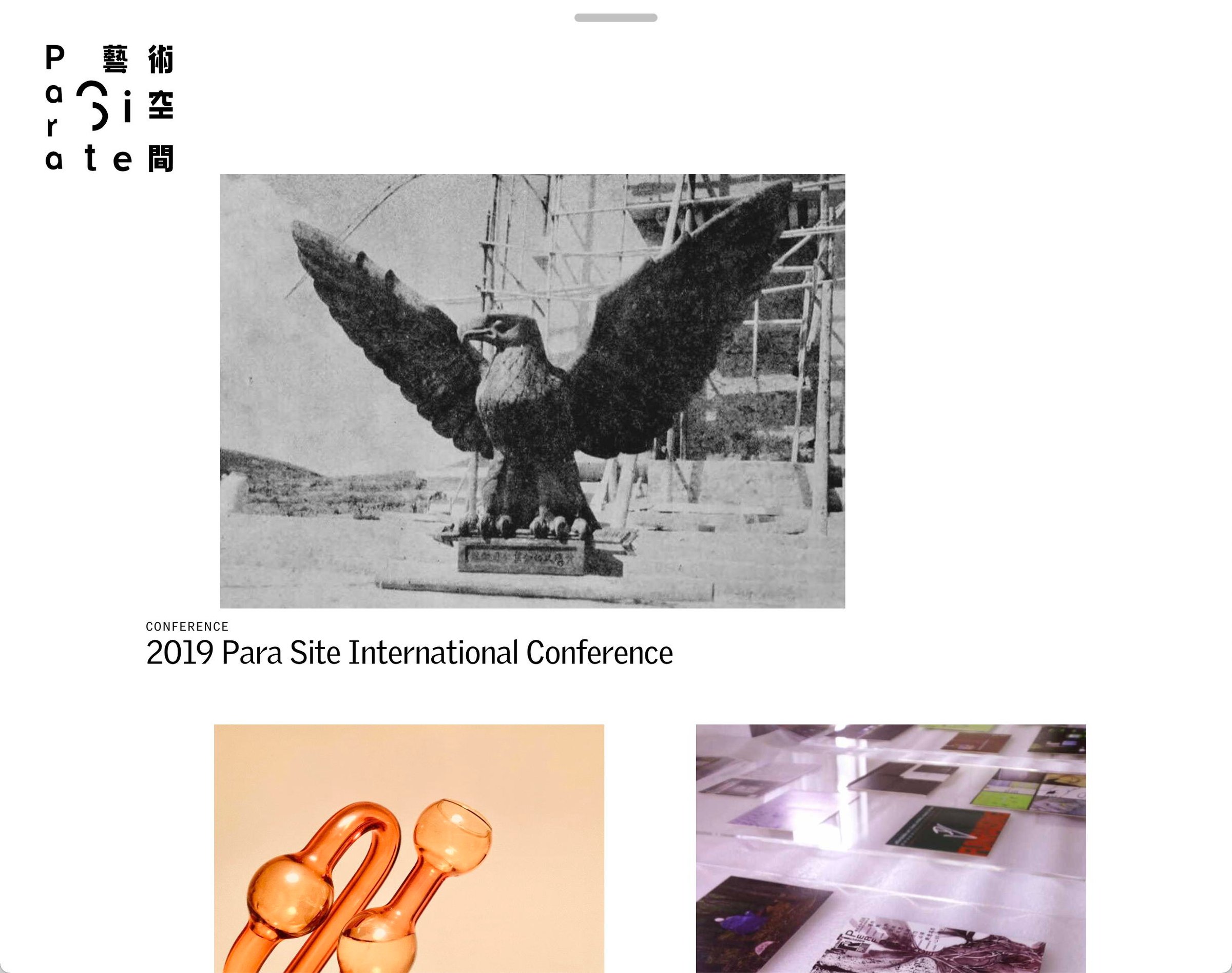
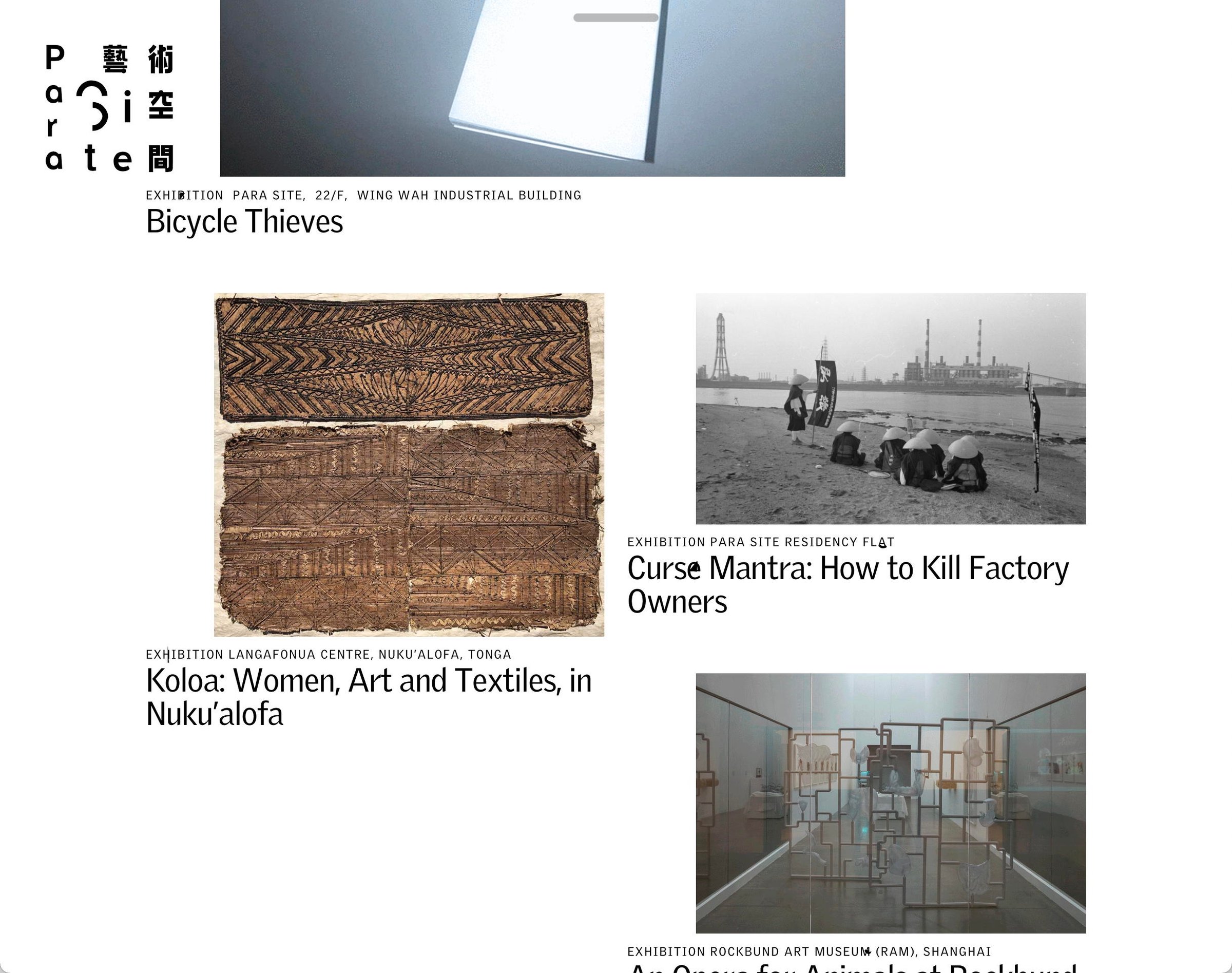
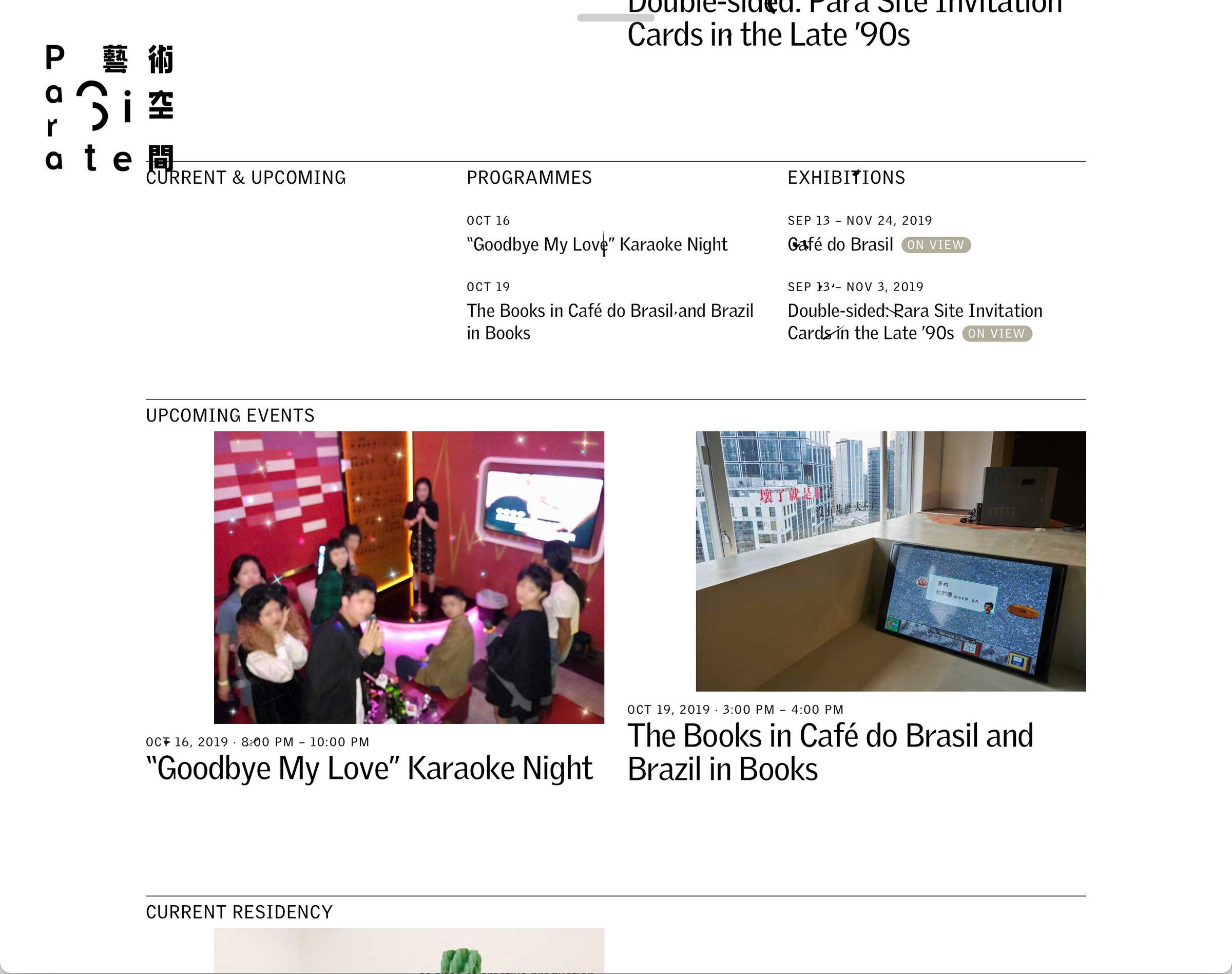
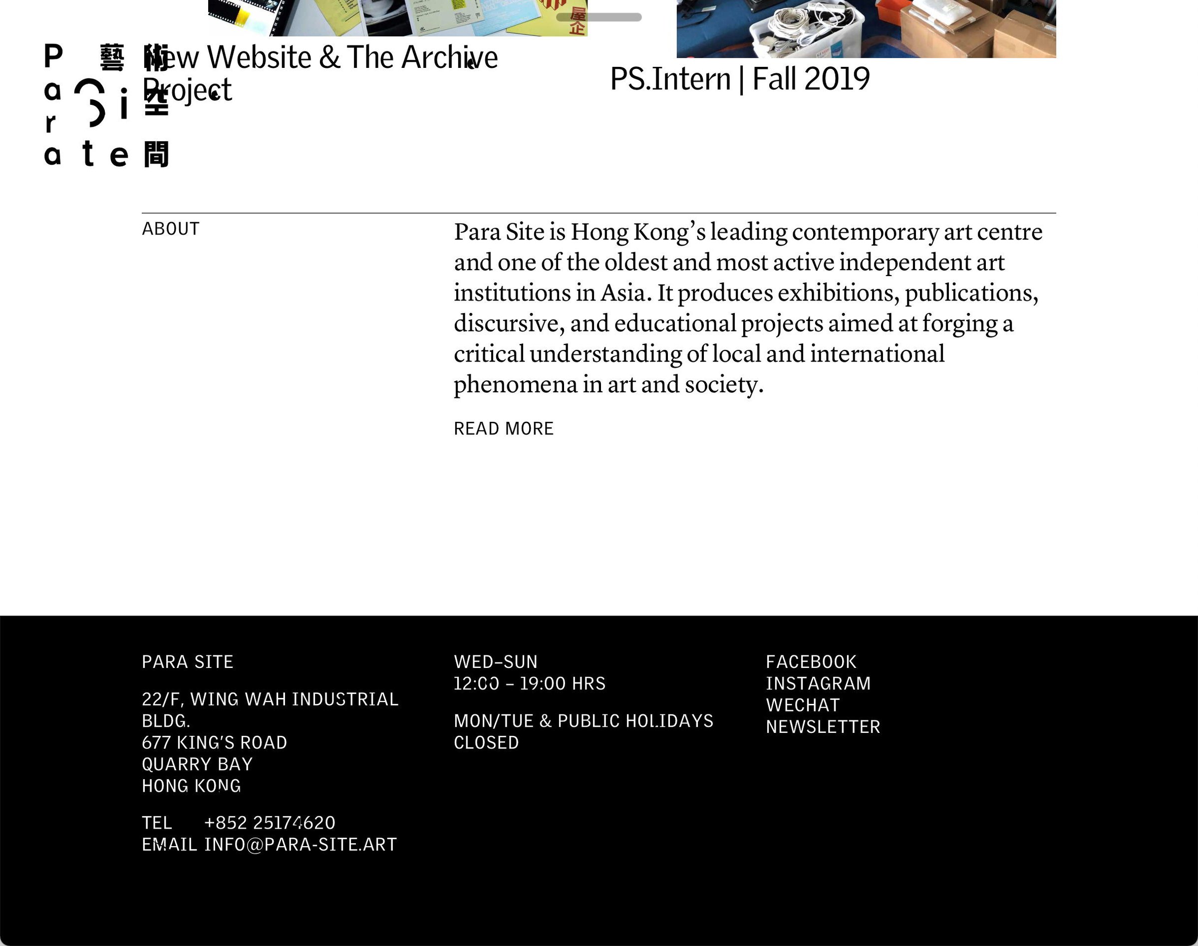
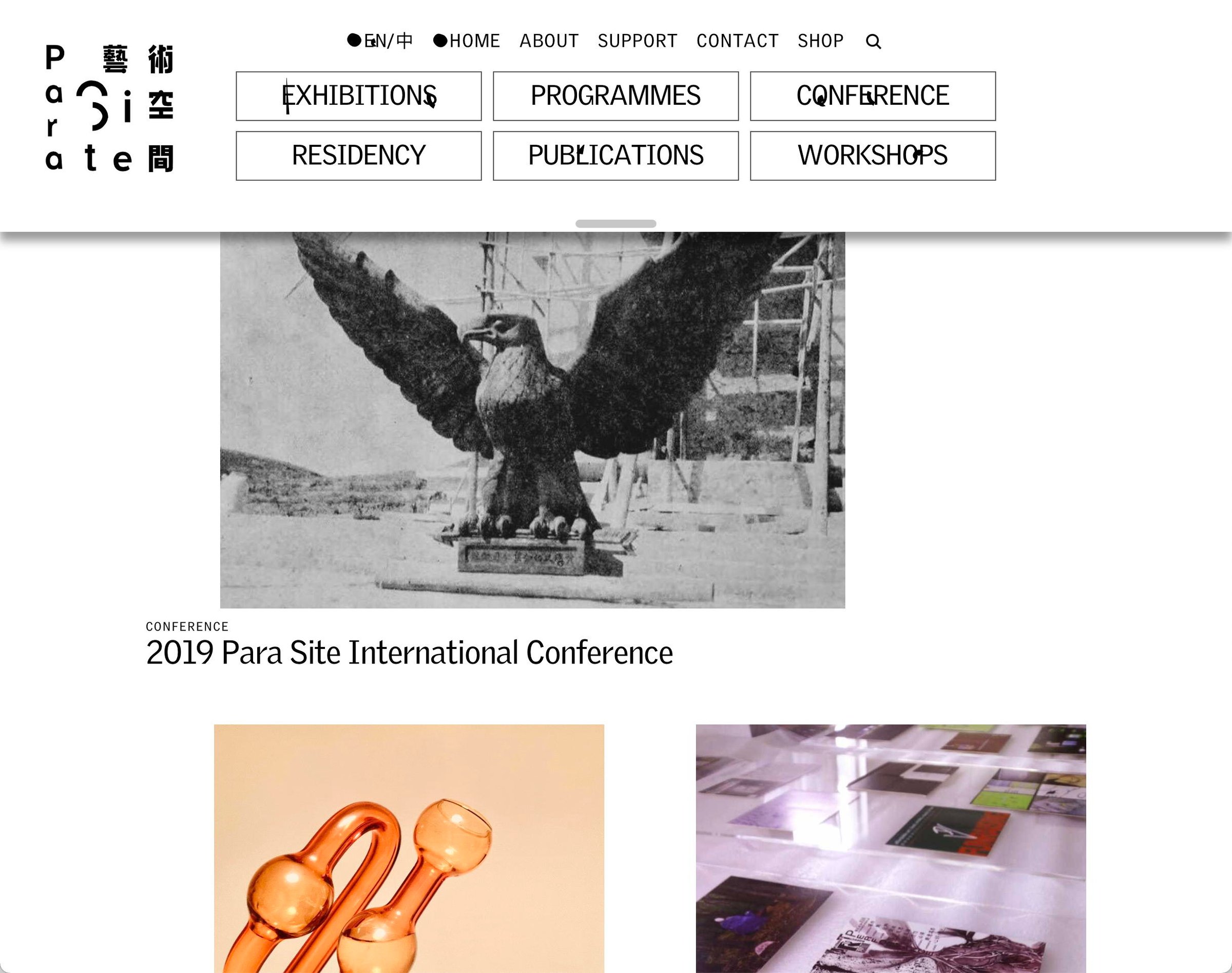
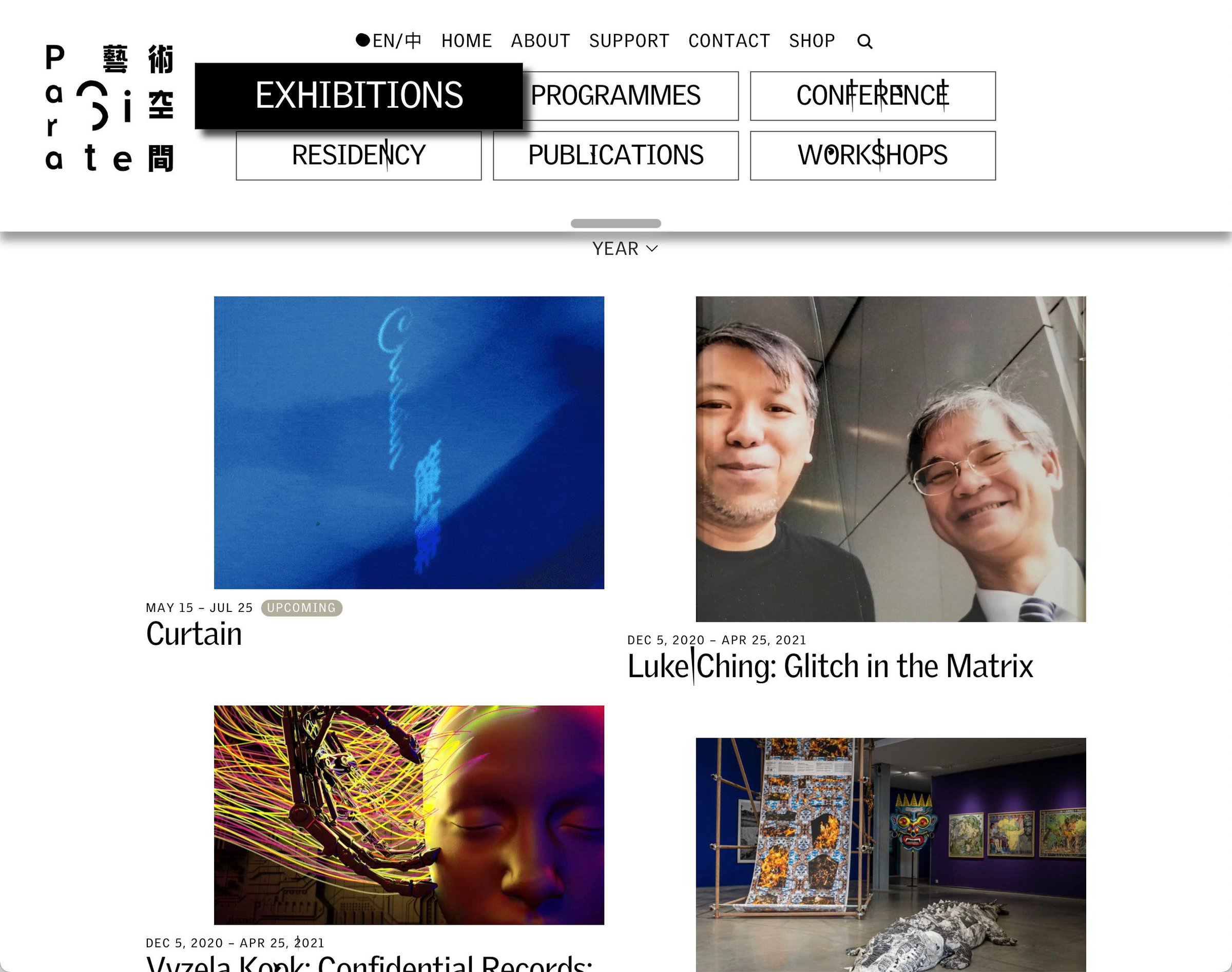
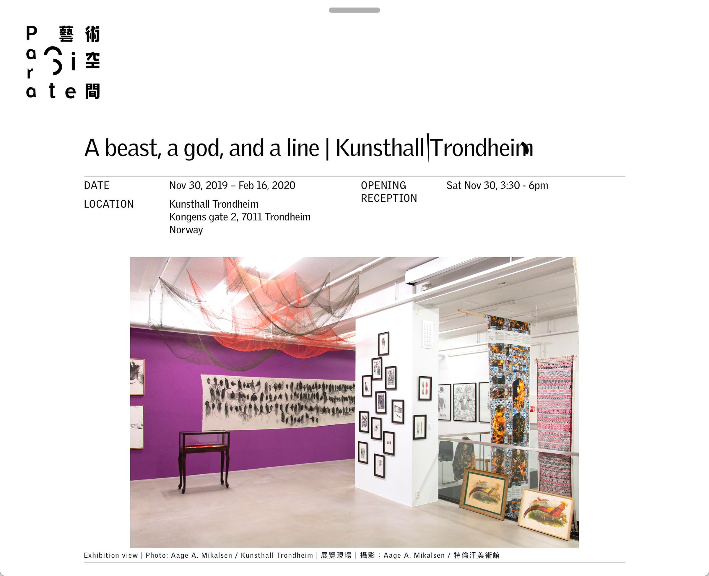
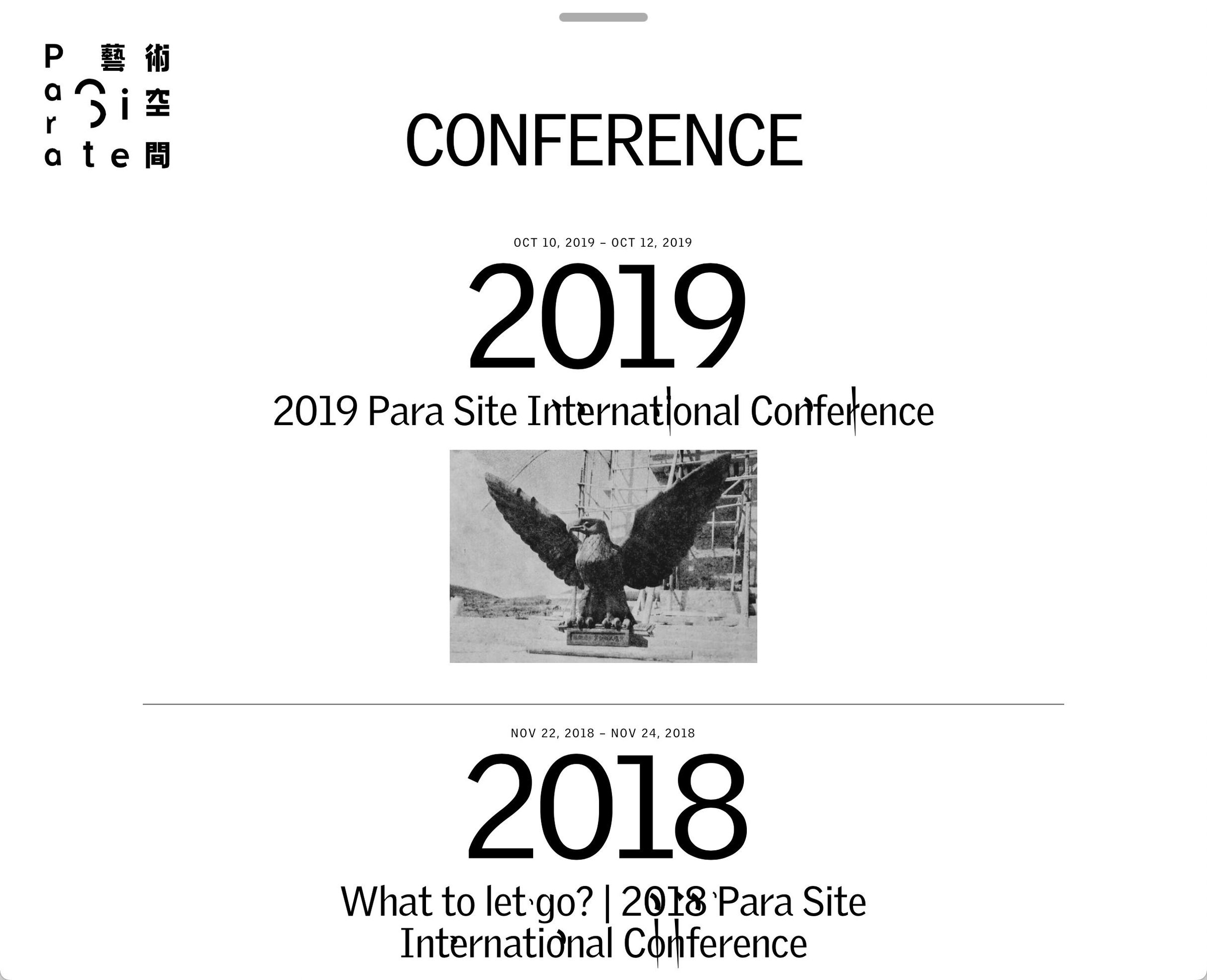
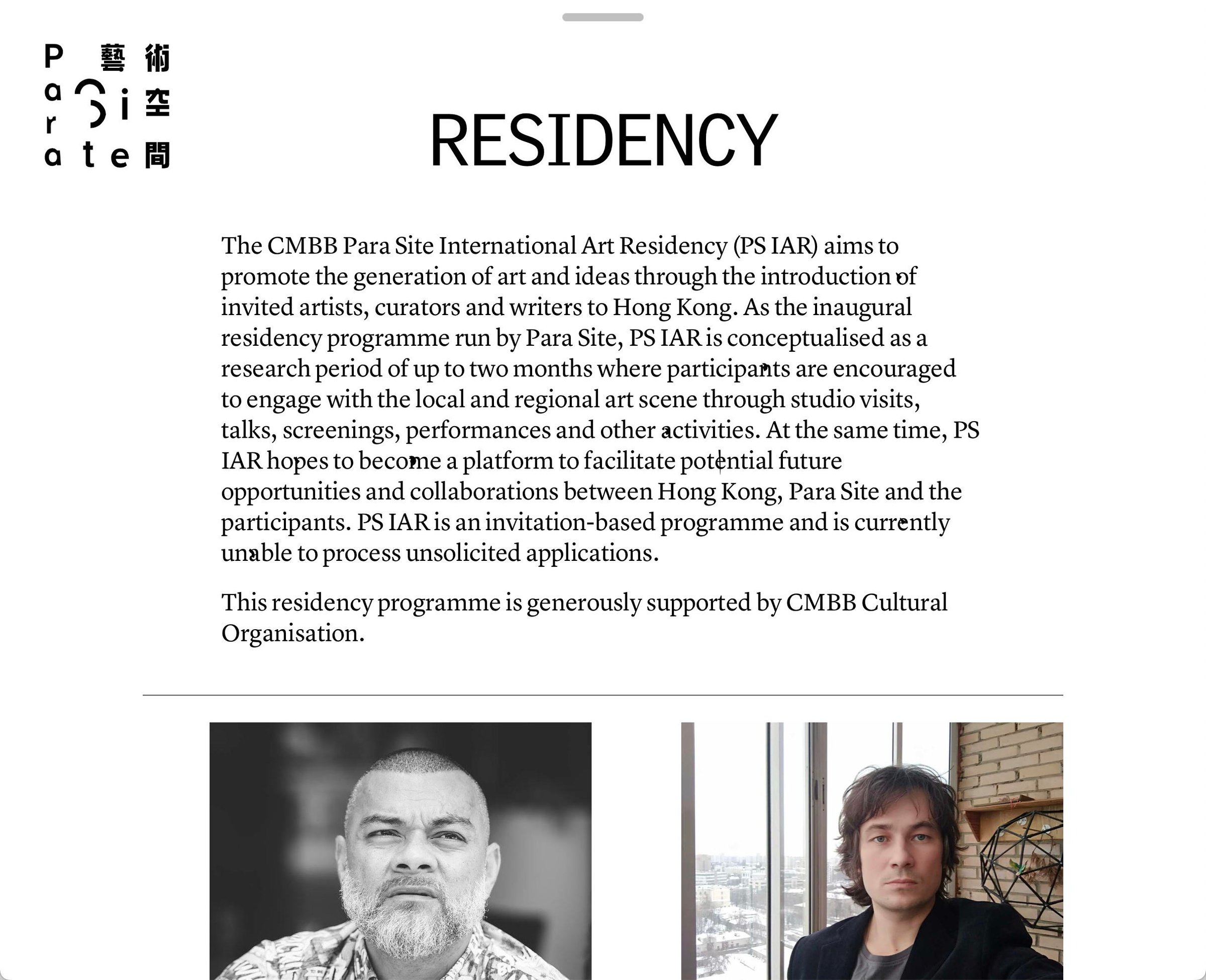
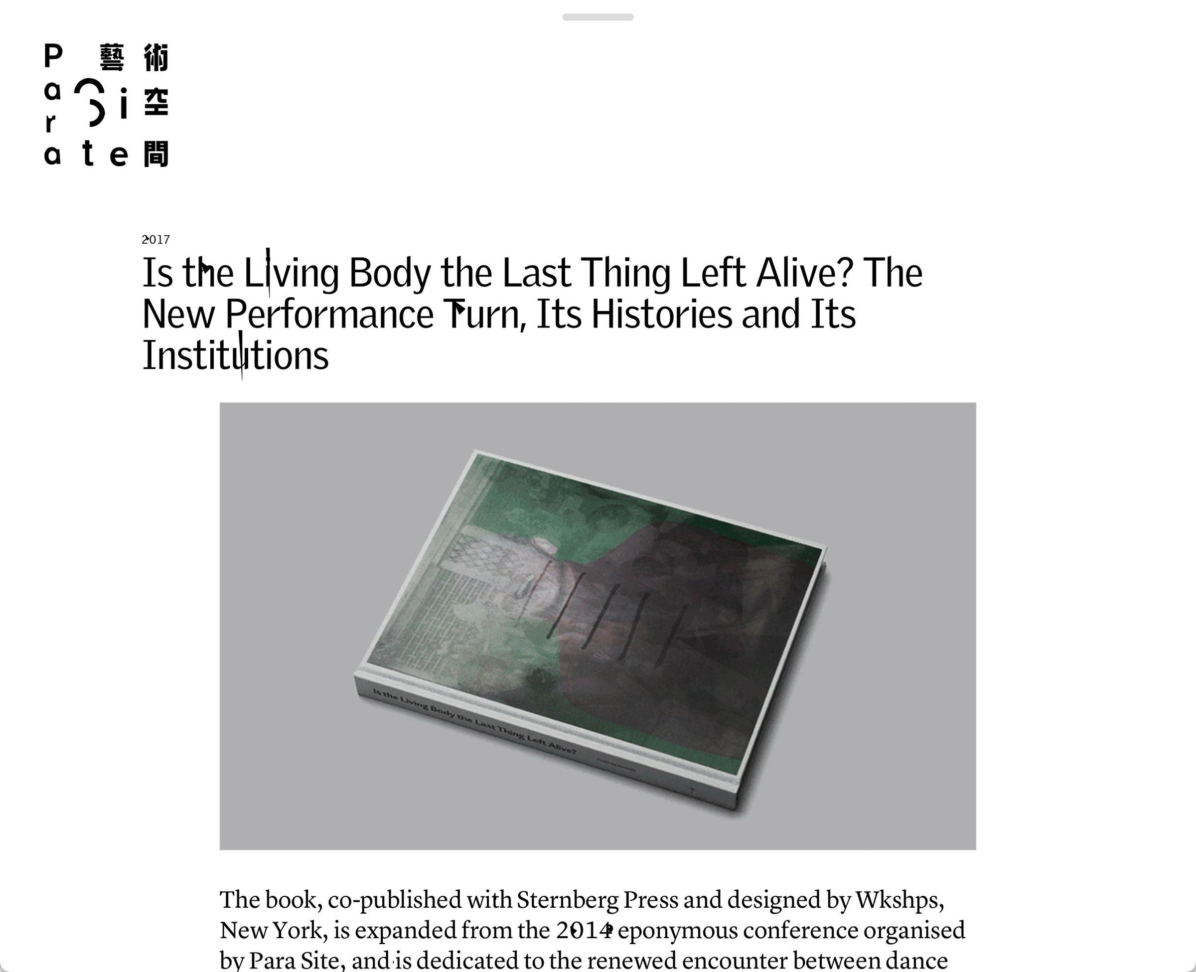
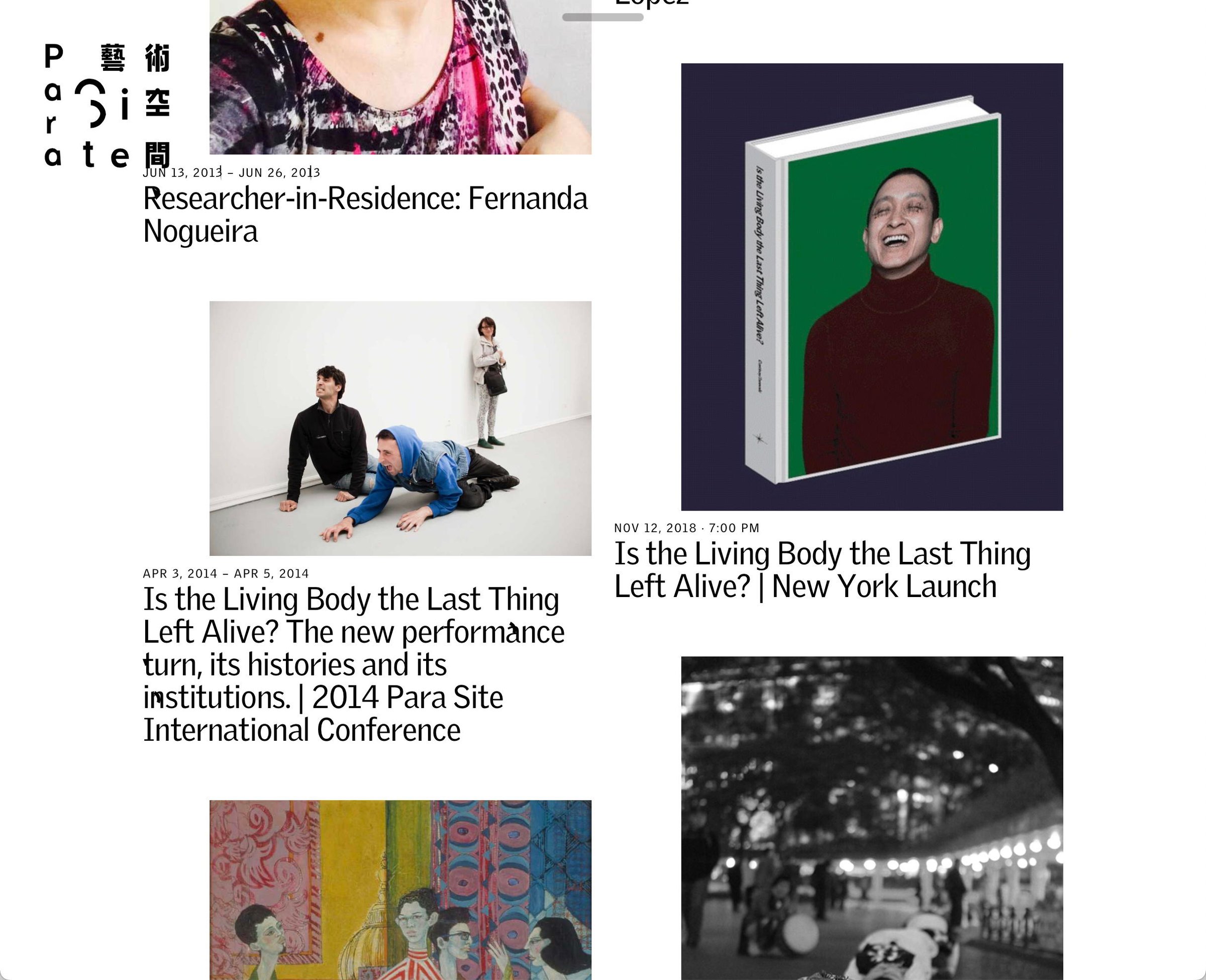
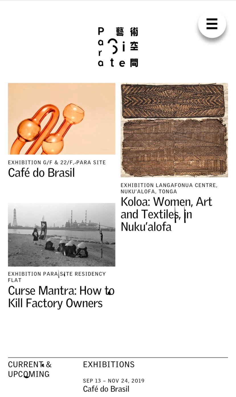
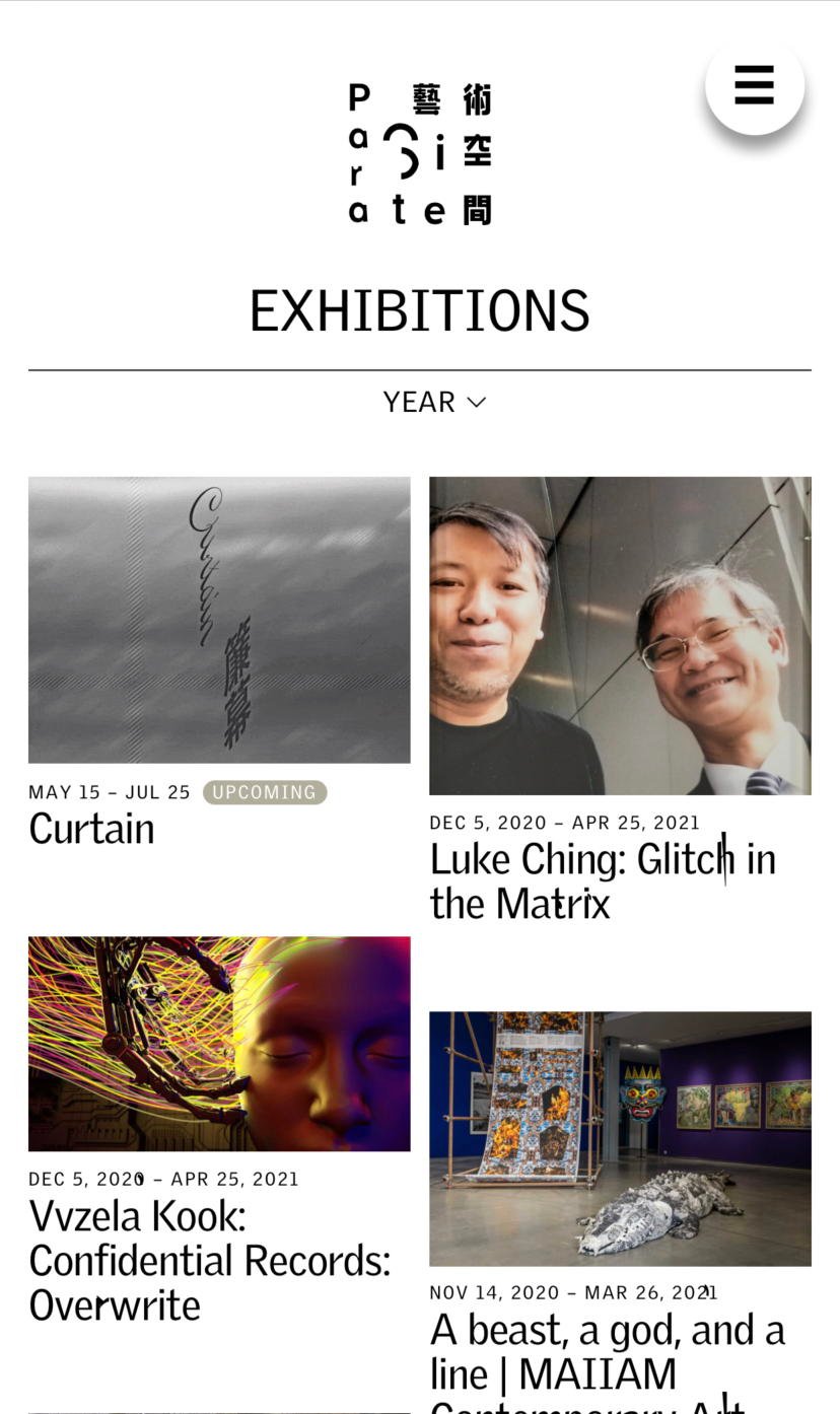
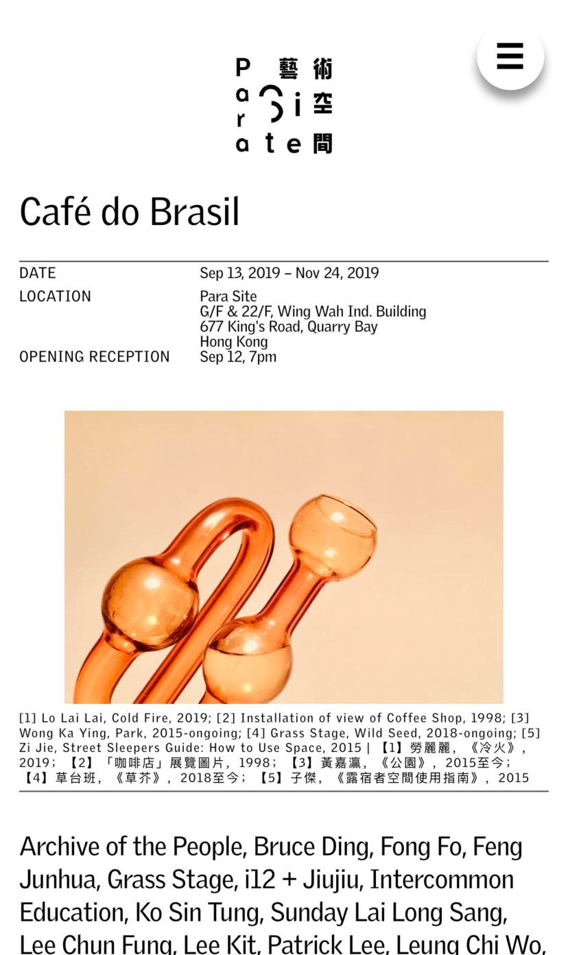
The infection starts in the letters. Small pieces of Para Site’s logomark break off and lodge inside ordinary text, turning up at random like something picked up from a shared surface. A character develops a growth. Another has a bit of the logo stuck to it. The words remain readable, but they have acquired something.
Para Site, the Hong Kong art space, has no fixed typographic palette. This gives the identity another way into the writing. The type becomes a host; the logo no longer needs to remain a discrete, well-behaved object in the corner. Its little fragments can turn up wherever there is text.
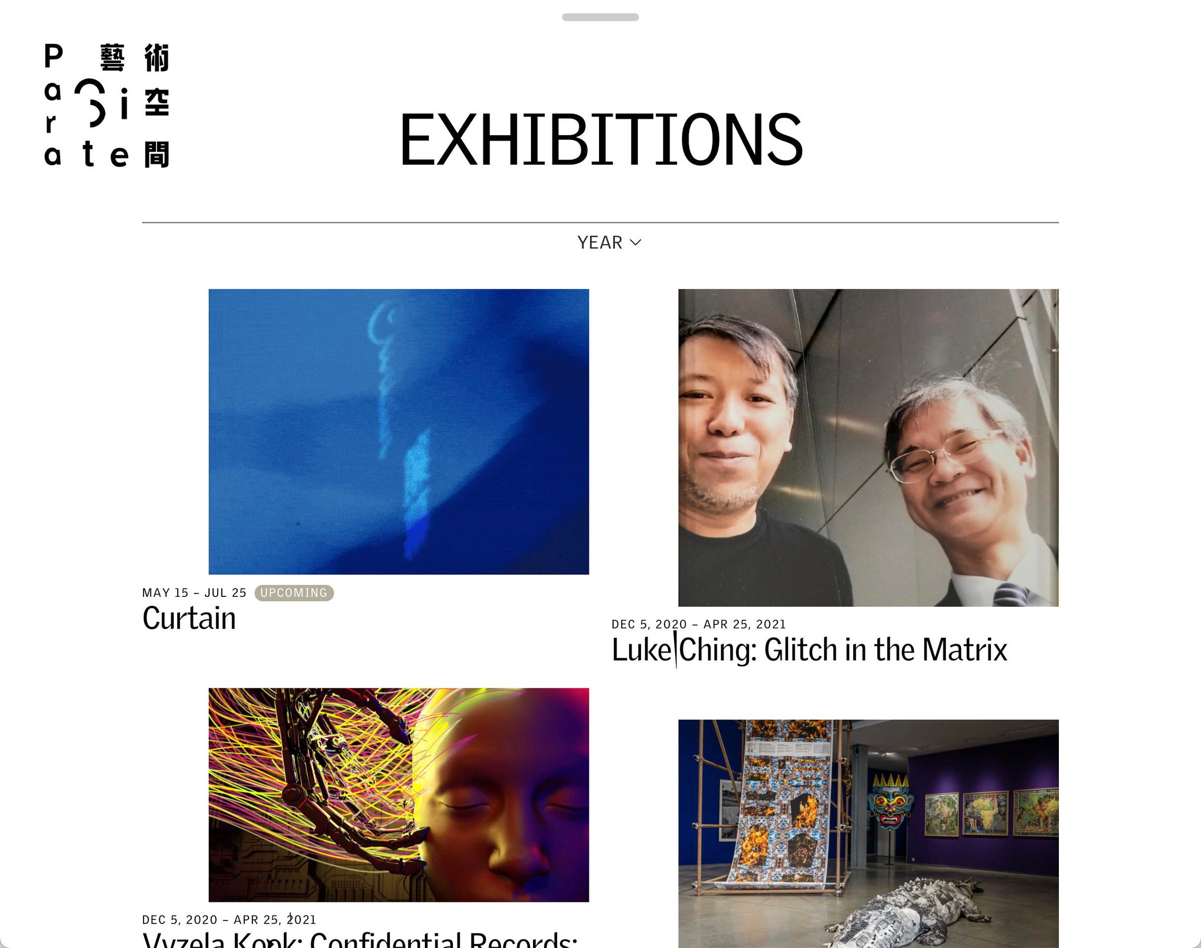
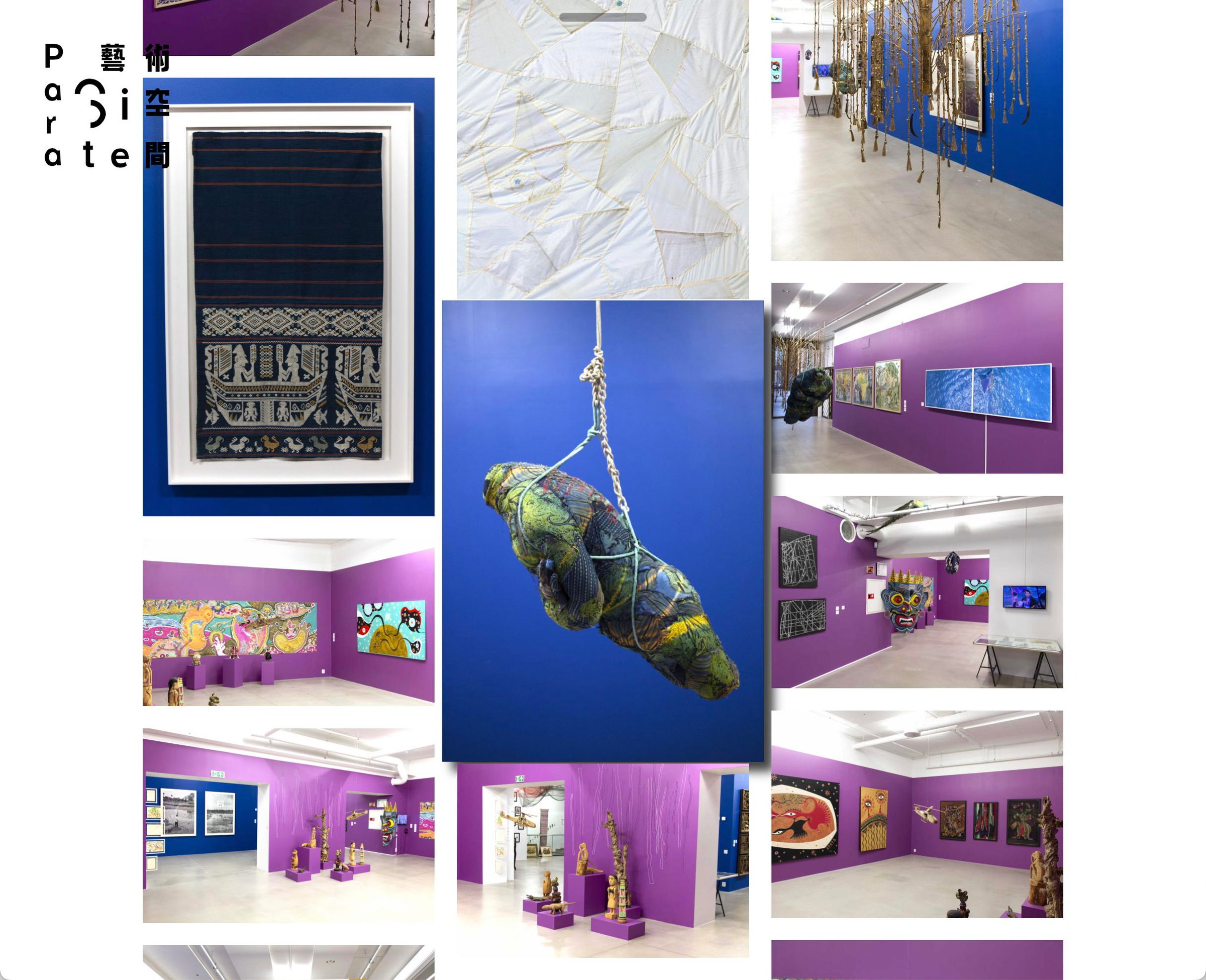
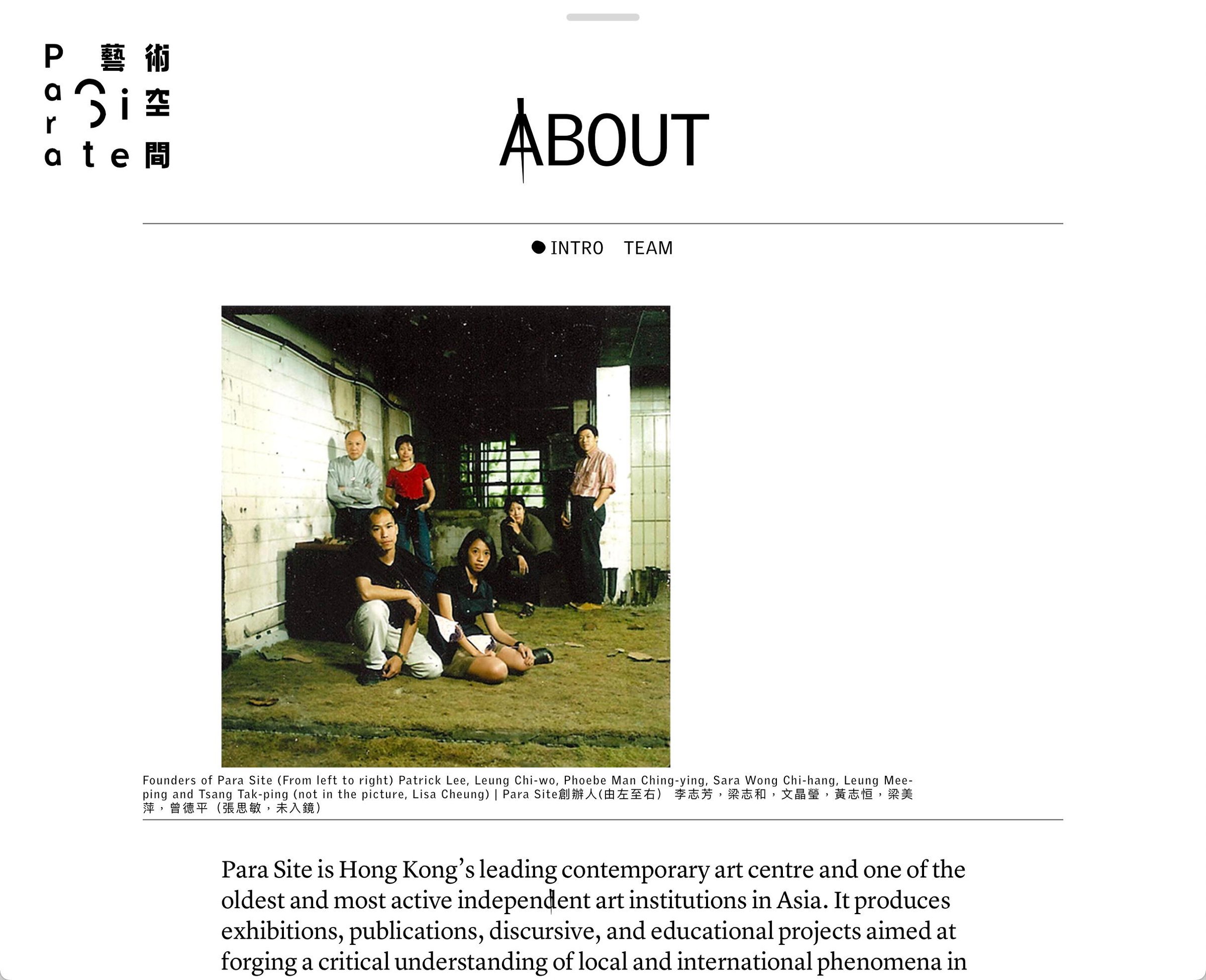
We designed and developed a sparse website around that idea: a hidden menu, little conventional branding, large interface elements pressed close together. Images and text overlap. They get into one another’s space and emerge in combinations that feel a little too intimate to have been planned.
There is something useful about a page that looks as though it might pass its condition on to the next one. Cleanliness is a peculiar ambition for a place called Para Site.